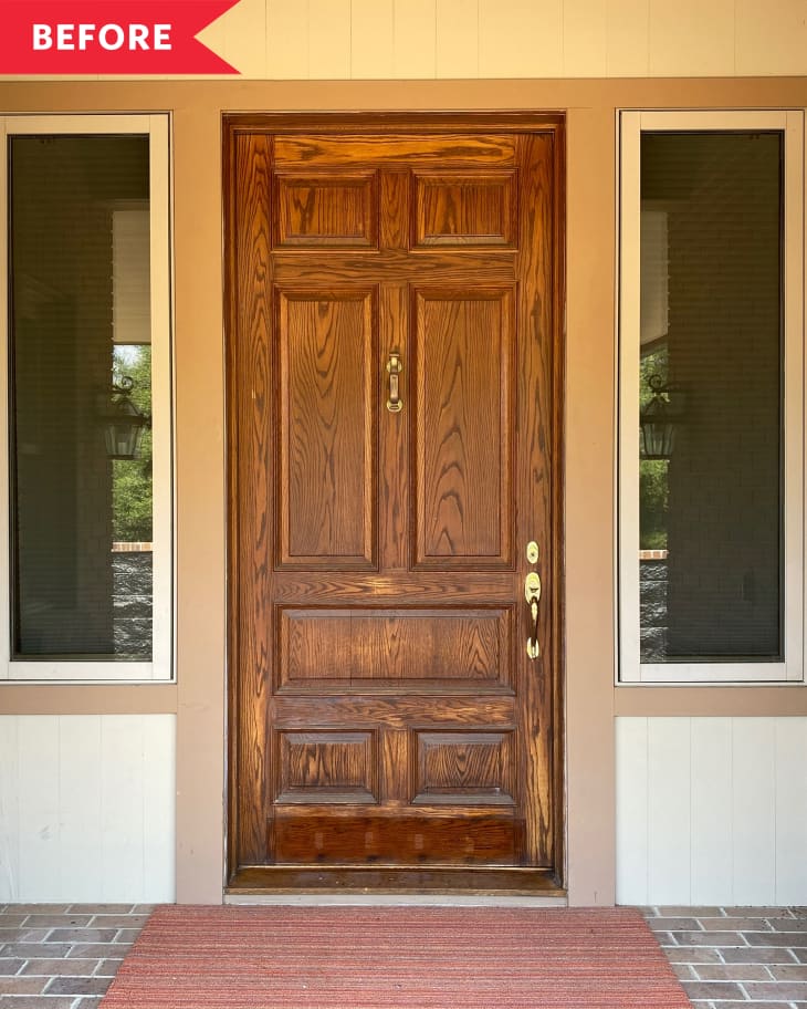
Before and After: This Front Entry Door Went From “Blah to Tada” With 29 (Yes, 29!) Different Paint Colors

There are color lovers, and then there are color lovers with a capital “C” and in all rainbow letters, of course. Jenna Pilant of Room Bloom Design definitely falls into the latter category. Everything this upholstery artist, designer, YouTuber, and blogger touches turns to technicolor, and it was about time the exterior of her California home started to look a little bit more like the rest of her bold, joyous interior. “It was an absolute taupe tragedy — completely uninviting with its brown-on-tan-on-beige exterior,” says Pilant of the front entry. “My entire aesthetic goal with this design project was to give a morsel of the house’s interiors on the exterior, a visual ‘glimpse’ of the rainbow delight that awaits all who walk through this front door.”
So Pilant did what any one looking to make a big impact on a budget would do: She pulled out her trusty paint brush! Instead of selecting just one or two hues to highlight her door’s different sized box panels though, she embarked on a rainbow bright makeover with 29 (!!!!) different shades of Behr paint. Feast your eyes on the finished door below, which pops even more, set against the now black backdrop of her home’s exterior (that got a paint job, too).
How did she come up with her plan here? Inspiration struck one day as she was scrolling on Instagram and saw a piece of artwork hanging in artist Angela Chrusciaki Blehm’s home.”With the insides of this home being under renovation the past few years, the exterior simply was not a priority for me and my brain,” says Pilant. “Then one day — BAM! — this creative notion entered my colorful psyche and just would not quit.”
She decided to paint each of the panels as if they were different multicolored frames. Being the color lover she is, Pilant mapped out a scheme on paper where she wouldn’t use any color more than once, leading to the 29-shade strong door you see here. Naturally though, the swatching and planning process started in the paint aisle at The Home Depot.
Once she settled on her scheme, she coated the body of the door in Behr’s Proper Purple, which became her base color, then she approached each individual square with four different shades total, each appearing on either part of the trim or within the box of each panel. Not only do the vibrant colors she chose highlight the door’s pretty features, but they also create a heightened dimensionality on the door itself. Due to her expert placing of shades, the squares and rectangles appear to be hovering and jutting out in space, not unlike the effects artist Josef Albers explored in his “Homage to the Square” series.
Using this many paint colors might sound expensive or confusing, but if you plan it out first — and use sample pots and/or some leftover colors you might have lying around — you can actually complete a high impact project like this without spending a small fortune. Sure, time will be a factor, since it takes patience pick out a palette and then paint trim work in one shade let alone several. Of course, this DIY involves lots of taping, too, to get crisp, clean paint lines.
All that aside, you could always scale back on shades, maybe just painting the body, trim, and interior squares/rectangles different hues to max out at three shades total. For Pilant though, this project, in all its 29 shade glory, was worth the wait and effort.
“I delight in how the after of this entry exudes the temple of vibrancy you’re about to enter; it makes my technicolor heart skip a beat every single time I see it,” she says of the door. “There’s nothing in this world I enjoy more than taking something from BLAH to TADA!”
