
This Once-Dark Craftsman Kitchen Now Has a Backsplash That Glimmers Like the Ocean
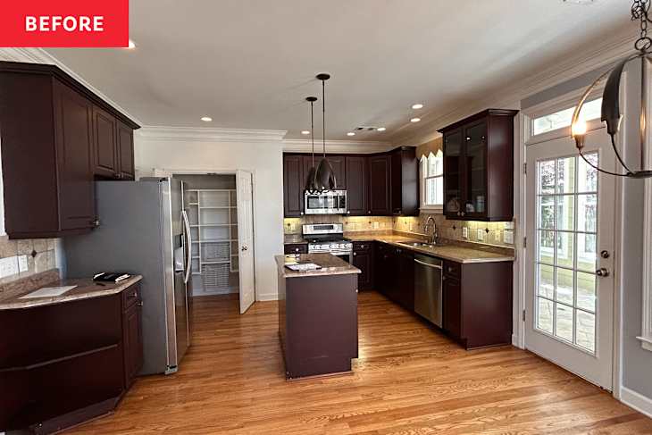
When principal designer Dorothy McGhee of McGhee Studios first entered her clients’ 1997 Craftsman Revival home, she noted a “dark and dated” kitchen that needed some serious TLC.
The Atlanta-based designer has a gift for reimagining spaces into more practical, colorful environments for her clients. This particular home, though rich in architectural detail, lacked the utility and energy her clients needed for their family of four. The young, vibrant couple wanted a kitchen that reflected their personality and lifestyle for their first home — one that was “more functional, more open, and brighter that reflected the way they lived and wanted to experience their home,“ McGhee says.
When they entered the kitchen, the cook space felt dated, dark, and not optimized for cooking or gathering. “There was no pantry or storage space anywhere to put everyday [essentials],” McGhee adds. “The island was too narrow for the homeowner, who loves to cook.”
The kitchen cabinetry also fell short, literally. “It didn’t extend across the entire wall,” says McGhee of the cabinets. This — and the fact that the uppers stopped short of the ceiling — made the room feel squat and limited in terms of storage.
The tiling, too, was simply stuck in another era. “The backsplash was completely dated and didn’t stand out against the other elements in the kitchen at all,” McGhee says. “There was nothing that stopped you — no focal point, no wow moment.” Ready to bring their vision of a “light, bright, and functional space that reflected their personality” to life, McGhee’s clients enlisted her design studio for the transformation.

McGhee made only a couple of structural and layout upgrades, moving the plumbing and gas lines for one, so the range could be centered on the back wall to create a more “symmetrical look.”
They removed the microwave from the upper cabinets and replaced it with a range hood. To give the space a high-end, seamless look, they tucked a new refrigerator into a built-in cabinet. Then came the fun part: decorating.

A Mint Green Backsplash Brings Vibrant Vibes to the Space
To roll out the red carpet for the star of the kitchen — a two-wall backsplash installation — McGhee made an intentional design decision not to take the cabinets to the ceiling. Instead, she and her clients decided to lean all the way into the tile, bringing it beyond the backsplash and all the way up to the top of the wall. They chose a vivid, zellige-style artisanal tile, Walker Zanger’s Cafe Moroccan Mint in Brick Gloss, to add some texture “without feeling over the top.”
The tile now climbs to the ceiling above the cabinetry, transforming the once “dead space” into the visual color story the kitchen had been missing. “The backsplash tile is the real focal point of the kitchen,” McGhee says. “It has movement, and when the light reflects it just right, it looks like water.”

For the countertops, the clients wanted something durable, easy to clean, and stain-resistant. They selected Taj Mahal quartzite for its longevity and low-maintenance appeal. “It [allows] the backsplash to shine and still provides some brightness,” McGee explains.
A New Island Serves Up Storage and a Pretty Focal Point
McGhee and her clients chose to reorient the kitchen island to better suit the homemaker’s need for prep space. Fittingly, McGhee found the perfect piece in a country Craftsman-style island in mango wood by Crate & Barrel. Its finish highlights the natural open grain and unique knots, adding warmth and classic charm to the space.
Instead of matching the island with the cabinets as the old kitchen had, McGhee chose this new kitchen island to be more “charming, youthful, fresh, and functional.” Three drawers, beveled panels, and dangling brass pulls provide storage and visual interest, while the open bottom shelf displays the client’s prized dishware collection.
Finishing Touches FTW (And a Few Budget Finds!) Led the Way
Then came the finishing touches. McGhee saved by refinishing the original hardwood floors (rather than replacing them) and keeping the original Craftsman moulding intact. To honor the home’s architecture, McGhee “matched the molding in the home and carried that over to the cabinets,” which now extend the full length of the back wall.
A new pantry was added for much-needed extra storage. For the walls, McGhee selected Sherwin-Williams Greek Villa (SW 551), a sunny white that reflects natural light beautifully during the day. What really made the space sing, though, was McGhee’s talent for blending classic architectural charm with modern updates.
Mixed metallic finishes keep the room fresh and on-trend — and on a budget. “We bought cabinet hardware from Amazon, but it’s in this beautiful brushed bronze, where we’re accentuating that with a nice, highly traditional style polished nickel faucet,” McGhee says. “That polished nickel picks up some of those brownish tones. It’s not a stark silver; it’s warm, and it looks like a piece of jewelry.”

Vintage-Inspired Styling Took the Space Over the Finish Line
For styling, the group leaned into pieces with history. A thrifted six-piece blue-and-white chinoiserie collection — including a teakettle, coffee creamer, sugar holders, cookie jar, and vase — was styled on open shelving, and an heirloom red Le Creuset piece displayed on the stove. A vintage rug passed down from family adds another layer of character and story.
“What I focus on is how the different textures accentuate each other and enhance the story that we’re trying to tell,” McGhee says. Rather than focusing on cost (or having more expensive things), McGhee says to pay attention to how everything interacts together. That’s what makes a well-rounded space for a vibrant family!
Design Defined
Never miss the style inspo and recommendations you crave with Design Defined. Follow along each week as our Home Director Danielle shares the best style advice, latest trends, and popular decor finds you just can't miss.