Before & After: A Kitchen Goes from Ugh to Unrecognizable

Andrea is a stylish fashion blogger who founded the blog Blonde Bedhead. And though her expertise is in personal style, it’s clear she’s also a master at interior design, too. In fact, she’s recently been able to flex her interior design muscles thanks to her newly purchased first home.
Though the house didn’t quite fit her own style when she first saw it in person, she could see the potential.
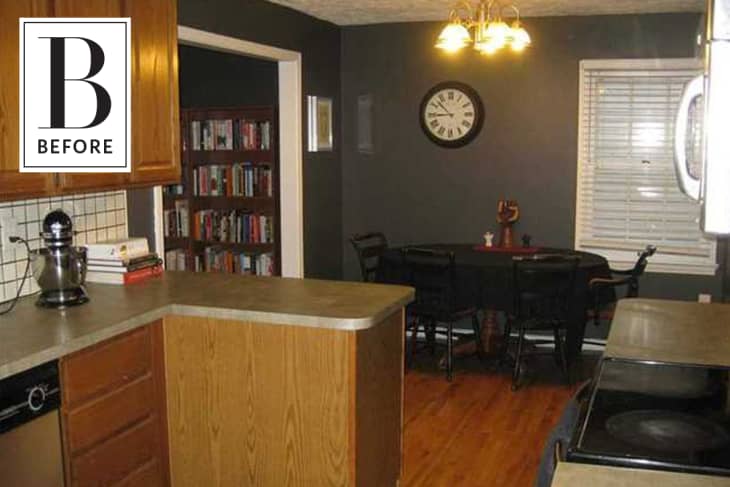
Andrea says upgrading the kitchen was the most expensive project in the house. “The kitchen was outdated with green laminate counter tops and old tile backsplash with dirty grout.” Andrea tells us.
The cabinets were painted, and the laminate countertops were replaced with a black and white granite to blend the white cabinets and subway tile backsplash with the existing dark slate flooring. “I was able to quickly and affordably transform it to light and bright to match my aesthetic!” says Andrea.
When she bought the house, each room had been painted a dark wall color. The dining nook on the other side of the kitchen had dark grey walls and dark furniture. With the brightening of the kitchen, the eat-in nook needed a refresh, too!
Andrea turned the dark corner into a bright breakfast nook that reflected her personality by painting it white and adding her special touches. “I love my dining nook. It’s cozy with natural wood tones and still keeps that mid-century, inviting vibe with plants, antique finds, cowhide rug and great natural light,” says Andrea.
Not every room in the house got a coat of white paint, though:
Although she wanted to make the house feel brighter, she kept the dark grey color in the room, which was previously used as a library. She turned the room into the formal dining room, and the dark gray walls bring a little bit of drama and elegance to the space. She added a custom table and matching bench, two chairs, a rug, curtains and artwork to the room. Though minimal, it reflects her style and complements the rest of the house.
Andrea’s inspiration is her jewelry designer friend Merl from Clyde’s Rebirth. Andrea says “Her home and shop are beautifully curated. I’m a little more of a minimalist than her, but her bright spaces filled with plants, natural wood tones and brass details has always served as an inspiration for me.”
