
10 Design Experts Share Their Favorite Blue Paints
Remember our epic guide to white paint? We figured it was time to ask designers about their blue crushes as well—you know, those just right shades of cornflower, ocean, cerulean, navy, and everything in between. Blue typically isn’t a polarizing color. Most people gravitate towards the spa-like, tranquil quality of its lighter shades, while others love the darker side—the energy of aqua, the intensity of midnight. Sure, you could go about picking a blue paint color alone. But why not make selecting a shade easier by starting with this list of designer-approved blues? You’ll be that much ahead of the game and ready to tackle swatching sooner. So without further adieu, here are nine designers’ (and one builder’s!) favorite blues. Oh, and they basically all called out Hale Navy from Benjamin Moore, so give that shade a look if you want to go dark and moody. But I wanted fresh, under-the-radar hues, so here are 10 new blues for you to obsess over.
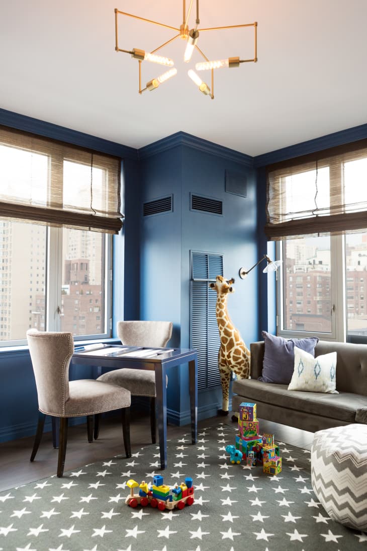
“This blue combines the perfect balance of sophistication and playfulness for this playroom. It warms up the room to feel like a cozy nook for imaginative play to take place but is not too childish when seen from the rest of the apartment. Deep blues are my absolute favorite!”—Lauren Behfarin, Lauren Behfarin Design
“My go-to blue is Waterscape. I’ve painted my front door, porch ceiling, and laundry room in this color, and it’s just the best happy aqua. It reminds me of the ocean and the beach.”—Gretchen Black, owner of Greyhouse Design Firm
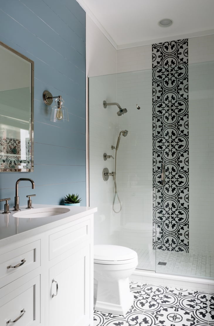
This hue has gray in its name, but it reads as blue on walls. “I really enjoy using this shade on a shiplap wall instead of white. This specific color, as shown in the bathroom here, gives a punch to the walls but doesn’t overpower the black-and-white design. Instead, it just frames it perfectly.”—Jess Cooney, Jess Cooney Interiors
“This luxurious teal mixes perfectly with the PPG 2019 Color of the Year, Night Watch (PPG1145-7), as an ode to ocean and earth, creating a serene space in any environment. For maximum impact, go with a flat sheen and add wood tones and textures, such as a natural wood floor. White decorative trim adds a touch of elegance.”—Leanne Ford, designer and star of HGTV’s Restored by the Fords
“We used this beautiful blue in our office on the doors here. It has more green in it than other blue shades tend to, which was a perfect fit for the teal chairs in the space.” —Courtney Thomas, Courtney Thomas Design
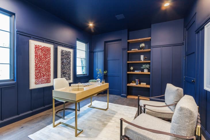
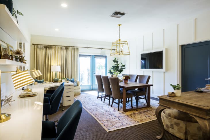
“We really love to utilize a deeper blue in rooms with high ceilings. It really helps accomplish the goal of giving the room a sense of privacy. An office should feel comfortable and productive, while still showcasing the size of the space with its high ceilings.”—Ami Harari, president of LA Build Corp
“Blue is a color that most people can agree on. It is the color that satisfies couples, parents, and children as they create a home that feels like their own. I love a hallway with repeating grayish blue doors in Tradewind. I always choose a shade that has some gray in it—this keeps the color from seeming too primary or glaring.”—Christie Leu, Christie Leu Interiors
“I needed to find a paint color for a basement room that was used for teenage kids and their friends to hang out in, and I fell in love with this silvery blue shade. It feels fresh, peaceful and calming all at the same time. It also felt perfect for this home in the Hamptons right next to the beach.”—Birgit Klein, Birgit Klein Interiors
To create an intimate, jewel box vibe in a bedroom or powder room, don’t be afraid to go bold with your blue. “Electric Blue is a lively, punchy hue that I first discovered in the aughts when trying to match my then-bedroom to Carrie Bradshaw’s in the Sex in the City Movie (I can’t believe I’m admitting that in writing).” —Caitlin Murray, Black Lacquer Design
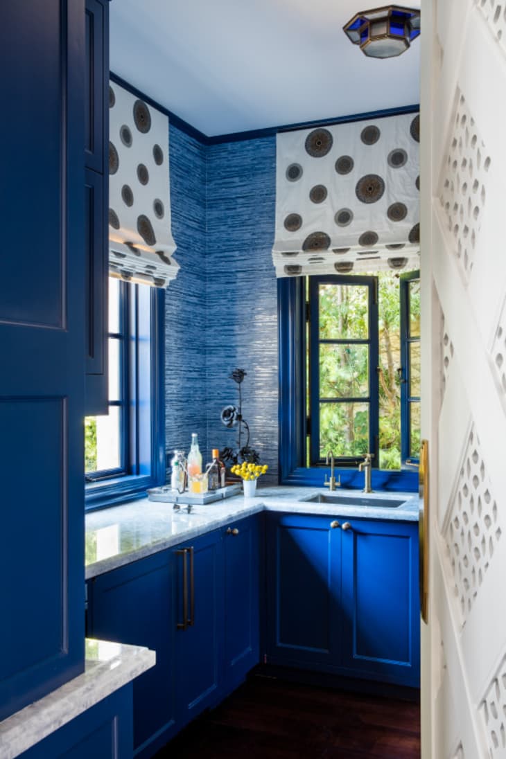
“Noir is the perfect shade of blue that’s right between moody and playful, great for a small space like this butler’s pantry.”—Christine Markatos Lowe, Christine Markatos Design