The 4 Best Kitchen Paint Colors (and 4 to Avoid at All Costs), According to Interior Designers

The kitchen truly is the heart of the home. It’s the place where fancy footwork is practiced between stirs, familial bonds are strengthened between sips, and bellies and souls are nourished thanks to grandma’s age-old recipes. A sacred place like this needs to project the right vibe — one that can be achieved by combining staple decor pieces with the perfect kitchen paint color. But what exactly is that ideal shade, and why should you take note of it before you renovate? Before we dive into paint pointers, here’s why the color you choose for your kitchen is more important than you might think.
Why does paint color matter in the kitchen?
The color of your kitchen affects more than just your aesthetic — research shows that it influences your demeanor and can make you feel a surprising array of emotions, from calm to disgust. As Artem Kropovinsky, an interior designer and founder of the award-winning NYC Arsight studio, puts it, “The kitchen, as the heart of the home, demands colors that complement its very essence.”
Because a kitchen’s color can leave an impression beyond the backsplash, we talked paint with Kropovinsky and Ricky Allen, an interior design pro and director of Ever Wallpaper, for the scoop on which paint colors are really best for the kitchen. Funny enough, there’s one paint color they both cited as a go-to for this aromatic area.
Which kitchen paint colors are best, and why?
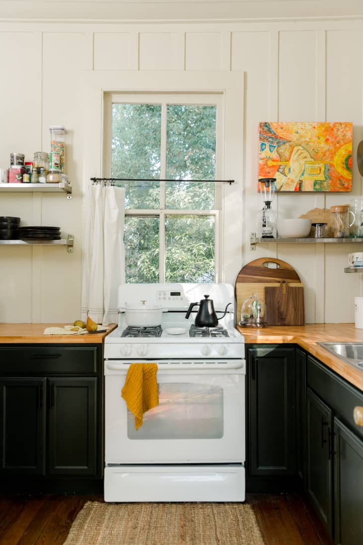
Both Kropovinsky and Allen concluded that soft neutrals are the way to go when painting the kitchen — specifically with whites and grays. Allen says these colors create an open and fresh aesthetic for the heart of your home, plus they lend a beneficial illusion for small kitchens: “White reflects light and makes the space appear bigger, while gray adds depth and complements stainless steel appliances,” he explains.
- White paint: Kropovinsky and Allen recommended the same white paint color: “Simply White” by Benjamin Moore, which provides that perfect touch of warmth to create a welcoming-yet-clean look.
- Gray paint: For those gray shades, our interior design specialists recommended different shades from the same brand: Farrow & Ball. Kropovinsky vouches for the “Ammonite” color, whereas Allen swears “Pavilion Gray” provides a sophisticated touch to any kitchen.
Okay, but what if I want some color in the kitchen?
You’re in luck. Kropovinsky and Allen say earthy greens and subtle blues provide tasteful and serene feels for the kitchen. “Blue promotes relaxation, making it perfect for a dining area,” Allen explains. “Green brings nature indoors and has a calming effect on the mind.”
- Green paint: Kropovinsky says olive and sage greens are perfect for achieving a calm aesthetic. Grab Sherwin-Williams’ “Oyster Bay” or Dulux’s “Soft Moss” to achieve an earthy and serene space. Allen also went with a Sherwin-Williams pick for green (“Sea Salt”) and praised Behr’s “Jojoba.”
- Blue paint: Kropovinsky’s blue picks are Little Greene’s “Bone China Blue” and Behr’s “Watery,” a perfect shade for those needing an elegant gray-blue blend.
Which colors should you avoid when painting your kitchen?
Sure, every color can find a place in the right home, but both Kropovinsky and Allen agree that some shades just don’t work in the kitchen. “While every hue has its day, certain colors, especially bright neons, can be more of a distraction than an attraction in a kitchen setting,” Kropovinsky explains. Allen agrees, noting that very bright and bold colors, such as red or orange, should be avoided, as they can be overwhelming for the space.
Allen also notes that homeowners are better off skipping the darker hues. “Dark shades like black or navy should also be avoided, as they can make the space feel small and closed off,” he says. Kropovinsky has a similar philosophy, but if you have your heart set on a navy blue kitchen, he encourages you to balance the kitchen out with strategic lighting so the room doesn’t feel cramped.
This post originally appeared on Kitchn. See it here: The 4 Best Kitchen Paint Colors (and 4 to Avoid at All Costs), According to Interior Designers