Before and After: A Dim 1990s Dining Room Gets an Unrecognizable Open Concept Redo

Making dining rooms casual again is often the goal of main levels with open floor plans where kitchen, living, and dining rooms that seamlessly flow together. After all, a dining room that’s only used on holidays or when extended family comes can feel stuffy and is a waste of square footage on a more regular basis.
Although some people prefer closed-plan kitchens for hosting, many are knocking down walls and creating more hybrid areas where conversation can flow freely between all three areas, like Maura and Philip Watson of The Watson Spruce.
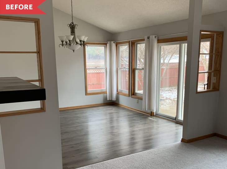
Before, Maura and Philip’s dining room had a full wall separating it from the kitchen and partial walls separating it from the living room. “We knew as soon as we walked into the house that we wanted to remove these walls,” Maura says. “All the rooms felt very disconnected, and you really couldn’t appreciate the height of the roofline.”
Over the course of two months, she and Philip knocked down the walls, repainted, added new floors, and removed the popcorn ceilings from 1993, the year the house was built.
They added Sherwin-Williams’ Snowbound to the walls and (now-smooth) ceilings, which makes the whole space feel brighter and larger and puts an emphasis on the angled roofline.
In the dining room, they replaced the dated chandelier for a Wayfair option with simpler curved lines. (Bonus: The black metal chandelier matches the backs of the dining chairs and the etagere-turned-plant stand in the corner.)
Maura also added a gallery wall to give a more collected, eclectic vibe to the somewhat-new build. “Because our home was built in the ’90s, we don’t have very much original character in our home,” Maura says.
The top basket with black detailing is from a small shop in her hometown in Pennsylvania, the bottom basket is from Home Goods, the flower sign and wood window are vintage, the top landscape print is from Juniper Print Shop, and the bottom is from Studio McGee for Target. “I love to mix and match old and new,” Maura says.
Her new gallery wall serves as the perfect statement wall in the now-open living, dining, and kitchen areas — and gives the dining space the character that Maura craved.
Inspired? Submit your own project here.
