Before and After: A Fancy Boutique Hotel Was the Inspo for This Blank Bedroom’s $1,500 Redo

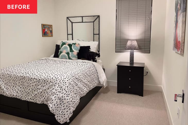
When you first move into a house or apartment, especially if it’s relatively new, it might feel a little impersonal. That’s how homeowner Sophia Bailey saw her space, a townhome she bought from a builder in 2020. “The home itself is what you’d expect a new build to be,” Sophia says. “It was a clean blank slate, but also very lifeless with all white trims, fixtures, and more.”
If your home feels a little like Sophia’s did, take inspiration from these seven ways to add a bit of character to homes where the rooms feel like blank boxes — and then look to Sophia’s own makeover of her guest bedroom, which she pulled off with her husband Alex for $1,500. The redo takes their guest room from blank and white to bespoke, all in an effort to make the space a more inviting and comforting crash pad for visitors.
“My husband and I are eager to learn new skills and decided that we’d DIY this project ourselves,” Sophia says of the bedroom redo.
“I was so excited to start on projects when we bought our house,” Sophia adds on Instagram. “Our first painting project was our stair railing, which turned out just okay. It ended up being uneven in certain parts and took a lot longer than expected. Since then, we’ve painted our entryway, living room, dining room, and guest room. We’ve come a long way in terms of efficiency, learning new techniques, and investing in the right tools.”
For the bedroom, Sophia decided on an accent wall that would bring both color and texture that was inspired by a boutique hotel, The Ramble Hotel in Denver, which has rooms with blue wainscoting behind the beds and gallery walls galore. Once Sophia mapped out the accent wall’s pattern, she worked with Alex to cut the wood for the wainscoting before painting and installing it. The gridded panel design feels classic and luxurious — and including a gap over the bed highlights the gallery of artwork displayed there.
Sophia says the most important design lesson she was reminded of during this particular project was to mix and match styles. “It wasn’t until Alex and I started blending our styles (he’s modern and minimal while I’m eclectic and maximal) when I realized that design doesn’t need to be cookie-cutter perfect. It actually looks best when you add unexpected touches that speak to your soul,” she says. “I love displaying our random objects we’ve gotten while traveling, personal art I’ve made, our collection of coffee table books, and of course photos of our cats.”
“I love how cozy the space turned out and that you can feel our personality come through the once dull and lifeless all-white facade by using a lot of velvet to add soft and playful textures while mixing leather and gold accents for a mid-century modern feel,” she says. The couple was also able to shop budget-friendly favorite stores: The velvet bed and the leather bench are from Wayfair, the velvet drapes are from Amazon, and the leather-looking lumbar pillow is from Target. Sophia says she’s proud that with a total cost of $1,500, “the space looks more expensive than it was to transform.”
Two of Sophia’s favorite details in the space? The “calming yet bold paint choice” (Sherwin-Williams’ Bunglehouse Blue) and the fact that she created some of the art for the gallery wall above the bed. “I’m happy that my creativity and personal touch is displayed for our guests to enjoy,” she says.
Inspired? Submit your own project here.
