I Painted My Walls the “It” Color of 2024, and It’s Surprisingly Versatile

I’ve seen it all when it comes to home color trends, from coffee-inspired shades of brown to unexpected hues of red. If there’s one color that I can’t get enough of right now, though, it’s yellow — and more specifically, butter yellow. Something about this tint feels as good as the first day of summer. It’s calming and soft, yet punchy, as well as energizing without being too overpowering.
After I painted my living room Farrow & Ball’s Hay (pictured below), I started noticing this buttery shade of yellow everywhere: flooding my Instagram feed, in home goods stores, and even dominating fashion. That’s why I spoke to three different interior designers about what makes butter yellow so captivating and why it’s arguably this year’s “it” color.
Butter yellow is a safe color for testing the waters.
I’ll be the first to throw bright paint on a wall, but as my friends like to lovingly remind me, this isn’t how everyone operates. For some, slowly integrating color into your home may make you feel more at ease while still pushing the boundaries. Designer Autumn Hachey believes this helps explain butter yellow’s recent popularity.
“For several years, neutrals took over, and homes felt tonal and beige,” Hachey says. “Now, people are craving color. Yellow is a beautiful, bright color that feels opposite to beige in terms of energy, but in a buttery tone, it still feels safe to explore.”
To put it into perspective, color psychology tells us that yellow exudes positivity and happiness, but too much can also make people feel anxious or overwhelmed. A softer, buttery shade of yellow achieves that just-right feeling at home.
Before you try this color, consider Hachey’s pro tip. “When styling yellow, it’s crucial to understand the tone you’re working with,” she says. Some shades of yellow can skew green, so “it’s important to always check paint and tile samples in person,” she adds. If you’d rather start out small with a few decor pieces, though, Hachey recommends Hawkins New York’s everyday mug, Boo Boo Clay’s ravioli spoon rest, or displaying Good Food, Good Mood by Tamara Green as a coffee-table book.
You get the perfect neutral to make a space shine.
Gone are the days of beige being the primary neutral. According to Jen Levy of Surrounded by Color, butter yellow is the new go-to. “Butter yellow is the happiest and easiest neutral,” she says. “It has a warmth while still being bright and making a space feel open.”
Levy also thinks that this hue casts a flattering glow that very few colors can achieve. Her go-to paint options are Benjamin Moore’s Good Vibrations, Backdrop’s Disco Nap, and Farrow & Ball’s Farrow’s Cream.
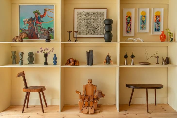
Butter yellow is pretty versatile when paired with other colors, too. If you’re giving this cheerful hue a go in your space, pair it with a bright red or cobalt blue accent piece or even lavender or rich shades of purple. When in doubt, look at a color wheel to find your complementary colors (anything facing across yellow!).
It’s a nostalgic, feel-good color.
Sometimes, making design decisions all comes down to a feeling — at least that’s the case for Alisha Sturino of Studio Otty. “Yellow has always been my favorite color,” Sturino says. “As a child aspiring to become an interior designer, my bedroom was painted a beautiful, soft yellow. It is a cheerful color that embodies positivity, reminiscent of spring and the blooming flowers.”
Sturino also enjoys the color because it can be classic and sophisticated, depending on the complementary elements. “If you choose to explore buttery yellow painted walls, consider incorporating high contrast and texture,” she adds. “Rich, beautiful wood, especially those with heavier grains like ash or rich walnut, can create a stunning effect. Pairing buttery yellow with bolder patterns can also work beautifully against this neutral backdrop.”
Tempted to try this buttery color in your home? Start small and work your way up. You’d be surprised how big of an impact it can have, even in small doses. Sturino recommends using Benjamin Moore’s Melted Butter, and, for the more adventurous, “extending the color to the ceilings, trim, baseboards, and doors for a cohesive look.” Now that sounds like my kind of room!
