
Carolyn’s Bedroom Makeover: Shopping and the Budget
Planning a room makeover can be fun, especially when it comes to sorting through inspiration photos and figuring out what elements you like most. But it can also be frustrating: developing a budget, thinking about needs, considering design constraints. It was all necessary, but once the planning was out of the way, the fun part of this makeover could begin: shopping!
Budget: I knew that we wanted to spend $300 on the makeover total, and it was a fairly strict budget, so I started an Excel spreadsheet that kept track of all our potential costs. I knew that paint was going to be a certain cost, so I calculated how much two gallons would cost and went ahead and subtracted it from the total. Then, I listed all the things that, in an ideal world, I would spend money on: lighting, bedding, accent pillows, curtains, artwork, frames, lighting, plants, etc.
I then rearranged the items on the spreadsheet, ranking which ones were most important to achieving the desired look. For instance, I knew that I needed a white coverlet since our only white bedding were heavy duvets, and going into summer months, we didn’t have any lighter blankets, much less white ones. I knew that I despised the light, so it had to go. Artwork was dispensable since we already had several pieces around the house that needed to be hung somewhere, and plants could be moved from other rooms.
By having some kind of ranking system and performing a lot of price comparison (with a system you’ll read about below), I was able to easily discern where it was possible to spend money. And crucially, before I bought anything, I had the whole budget figured out. The one exception to this rule ended up being a mistake: I bought yellow curtains on an impulse before the design plan was complete, only to find out that the shade was completely wrong and that they wouldn’t work in the room. Luckily, I could return them, but I think that if I had waited until I had the whole plan in place, I probably wouldn’t have made this mistake.
It’s really hard not to buy items along the way, but when it came to sticking to my budget, this was indispensable. Of course, you can give yourself some flexibility if you find the most amazing thing you’ve ever seen at a flea market, but generally, I advocate having a plan in place before you spend. It’s really easy to keep adding on otherwise. Plus, waiting gives you a chance to really get the design plan together, so you know that when you actually click “buy” or check out at the store, you’ll be getting exactly the pieces you want and need.
My budgeting/ shopping process only took a matter of a few days, so the waiting wasn’t all that hard. Here’s how the final tally shook out:
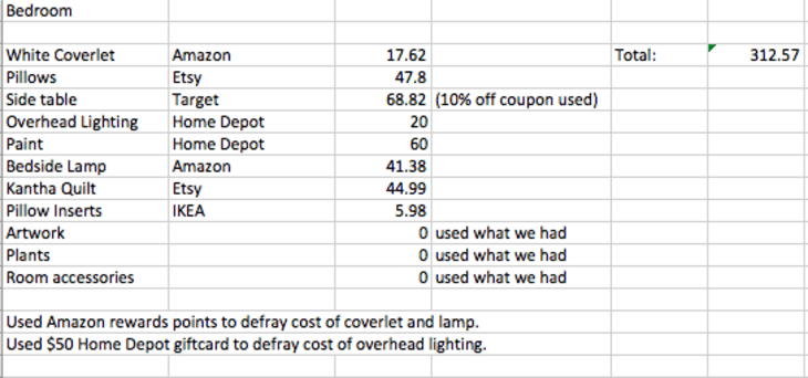
We only went about $13 over budget, and I was quite pleased with this, since I hadn’t even intended to buy a new side table, but I saw this X-base stool at Target and had to have it.
Furnishings: Usually I’m a slow decorator. My home is made of objects collected over time, pulled from thrift stores, alleyways, and stumbled-upon boutiques. But this makeover posed a whole different type of shopping process for me. It had to be much more directed.
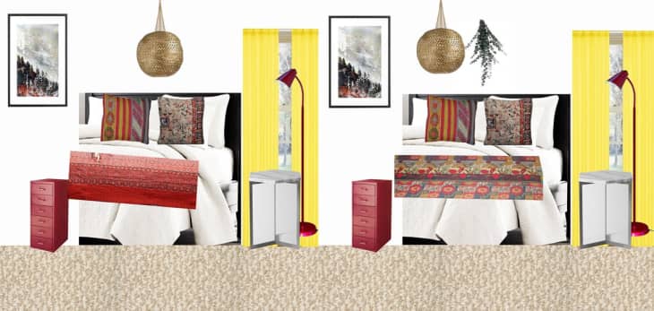
Thanks to the Photoshop mockup I did while planning, I had a pretty good idea of what things I had and what things I wanted. The Photoshop mockup kept changing throughout every part of the shopping process, though, and I would recommend that you edit it scrupulously as you piece things together. Subbing items into the Photoshop file made it much easier to compare them and see how they would all fit together, as the blanket example below shows:
I won’t walk through you every step of my shopping experience, but here’s a sample case that will, hopefully, give you some tips for how to make the most of the shopping experience. I thought first about our list of needs. One thing we needed was better bedroom lighting. One of our lamps was fine, but the other was not serving our reading needs. Bedside lighting was definitely an item that ranked on the “need to spend money on” list.
Then, I thought about what would work best for the space. I thought about the fact that on one side of the bed, we already had a red, industrial-style piece (the IKEA Helmer). A red floor lamp would be practical and affordable, and it would add red to the other side of the bed, visually mimicking not only the color, but also the vaguely industrial style.
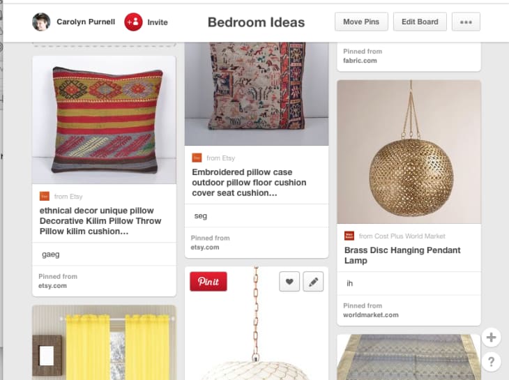
As I mentioned in a previous post, I’m not a die-hard Pinterest user, but here’s where Pinterest became quite handy. I started a board for “bedroom ideas” that only included products I could shop for (no inspiration images). Every time I found a candidate for the right lamp, I added it to the board. Within a few days, I had several red floor lamps to choose from. At a glance, I could compare the Land of Nod Bright Idea Floor Lamp ($79, bright tomato red, 51.75″ tall) with the Nuvo Gooseneck Floor Lamp on Amazon ($59, darker red, 64″ tall). Having everything side by side really helped make a choice about which item worked best for our room.
I also used the Pinterest board to collect things that I had a less distinct idea about. I knew I wanted patterned textiles, but I wasn’t sure whether I should go for silk ikat pillows, kilim pillows, or some other kind. Collecting them all together, again, helped me compare them side by side, and it helped me make a more informed decision about which I liked more.
Paint selection: Having read enough interior design writing, I know that looking for the perfect white paint can be like looking for a single flea in a sea of puppies. Usually, I’m happy to buy an overabundance of samples and live with them for several days before making a decision, but with this choice, I could see myself going down a rabbit hole from which I would never emerge if I let myself debate too heartily. I compared white paint chips from Sherwin Williams, Behr, Martha Stewart, and Benjamin Moore, but I limited myself to two samples.
I selected Benjamin Moore Chantilly Lace as one of my choices, since I was inspired by this beautiful interior and the designer’s assertion that it was “a white that wouldn’t look too cold or stark…but also [without] any hint of yellow or creaminess.”
The second choice was Martha Stewart’s Pure White, which seemed a bit brighter but also not too blue and not too yellow. When I went to Home Depot to get a sample pot, the guy at the paint desk said that the formula for that color was just Glidden’s base Pure White. I’m not sure if this is actually the case, but I went home with the untinted pot nonetheless.
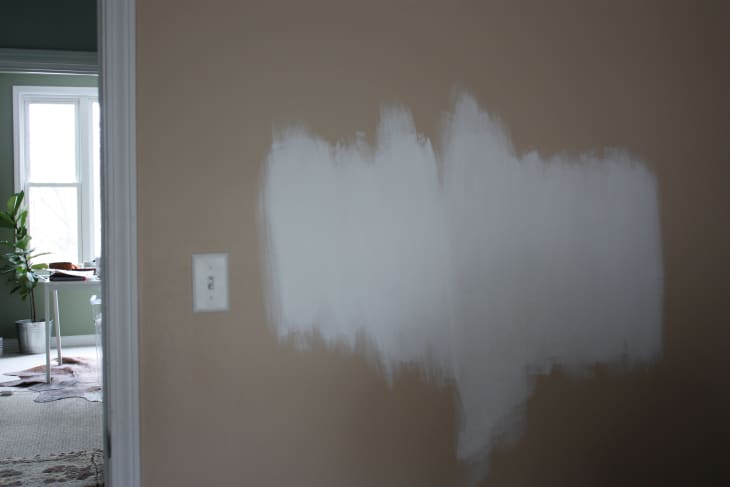
Chantilly Lace (right) is a gorgeous white, and it would have been the safer, less intensely modern bet, but once they were on the walls, it was immediately clear to me that I wanted the Glidden white (left). It was brighter and more intense, but it didn’t seem cold. And I figured, if I’m going to go white, why not just go for it with gusto?
While I’m usually the first to argue that you need to try paint before you buy it, and while I could probably run my own paint store from the stock of samples I have in my basement, I think it was a wise decision for me to limit the number of samples I could buy in this instance. I think I would have been paralyzed by choice, and since I was already feeling nervous about white in the first place, just getting a color picked and sticking with it was the best plan.
Since my goods were gathered from a variety of places (local shops, suburban shops like IKEA, and online), it took a couple of weeks to actually procure them all, but once they arrived, the fun of setting up the room could begin!