Before and After: This $350 Kitchen Redo Is Filled with Smart Rental Tricks

You know the drill: Any improvements made to this rental kitchen needed to be affordable and reversible, so that the renter could get the security deposit back. With just $500 in upgrades and some very clever re-styling, this kitchen now looks like a million bucks.
I was all ready to gush over this ridiculously adorable wallpaper, when I realized that it’s not wallpaper: It’s renter-friendly removable decals. That is an amazing hack that even homeowners should take note of: It’s perfect for those of us with zero wallpaper-hanging skills; it’s a great way to make the most of a teeny wall; it gives you the freedom to try out more daring looks; it’s affordable, and have I mentioned how darling it looks? The decals are from Urban Walls.
Moving on, the rest of this space looks great too. The pale blue cabinetry complements the tangerine hues perfectly, while the new brass handles work much better with their rosy warmth than the old silver ones would have. Same goes for the newly painted shelf brackets, which add a bit of glamour to the storage area.
Autumn Hachey of Make Moves—@autumnhachey on Instagram—did this makeover for a client and totally nailed these renter-appropriate design tricks.
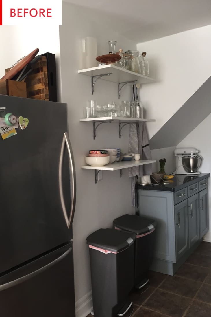
This is such a nice rental kitchen already, but let’s see what other changes were made…
And now it’s even better. Yes, lighting has improved greatly, but Autumn has made several low-investment, high-impact changes:
We did a lot of cool rental friendly things, like the decals (peel-and=stick), we kept the original shelves and just sprayed the brackets, added a rug to the dark floor to brighten it up, faux plants on the shelves that don’t get light—and if you can believe it, ALL of the items on the shelf except the watering can are from the thrift shop (and a few she already owned). We literally spent next to nothing to outfit the entire kitchen.
Even the handles were a super cheap find on Amazon (four-packs for under $15, compared to $12 a handle at most places we looked at). Albeit, they aren’t the grandest quality but for a rental they are totally good enough.
Some key points are really decluttering, establishing a color palette, and adding life (both fake and real) with plants, flowers, and fruit.
The handles make a huge difference throughout the room, and the new art adds a lovely, lively glow, but my favorite upgrade is the new Oscar the Grouch-style trash/recycling area. Those cans are so charming and classic! These are from IKEA. The new pale rug is also a smart choice as it brightens the floor, while its black stripes link it to the black countertops. The rug is also from IKEA.
I like the way these shelves take advantage of the headspace above the sink, while their narrow profile keeps them from feeling imposing or crowded. That’s also a very nice faucet and dish-drying rack!
There aren’t many major changes here—fewer jars, more plants, new soap bottle, new handle of course, and the dish rack has been replaced with a gorgeous flower arrangement—but the resulting vignette is much more elegant. It would be hard for me to give up any storage jars, but perhaps that’s not a problem for this renter; having room between each jar certainly lets the space flow better. The soap dispenser is from H&M.
Autumn was good enough to provide a budget of this project:
Here is the kitchen cost breakdown:
- 4 Packs of Tangerine Wall Decals: $305
- 2 White Garbage Bins: $60
- White Stripe Rug: $24
- 25 Pack of Brass Hardware: $34.99
- Stone Utensil Holder: $19.99
- Glass Soap Dispenser: $14.99
- Shelves: $40 worth of thrifted items (amber glassware, wooden bowls, blue bowls, decanters, etc.)
- Plants, cookbooks, cutting boards and the print: $0, found in other rooms of the house and styled into the space
That puts the total at about $462.97—and I believe that’s in Canadian dollars, making it about $357 USD. And other than the wall decals (which should last for years, but cannot be reused), everything purchased can be used in future homes, so there’s no money lost when the client moves out.
Finally we have this shelf unit next to the kitchen. While it was certainly providing crucial storage space for a ton of dishes and other cooking supplies, it added a bit of a jumble to the living area.
Removing the backing board was a brilliant move that, once again, allows light and space to flow. There’s still a fair amount of stuff stored here, but by limiting the palette to white, gray, and wood, Autumn has majorly unified the disparate elements. And with the wall shelf gone, this piece can be the main attraction—and it is, thanks to the beautiful elements arranged upon it. It’s so much more refined now—a buffet or credenza rather than a kitchen shelf—but still just as functional.
Thank you, Autumn Hachey of Make Moves!
