
8 Wall Colors That Will Always Be in Style
When it comes to picking a wall color for your home, the sheer number of paint options can be daunting. Sure, there are colors that feel of-the-moment, but choosing a paint that doesn’t vibe with your personal style just because it feels like you’re seeing it everywhere is a recipe for either repainting super soon or living with a color you don’t really like. To avoid either of these results, we asked designers for their favorite classic wall colors.
Benjamin Moore’s Horizon
We suspect every designer has a favorite shade of gray paint, and this one is designer Orlando Soria’s. “This is my go-to for a faint gray,” he says. “I love it because it’s warm enough not to look like it belongs in a hospital but cool enough that it’s not beige.”
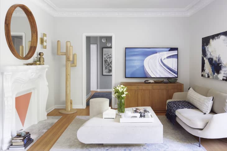
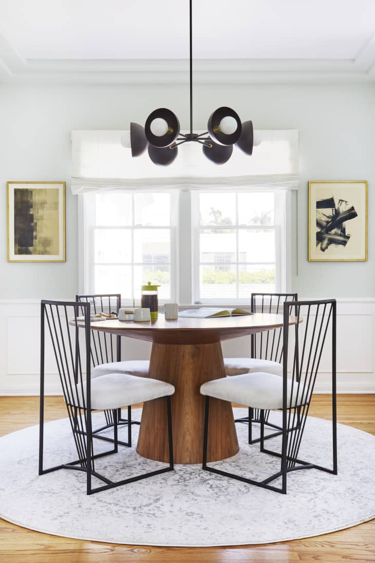
Benjamin Moore’s Chantilly Lace
“A fabulous white will never be a bad option,” says designer Crystal Sinclair. She specifically suggests the shade on the ceiling in the above photo, which she says is “bright without being too blue, gray, or yellow.”

Sherwin-Williams’s Tricorn Black
Want to go full-on drama, but classic drama? Try painting your space black! Just be sure it’s the right shade—otherwise, you risk ending up with something greenish, blueish, or charcoal-y, according to design duo Roger Hazard and Chris Stout-Hazard of Roger and Chris. They like this one.
Clare Paints’s Penthouse
Meet one of Nicole Gibbons of Clare Paints’s favorite colors. “It’s a pale greige that is a very sophisticated shade and pairs beautifully with other colors,” she says.

Sherwin-Williams’s Hinting Blue
According to Roger and Chris, a lot of blue shades can appear too saturated on living room walls, but this one is just subtle enough to look fab.
Benjamin Moore’s North Shore Green
To add a hint of color to a room, Soria loves this pale green shade. “This desaturated mint color adds a sophisticated splash and doesn’t feel too trendy,” he says. “It’s the type of color you can imagine in a historic home but also feels right for a contemporary space. And it’s unexpected, definitely something guests will comment on because it’s not something you see every day.”

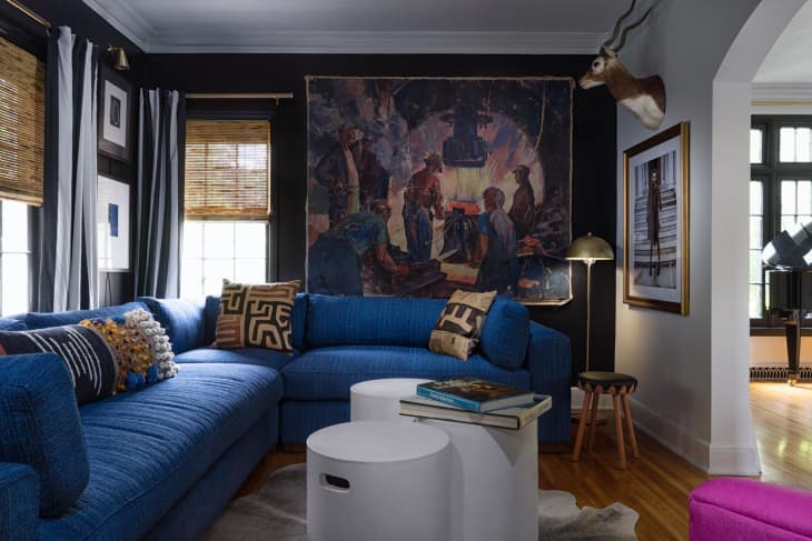
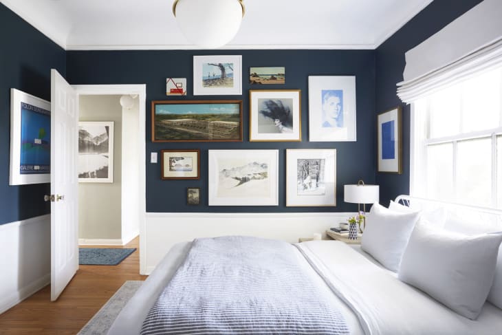
Farrow and Ball’s Stiffkey Blue
You can actually craft a “surprisingly restful space” with this rich blue shade, says Nicole Powell of We Three Design Studio. And here’s a tip: “When we use dark colors, we almost always go all-in and paint all the walls, the ceiling, and, when it works, the base and crown moulding as well,” she says.
Benjamin Moore’s New Providence Navy
Soria is all about navy, particularly this one. He says it’s “perfect because it’s got enough yellow in it to be warm, but isn’t so warm it turns into a peacock blue. It’s also not too bright—it’s desaturated enough that it feels sophisticated.”