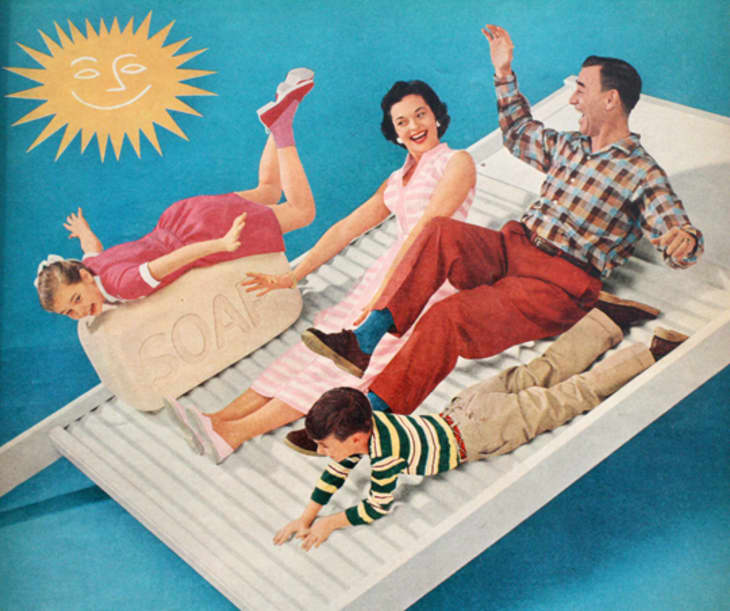
Color by Decade: The 50s

What bland optimism. Just look at all those smiling, happy white people. If there was ever a more striving crawl towards generic homogeneity, I’d like to hear about it. And if this utopia was built in the 40s and disintegrated in the 60s, then for a moment it existed — for some — in the calm center of the storm of the world, 1950s America. Let’s look at the colors used to sell this story.
Post-war America suddenly had an abundance of prosperity, plus product to buy and sell, and color was an integral component of this package. It’s Technicolor, to be sure — artificial and hopeful, and as a filter it reveals the limitations and aspirations of its time.
I think the first thing anyone thinks of regarding 1950s color is all that Mamie Eisenhower Pink — a simple calamine color, different from steely Art Deco pink, coral William Morris pink in the 1890s, or that calculated mauve of the 1980s yet to come.
And this color was everywhere — inside houses, inside magazines, inside refrigerators, and in all of that bathroom tile. When I was growing up, this was the color from the 50s that everyone was trying to get rid of in the 70s. That, and turquoise blue.
As I flip through old magazines of the era, it seems like many things Modern were pink and grey, pink and blue, blue and turquoise, and all paired with blond wood. And when I think of this, it sounds almost infantile, like a baby’s room, though at the time I’m sure it was the opposite of the Victorian era — bright colors and amoeba-shaped coffee tables to put a thumb in the eye of grandma’s brocade fabrics and heavy tufted furniture.
Blue requires red to make it American, and to our palette let’s add a tomato red. I’m thinking James Dean’s jacket in Rebel Without a Cause, or Grace Kelly’s dress in Dial M for Murder. I’m thinking also we should also add a Tangerine Orange to the mix, seedless and sunny, à la Howard Johnson’s.
These colors are more saturated and singing than those of the dutiful 40s. The first mass-produced acrylic paints arrived on the market in the 1950s, and suddenly homeowners had options and resources with which to color their new worlds, heretofore unavailable. Yet these are not quite the Op-Art colors of the psychedelic 60s, and when we think now of appropriating the palette of me-too Modernism, we seem to be taming the colors of the era, save for the odd accent of an Eames chair. I wonder if it was all too saccharine to begin with, or just simply too mass-produced…
(Images: Vintage McCall’s Magazine, circa 1950s)
