
Our Lifestyle Expert’s “Color Crush” Delivers on Romance and Drama

We’re asking some of the most stylish people we know for their 2024 Color Crush: the hue that’s lighting up their mood boards and room redos this year. For even more inspiration, use our innovative image search, powered by Sherwin-Williams: You can explore thousands of AT house tour photos to find ideas for paint colors, decor styles, and more.
Color is one of the most powerful changes you can make to a space, and one big reason is how specific it can get. Within each color family is an endless number of variations: cheerful to serene, energetic to calm, contemporary to classic. Whatever your vibe, there’s a precise shade to match.
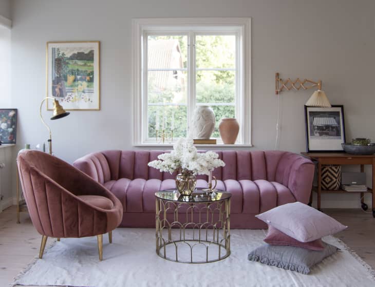
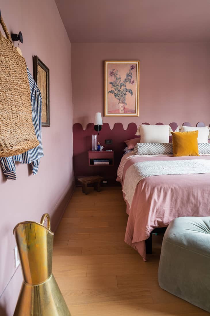
For Apartment Therapy Lifestyle Director Charli Penn, that shade is Fading Rose SW 6296 by Sherwin-Williams. The warm, sophisticated pink is her 2024 Color Crush for the elevated mood it evokes.
Why Charli Loves Fading Rose
“Fading Rose is both romantic and optimistic to me, but also super calming,” she says. “I’m still riding the pink wave of 2023, but this year, I’m all about more moody and subtle pink palettes. A color like Fading Rose can be carried into any season and really sets the tone for the serene and warm vibes I want to manifest all year long.”
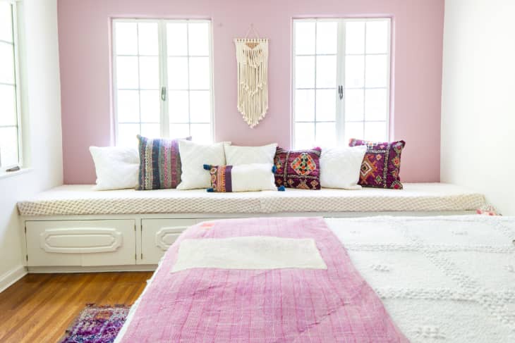
While Charli loves the sweet effect of Fading Rose in any room, there’s one in particular where she thinks it really stands out. “I love the idea of using this color in a bedroom to bring in a sweet hint of romance without the aesthetic losing its modern feel,” she says.
That modern feel helps the hue fit into any number of design styles. “As a modern glam decor enthusiast who also likes to flirt with boho glam, I love that I can use Fading Rose in either decor scheme and it will seamlessly adapt and shine.”
What Colors She Paired With It
Every color loves a complement: Charli built a whole palette around her Color Crush, combining three subtle neutrals — Ibis White SW 7000, Gorgeous White SW 6049, and White Heron SW 7627 — with the lusciously rich Merlot SW 2704.
“I wanted to bring in a gorgeous collection of creamy whites and a deeper red/purple tone,” Charli says. “With moody hotel aesthetic bedrooms popping up all over my social feeds lately, I’ve been drawn to colors that feel both modern and luxurious. I’m seeing softer pinks and purples showing up in a big way, and it’s so romantic and modern. It’s also just moody enough to feel luxe and hold its personality.”
If you’re looking for a spring-inspired color palette with a hint of romance that can work with any decor or design aesthetic, this is it — promise!
Charli Penn
Find Your Own Inspiration
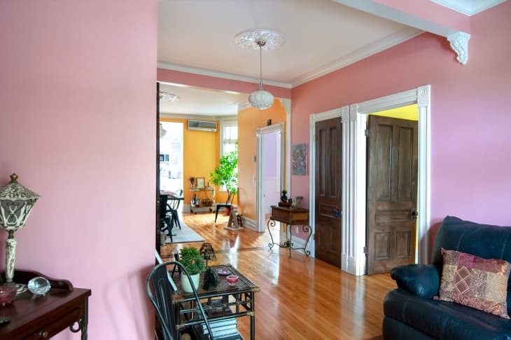
When Charli is looking for “moment-stealing statement colors,” her first stop is the Apartment Therapy photo archive. The innovative image search, powered by Sherwin-Williams, lets you browse thousands of house tour photos to find ideas for paint colors, decor styles, and more. And when something catches your eye, you can generate a customized paint palette based on the image, so you can turn that inspo into action in your own space. It works for any photo on our site — in fact, it’s exactly how we found the images in this post!
Once you have some Color Crushes of your own, Sherwin-Williams makes it easy to try before you buy. With Peel & Stick samples and FREE color chips, you can find exactly the shade (and mood) you want.
Pro tip: Put samples in different parts of your room to see how they look in different lighting throughout the day. Then comes the fun part: bringing your room to life in a whole new way.