These Are the Colors You Should Incorporate Into Your Home Right Now, According to Interior Designers
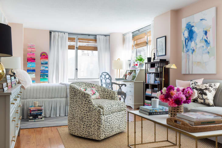
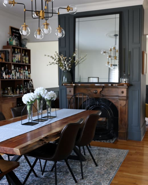
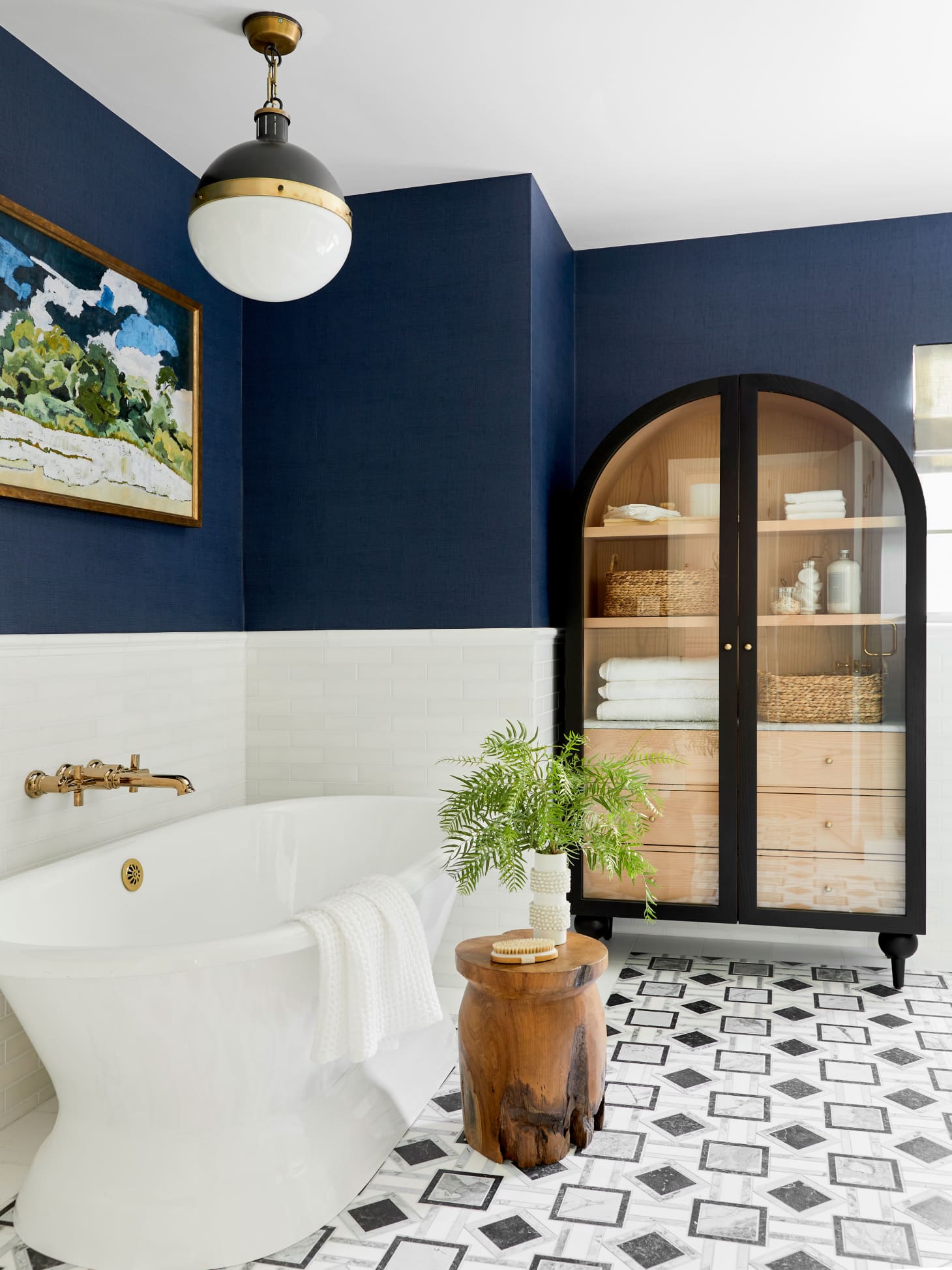
Interior designers are known for being able to work with every color under the sun, but surely they would be more than happy to play favorites when it comes to a few shades, right? That’s why I asked 12 professionals about the hues they wish clients would request more of and why these picks have the ability to add so much oomph to a space. Read on to learn more about the nine shades (or general “I love using darker colors — especially in smaller spaces or a room that doesn’t get much light. Most people are worried about darker hues because they think they will make the space feel gloomy or look even smaller. Darker hues can actually help to create a very cozy, inviting vibe in any space though.” —Designer and vintage dealer Gladys Tay in St. Paul, Minnesota “Black is a neutral color that can easily be either the focal point or the accent color in a room. I see people shy away from it because they think it’s going to be too heavy or overpowering, but I find black to be very grounding and sophisticated. It always elevates any space. It’s a great foundation, and it goes with everything. I wish more people wouldn’t be scared of it. I personally have a lot of black in my house — I’m a black-and-white lover through and through — and when my clients see my house in person, they always regret not adding more black.” —Designer Taylor Bowling, founder of Home Taylored in Charleston, South Carolina “I love incorporating bold colors into projects. Color adds visual interest and depth — think a deep blue, textured wallpaper. I wish clients would lean into bold colors more often — even just in a room or two — for contrast and warmth. I love using whites as a starting color for projects, but some rooms just need floor-to-ceiling color.” —Designer Cortney McClure, owner of Cortney McClure Design in Bartlesville, Oklahoma “Whenever I start a consultation, we discuss color and if the clients have any loves or hates when it comes to colors for a space. One of the top few colors I always get as a ‘hate’ is orange. I see it as my job to educate the client that orange doesn’t have to mean a traffic cone, and that this underused color can have so many nuanced and sophisticated shades! This client wasn’t afraid to take a risk, and we created a gorgeous bespoke sofa in a spiced velvet that brings the entire space to life. I’m always grateful when clients trust a vision and aren’t afraid to take risks!” —Designer Kate Smith, founder of Kate Smith Interiors in Fairfield, Connecticut “One of the most underrated colors is navy blue. A deep blue can be moody, powerful, and continually prove to be versatile, timeless, and chic. In low-light rooms, it creates a dramatic and romantic vibe. For sun-drenched rooms, the richness of the color creates a boldness and a sense of grounding in the space.” — Samantha Tannehill, founder of Sam Tannehill Designs in New York City, New York “I wish that more people would start to incorporate different shades of white or neutral colors, such as light grey, into their spaces. Contrary to how it might sound, this color palette is very versatile. Unless you’re going for a moody or bold look, which I think would look great in an office or lounge area, neutral and lighter colors give the main space in your home an open and airy feel while still providing a bit of warmth. Some worry that white creates a stark look, but white has come a long way, and the beauty of this color is that it comes in a wide variety of different shades.” —Designer Ria Smith, founder of Hunter Hue Interiors in West Orange, New Jersey “I wish more people asked for pink and would use it more frequently. Pink actually is a neutral, and it goes with every color and complexion. Men also shy away from pink, but pink for centuries was a masculine color and worn only by men and not women.” —Designer Travis London, founder of Studio London in Miami, Florida, and Los Angeles, California “When I think of green, I think of nature, a sense of calmness, and a moment to be present. We typically look to nature and incorporate greenery within our homes to achieve a tranquil and wholeness feeling. Why not incorporate that within your space through the color on your walls? What I love about green hues is the idea that they can also be used as a neutral or something a bit more on the calm and serene side.” — Designer Ashley Danielle Hunte, founder of Style Meets Strategy in Austin, Texas “I often find myself wishing clients were willing to expand what color combinations they’re open to. For example, a client who loves blues and purples could benefit from having a few small pops of red, orangey-tone, or even a golden yellow here and there. These don’t have to be a big punch; even something as small as a tiny bowl or the spine of a book can work (or fresh flowers in those colors or a bowl of oranges on a dining table). A contrast welt on a cushion is also a fun place to bring in an unexpected color, and I’m often surprised that people are reluctant to go bold there, as it seems like a small, easy way to bring in some punchiness and fun.” —Designer Mary Kathryn Wells, founder of Mary Kathryn Wells Interior Design in Nashville, TennesseeDark Hues

Black
Bold Shades
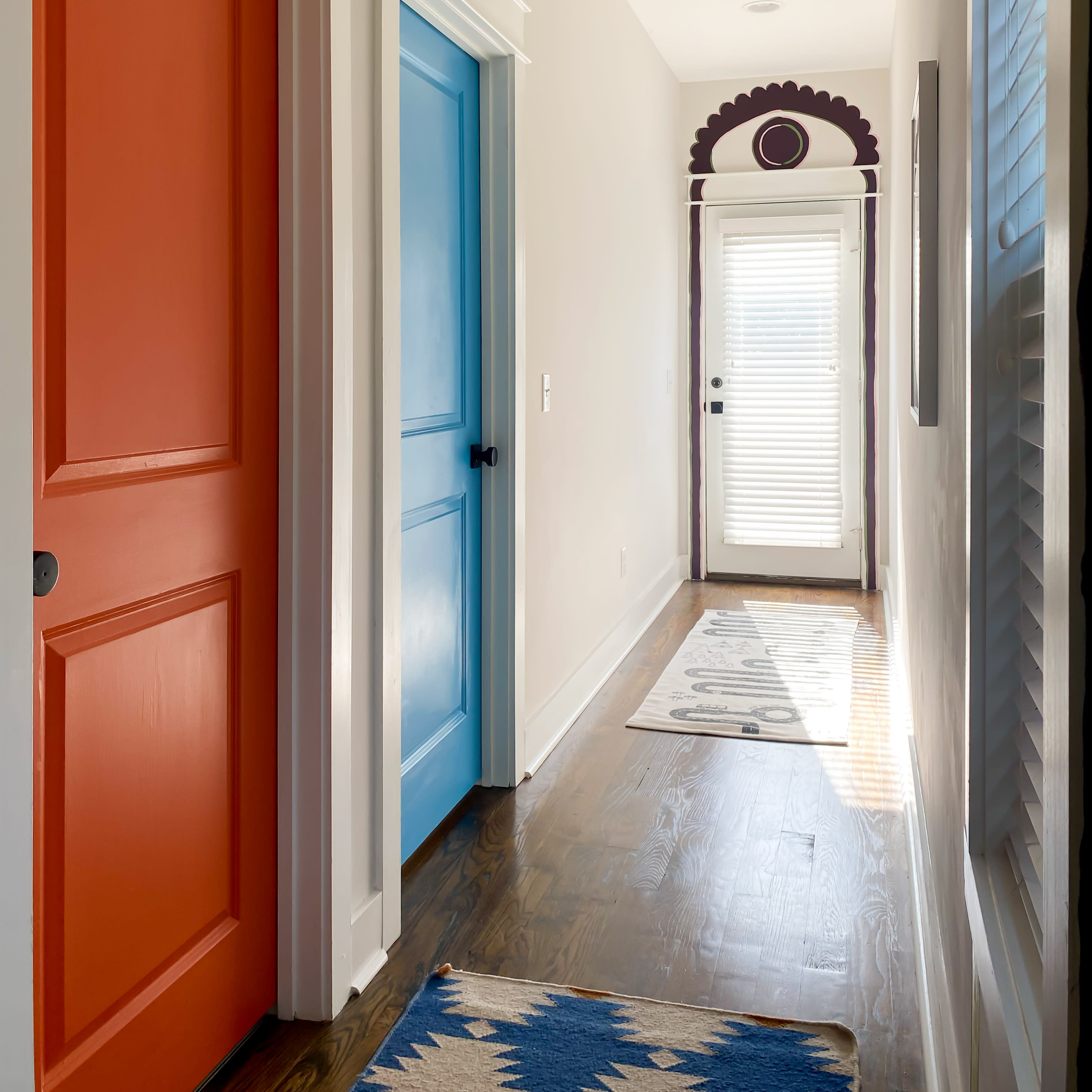
“I would like clients to consider something other than white on ceilings, interior doors, baseboards, crown molding, and window trim. It’s typical to see those elements in white, but color can modernize these architectural details and make the entire space look and feel more refreshed and updated.” —Designer Amy May, founder of Artala Designs in Seattle, Washington
“Never underestimate the ability of a vivid color to brighten your mood! In the same way we can all relate to and embrace a soft white or neutral to calm our senses, sometimes we just need an amped up sensibility from our spaces, too! Think of it this way: We love to relax at the spa (neutrality), but we all need to watch our favorite comedies sometimes, too! It’s simply another way to stimulate our spirit in a less conventional way.” —Designer Caron Woolsey, founder and principal designer at CW Interiors in The Woodlands, Texas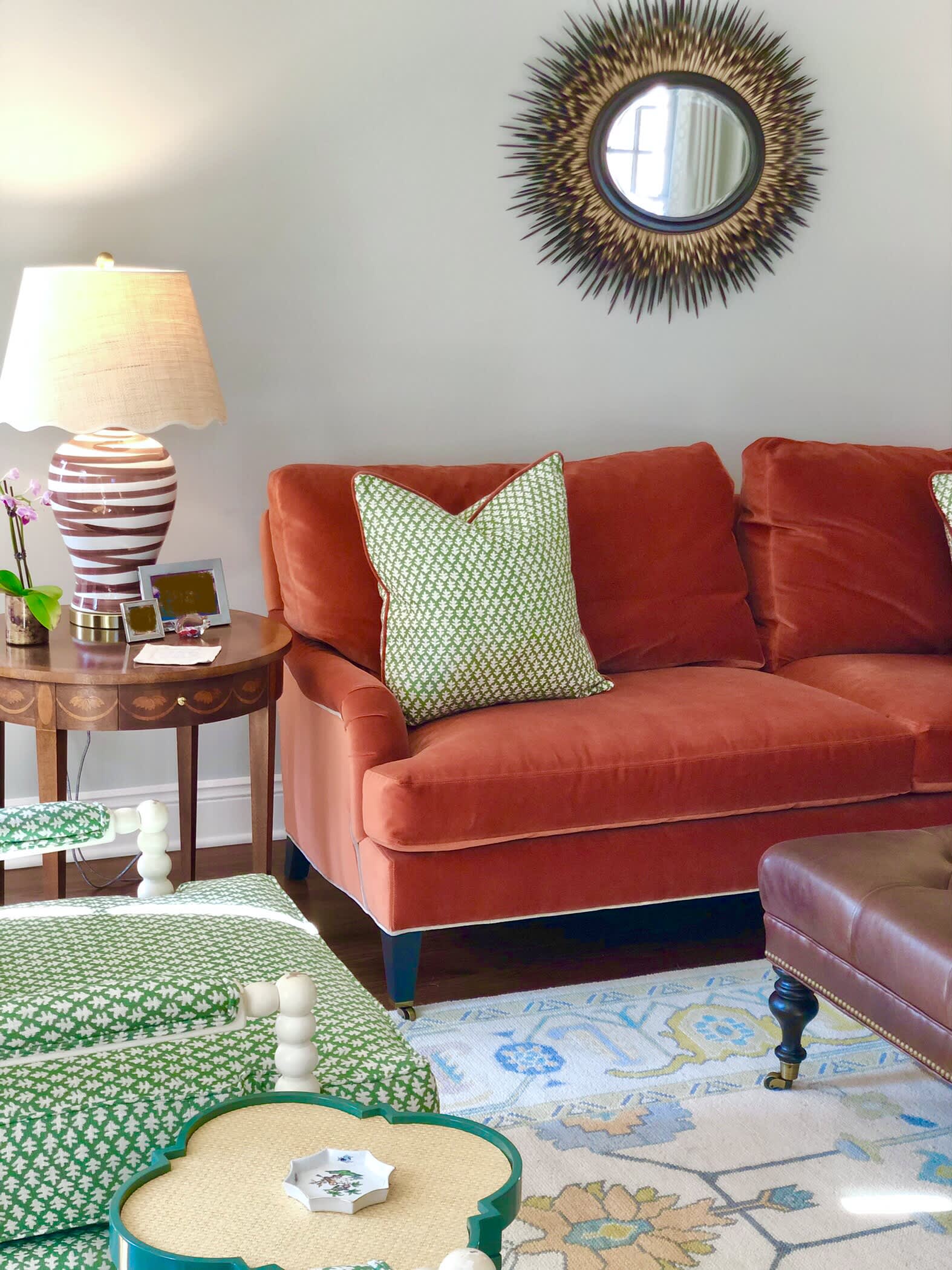
Orange
Navy Blue
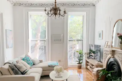
Whites and Neutrals
Pink
“There really is a shade of pink for everyone and for every application. Pink can be used so many ways in a space and is a perfect addition to a more neutral or subdued palette. I’m always bringing in a shade of pink in my designs, whether it is through pillow fabrics, paint, or soft pink flowers as a centerpiece. Every room needs at least a little hint!” —Designer Jocelyn Polce, founder of August Oliver Interiors in New Haven, ConnecticutGreen
Unexpected Color Combos
