8 Popular Colors That Are Making Your Home Look Dated, According to Designers

It’s one thing to appreciate home trends from the past, but it’s quite another for your space’s color palette to seem like it’s stuck in a time warp. Maybe architect David Mann, founder and principal of MR Architecture + Decor says it best: “Dated interiors can have their charm, but for me, certain colors and color combinations conjure definitively passé environments.” In particular, he associates pink and black with the 1950s, and coral and peach with the ‘80s. This doesn’t mean you can’t use these colors in your home at all; you just need to be careful what you style them with, if you want your spaces to feel modern. I asked Mann and a few other design pros what shades and pairings can make a home instantly appear dated, and they delivered this list of eight hues and combos. I’m going through them each here, so if you’re redecorating any time soon, you’re aware of what to watch out for in your decor.
Blue or Pink Bathrooms
Unless you truly appreciate a retro look, designers say to skip the all blue or pink bathroom. “I’m not talking about a cute pool bathroom with pops of these colors; I’m talking about the old ‘50s look, where the blue toilet matched the blue sink that matched the blue tub and the tile to go along with it,” says designer Dawn Ianno, the founder of Dawn Interiors.
Airy Pastels
These happy hues, designer Lauren Waldorf says, can make your home seem stuck in the past if you don’t use them in a modern way. “Super-airy pastels can also feel dated — I think of my grandma’s house in the ‘80s,” Waldorf says. “Today’s aesthetic, even for lighter colors, leans toward more saturation.” If you want to use pastels then, just bump up the saturation and consider drenching an entire space in that hue — walls, ceiling, trim, and even decor — for a very 2024 color application strategy.
Boring Beiges
Just say no to beige walls — that’s the mantra designer Beth Diana Smith follows for creating trend-forward interiors. “Anything in the tan and beige family for wall finishes, including paint and wallpaper, howls old and dated,” she says. Want an earthy neutral with a bit more personality and staying power? Try chocolate brown or sage green instead.
Black, White, and Red
This color combo is a little too ‘80s for designer Emily Meszkat. “Black and white palettes with a kick of red was every ‘cool’ apartment,” she says. “I remember being in my uncle’s apartment thinking it didn’t get better than black lacquer coffee tables and white sofas.” The trick here, if you still want to go with a classic black and white palette? Keep your pop of red to one or two smaller items, à la the unexpected red theory.
White Trim
In lieu of using white trim throughout the home, which designer Kim Mauney describes as “jarring and busy,” opt for more of a monochrome look. “We are matching trim and wall colors (using same color, different sheen) to make our projects feel like they envelop you,” she says.
Barbie Pink
Last summer’s peppy pink hue, which surged in popularity due to the Barbie movie, may already be considered “so last season.” As designer Kathy Corbet says, this hue “now has a dated feel.” If you have it in your home, give it some edge by introducing darker shades, like black or navy, to ground it. It’s really the pink-on pink-on-pink look that maybe feels a little stuck in 2023.
Deep Greens and Reds
These colors may seem fun but aren’t the best fit for every space, Corbet shares. “Hunter green family rooms and red dining rooms scream 1990s, and I recommend my clients avoid these hues at all costs,” she notes. The solution here? If you love these colors, just use them in different rooms.
50 Shades of Gray
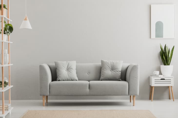
Grays were everywhere in the mid-2000s, and Meszkat says she instantly associates them with this time period. “In an effort to get away from the earth tones of the ‘90s, the world really over-corrected to blah,” she says. “I spend most of my design time trying to make these gray and white boxes more interesting and life-like!” Waldorf agrees. “Basic shades of gray feel very 2010,” she says.
Make an effort to skip one-dimensional grays and some whites in the kitchen, too; they’re “ubiquitous to the point of appearing bland and unoriginal,” according to designer Kati Curtis. “The use of gray walls and white kitchen cabinets, once hailed as modern and chic, is now increasingly viewed as passé and uninspired,” she adds. “Instead, consider incorporating more interesting colors, textures, and unique design elements that reflect your personal taste, ensuring your home remains timeless and vibrant.”
