
11 Design Clichés To Avoid When Decorating, According to Designers

Let’s face it: As played out as some interior design trends may be, avoiding them can be tricky when decorating your home. While some rules of thumb are worth paying attention to when outfitting a space, others are simply begging to be broken. So I asked eleven interior designers which old fashioned decor clichés they suggest staying away from and how to change it up in your space instead. Each of their suggestions is paired with a project where they turned a design convention on its head, and the resulting room was all the better for it.
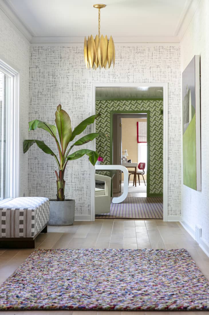
1. Perfectly paired wallpapers
While some might say using different patterned wall coverings in adjoining rooms is a no-no, designer Amanda Reynal urges you to reconsider the notion of coordinating your wallpaper to a T. “Different textures and patterns can be used on walls in a variety of ways to balance out scale and color between spaces,” she explains. “Look for unifying elements in your flooring, architecture, or color palettes when using different wallpapers.”
2. Matching furniture sets
If you tend to buy complete sets of coordinating furniture when outfitting a room in your home, designers Tavia Forbes and Monet Masters of Forbes + Masters say you’re missing an opportunity to mix it up. “Don’t go buy an entire matching bedroom or living room set,” Masters says. “Instead, we recommend picking one or two elements from the set and adding pieces that complement the aesthetic while playing with different textures to create interest and depth in the space.”
If you have a set, don’t worry. Try breaking up the pieces and relocating one or more to different rooms. You may be surprised at how much richer your spaces will look when there’s more finishes and silhouettes at play.
3. Light paint in small rooms
If you’re scared to paint a room a dark color because it might make the space seem smaller, designer Lori Paranjape of Mrs. Paranjape says this thought has become a design cliché worth ignoring. “I often hear people express fear over painting an entire room in a deep color, but dark spaces can create a sexy appeal that’s hard to achieve in bright, white spaces,” she explains. “Not only do dark rooms feel edgy, they allow your decor to make a statement against the moody backdrop.”
The bottom line: If you don’t want just a white walled room, don’t be afraid to go for the bold, even if your space is short on square footage. Embrace that coziness that darker shades can create.
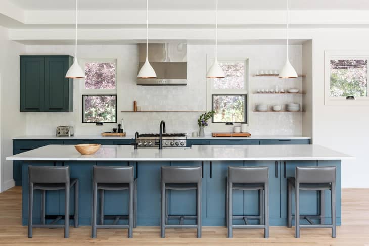
4. Too many primary colors
When you have a dark or super neutral space on your hands, it might be tempting to think that primary-colored decor items are all you need to brighten it up. Designer Allison Petty of Hyphen & Co., however, says too many brights can create an eyesore. “Don’t overuse primary colors, especially all of them at once,” she says. “Do work them in subtly and use them as a way to help accent a more neutral space in a more modern way. Primary colors can sometimes create a jarring color palette when used in excess.”
If you like red, yellow, and blue together, there’s no need to ditch this combo entirely. It’s all in how you use them, and there are subtle shades in each of these color families that can feel calm and soothing, as well.
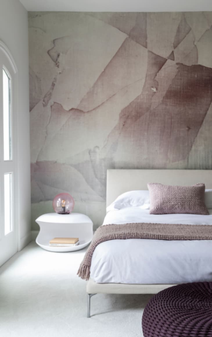
5. Painted accent walls
If you thought only way to freshen up an accent wall was with a fresh coat of paint, then designer Nina Magon of Contour Interior Design says you’d be mistaken. “Instead of using paint to create an accent wall to add interest to your space, why not apply a chic wallpaper that will add a bit more visual interest and excitement?,” she says. “It can also be a nice focal point over a bed to add depth and texture to your wall.”
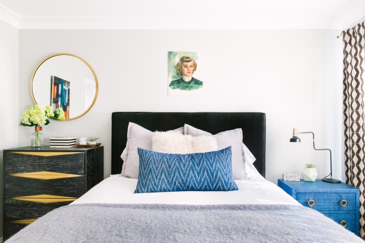
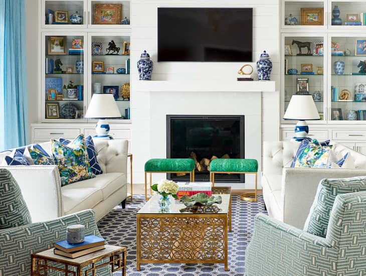
6. Identical nightstands
Why invest in a pair of matching nightstands when you make a bedside statement with two different ones? “It feels so much more inspired and interesting when pieces are complementary versus perfectly coordinating,” explains designer Caitlin Murray of Black Lacquer Design. “You can even take this a step further and switch up pieces that typically come in pairs like nightstands.”
Try pairing a traditional bedside table with a chair or a stool for a little bit of extra flair. You can even style two different sized and colored pieces together as well, just like Murray did in the bedroom above. Even though they’re a radically different scale and design, the two nightstands both relate to colors in the artwork and textiles throughout the bedroom, so this design move feels deliberate and cohesive.
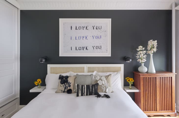
7. All-white bedding
For as crisp and clean-looking as all-white bedding can be, designer Lauren Wills of Wills Design Associates says that it can also be, well, somewhat boring in a bedroom (unless you mix it up otherwise, as Murray did above). “I love a bed drenched in crisp white linens, but I love a bed boasting that eclectic, mismatched look even more,” she says. “Reference other colors found in your bedroom to create a sense of consistency and be sure you don’t mix together so many styles that things begin to feel chaotic.”
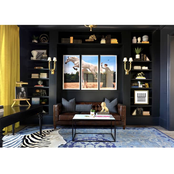
8. Light-colored ceilings
The belief that ceilings should be painted either white or cream is causing you to miss out on some amazing transformations, according to designer Carneil Griffin of Griffin Direction Interiors. “Ceilings are called the fifth wall for a reason,” he says. “Paint your ceiling a hue that’s complementary to a room’s color palette to create continuation or go for a bold hue that draws the eye up and turns your ceiling into the focal point of the room.”
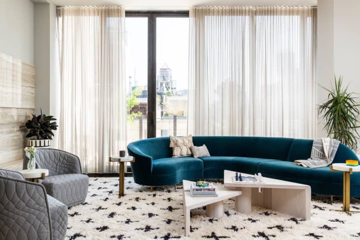
9. Match-y metals
Whoever says you can’t mix metals in a room obviously never checked with designer Allison Frederick of Abby Hetherington Interiors. “I say nonsense—mix it up,” she says. “The key here is to actually go bolder with your selections. Selecting strong different hues, such as copper and stainless steel, allow for the accent color to really pop. Mixing metals that are too close in color can make your selection feel like a mistake.”
10. Overly coordinated decor
If you prefer to outfit entire rooms in furnishings from the same collection or the same store, designer Liles Dunnigan of The Warehouse Interiors urges you to reconsider. “Good design should feel unique and specifically catered to you and your lifestyle—it shouldn’t feel like you’re walking into a showroom or a catalog,” she explains. “It is much more interesting to mix materials and styles to create an interesting and balanced interior.”
11. Pricey items all the time
If you’re splurging on nothing but pricey furniture and accessories for you home, designer Anna Kroesser, Kroesser + Strat Design says it’s not worth it. “In almost every single one of our projects, we’ve brought in a mix of high and low, and honestly, you can’t tell the difference,” she says. “Put your budget towards the pieces you intend to have for a long time, like a sofa, sectional, or dining table. Items like rugs, coffee tables, side tables, and lighting are all available at budget-friendly retailers and are still super well designed.”