
Design School Case Study: Sample Room Layouts for Ashley’s Living Room
So the comments around Ashley’s makeover were… spirited, to say the least. A lot of you all had things to say about the floorplan, and this is your shot at diving into the options in more depth. When the furniture arrived, we re-arranged things a few times to see what might work, fiddling until I felt we had the best possible option…
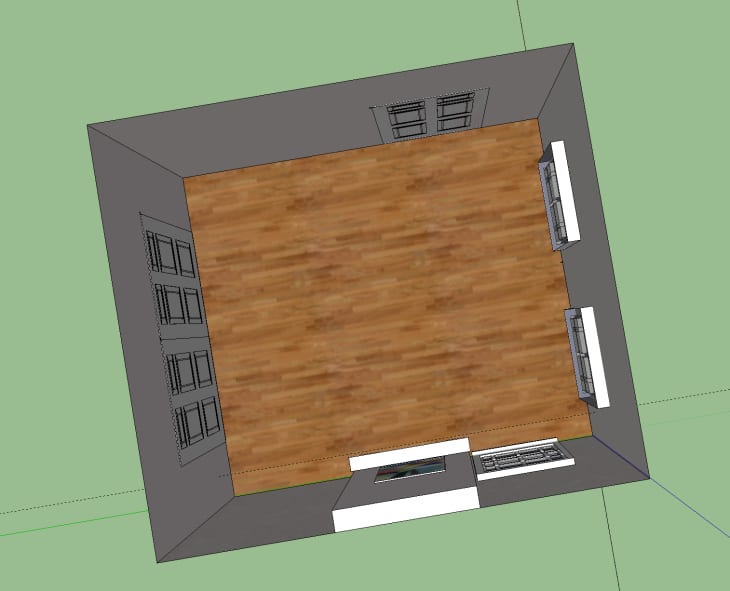
As a refresher, here’s Ashley’s living room as a 3D model. The room is about 13′ x 15′ with a mantel on one of the longer walls. Large double pocket doors lead to another living room. A single traditional door heads out to the foyer and front entryway to the house. The two tall windows face the street outside.
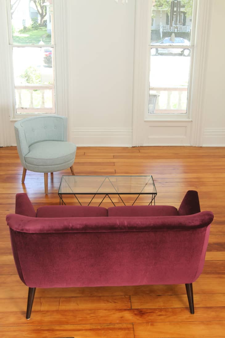
This is looking into the room through the pocket doors (which are often open). Having the sofa with its back to the main entryway feels awkward. Feng Shui folks would say something about that blocking energy, but to me, it just feels not very welcoming. Plus, the sofa back isn’t the prettiest thing going, so it’s not the first thing you want to see (or want others to see) when walking into the room.
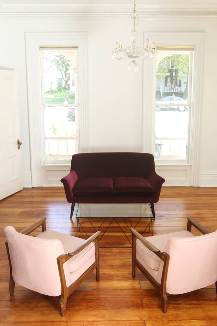
Mirroring furniture on either side of an imaginary axis (whether that’s a fireplace or a sofa) is a nice ways to make your eyeballs happy. It feels nice, and is always an easy approach to laying out your furniture, even when furniture doesn’t perfectly match. The sameness of these two pink chairs, along with their side-by-side placement, is nice, but they still block the entrance to the room from the sliding pocket doors. There’s also something about two matching chairs that makes a room feel more formal, which we didn’t necessarily want for this space.
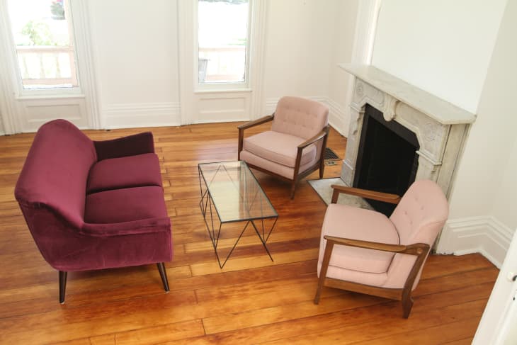
Here’s the furniture rotated to face the fireplace. Even though that’s a potential focal point for the room, the layout doesn’t do this space any favors. Not only does the right hand side of the room look heavy given the two chairs and the fireplace, but you can feel the flow of the room stopping, instead of moving about freely, on the right hand side of the room.
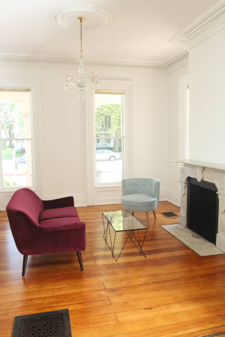
This arrangement feels a little bit better and has more room to breathe. But there is another traditional doorway right behind the sofa, so the first thing you see when entering the room is the back of the loveseat. Again.
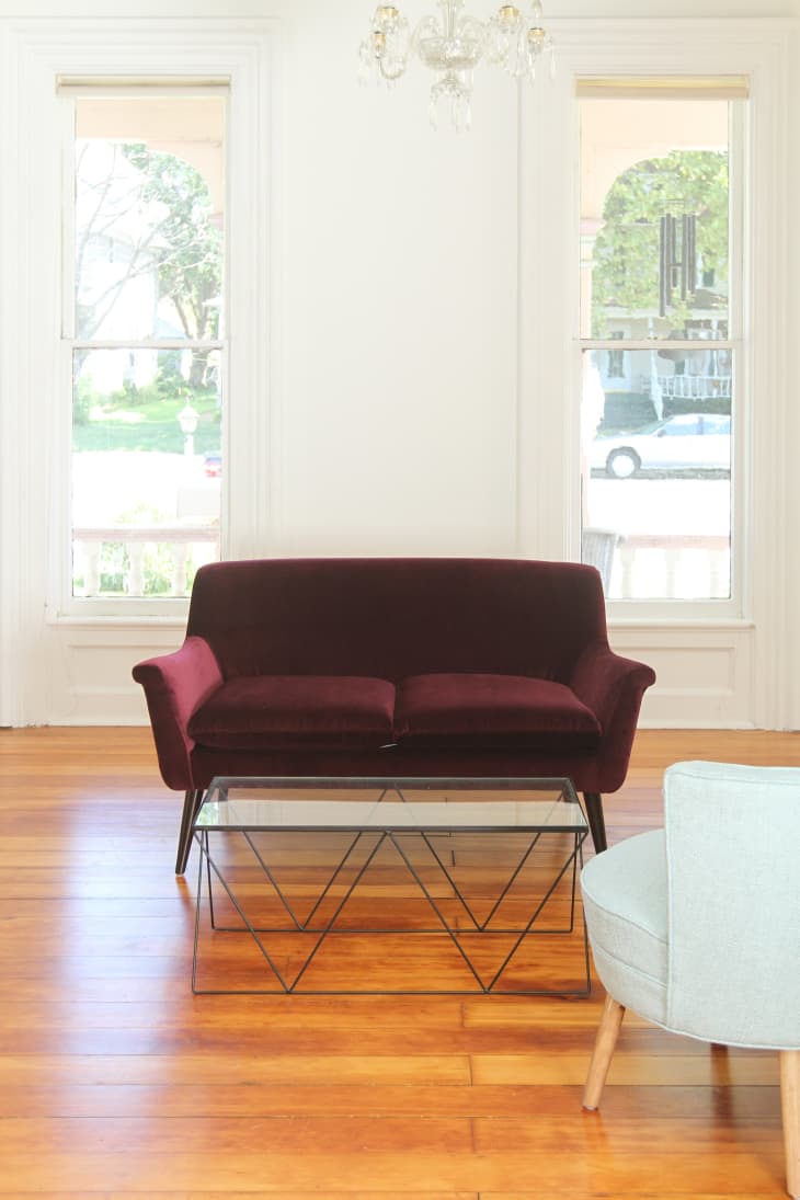
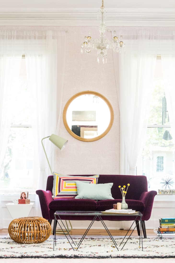
And here’s what we eventually decided upon. The sofa winds up nicely framed by those two enormous beautiful windows, which you can see through the pocket doors from the next room. There’s one chair with its back to room opening, but it’s tucked away a little to the side so it doesn’t block your entry.
MAKEOVER RESOURCES:
- Murphy Loveseat Sofa in Burgundy Vance from Room & Board
- Andanza Wallpaper in Blush from Hygge & West
- Mick Mint Floor Lamp from Crate & Barrel
- Coffee Table from Urban Outfitters
- Aqua Upholstered Chair from Home Goods
- Collage by St. Louis Artist Alicia LaChance
- STABEKK mirror from IKEA
- Wood Branch Side Table from Home Goods
- Pink Savafieh Rug from Wayfair
- Taza Wool Shag Rug from West Elm
- White Sunpan Modern Rocco End Table from Wayfair
- Acrylic Side Table from Wayfair
- Beckett 5-High Shelf from Crate & Barrel
- Adesso Nelson Arm Floor Lamp from Wayfair
- Noir Bar Cart from Crate & Barrel
- White BLOMSTER Candlesticks from IKEA
- Wooden Accessories from Collin Garrity