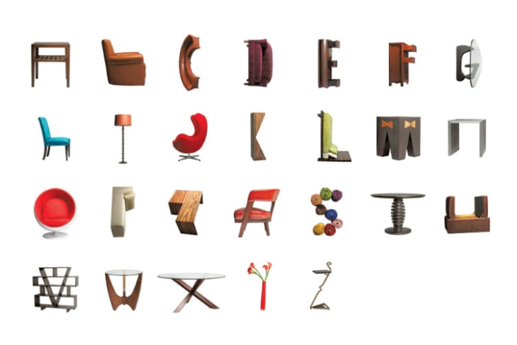
What’s Your Type? Fonts and their Furniture Doppelgangers

It started, as things so often do, with a Comic Sans joke. From there, our team Slack chat was abuzz with fonts and furniture (and decor) comparisons. Below are a few highly scientific, internationally renowned design (graphic): design (furniture) analogies from the creative minds of Apartment Therapy Editorial.
Poor, poor Comic Sans. It just can’t catch a break! It has become the internet’s favorite whipping boy, shorthand for outdated taste and mom vibes. It’s a remnant of those early AOL days where you sent messages in bright, vivid colors from an email address that looked something like SportySpice4Eva. The inflatable couch is a remnant from that same technicolor, Limited Too-heavy time. Similarly bulbous and ridiculous, both inflatable couches and Comic Sans emit a desperate scream of HEY GUYS I’M FUN.
Ok, so we know that the mason jar isn’t furniture, but its used so often in decor these days that we thought it was worthy of an inclusion.Much like the beloved Ball mason jar, Helvetica has suffered from hipster oversaturation. Sleek and multipurpose, both the font and the jar can be used to make a statement when combined with showier pieces, or used on their own to let folks know that you’re laid back and like to let your work/cocktail/wedding speak for itself.
Both Papyrus and wicker chairs provide a funky, attention-grabbing kitsch. The major difference is that with the right styling, a wicker chair can look fantastic and earth mother-y, while Papyrus remains firmly planted not only in the land of kitsch, but on the wrong side of the tracks.
I must clarify at the top that a wood beaded curtain would tag along with team Papyrus, while a plastic beaded curtain is 100-percent Hobo. Popular as a movie poster font in the late ’60s and early ’70s, it gives off a hippie counter culture vibe but doesn’t commit as hard as Mojo.
Clean, classic and evocative, both the font and the chair have seen a resurgence in popularity in the past decade. Not only for MCM style aficionados, both the chair and the font have popped up in some surprising places, aka the Pittsburgh Steelers uniforms (the font, not the chair). Can’t you just picture a sharply dressed ad man of today or yesteryear, signing off on a sleek, Futura-featuring advertisement from the seat of an Eames chair, reaching design/design nirvana.
But one great question remains: What home design element is the counterpart to our beloved Windings font?
