Before and After: A Tiny 1945 Galley Kitchen Gets a Luxe-Looking, Space-Maximizing Redo

Apartment Therapy has showcased some incredibly practical small kitchens, where renters and homeowners alike have made tiny footprints work for cooking and dining. But if you own your space and have the budget for a renovation, sometimes taking out a wall in a closed-off kitchen is the best solution.
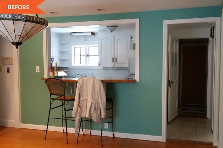
In Christina Orleans’ home, losing the wall and pass-through on the left-hand side of the space made the narrow kitchen feel much larger. “The kitchen before was so cramped and frustrating,” Christina (@meyne_co) explains. The 6-foot-wide layout “with very little counter space and very old, inefficient cabinets” was original to the 1945 home.
Christina and her husband wanted to be able to cook together in the space, and they wanted to update its dated appearance, which, as she puts it, “had been covered in layer after layer of flooring, wallpaper, paneling, and even faux brick.”
There are several big changes make the space feel more open and contemporary. First up: the aforementioned elimination of the partition between the kitchen and living rooms. “We planned on gutting it from the very beginning because it was way too small to use and function efficiently in,” Christina says of the kitchen layout. Now, there’s room for island seating, and there’s storage underneath the island, too.
Second is the cabinetry. Christina and her husband swapped the bulky white overheads for open shelving, which “makes the space feel even that much bigger,” Christina says. The lower cabinets — and their origin story — are one of her favorite parts of the redo.
Christina and her husband were originally planning on using IKEA cabinetry, but after the kitchen sat for about a year due to cabinet delays, they had to pivot. That’s when they happened upon former showroom cabinets at a Habitat for Humanity ReStore that would fit perfectly with their design.
“They were never actually used, but it also meant that they had all the upgrades like olive wood drawers, amazing slide-out cubbies and baskets, built-in spice racks, tiny bonus cupboards on the ends for small items, and more,” she recounts on her website. (Christina and her husband purchased sleek pulls with a brass accent to pair with the gray cabinetry for a more modern and luxe look than the bulky black pulls and hinges from before.)
But the best part of the discount cabinetry is that they actually used it to create the new kitchen island as well. “Space was really limited, but we needed more storage,” Christina explains on her website. The cabinets worked well because they are only 15 inches deep — not as bulky as a traditional island. Christina’s husband built a base for the cabinets, and then they added an IKEA countertop slab, which overhung just enough for three counter-height stools.
“The island is used even more than the dining table now,” Christina says.
For even more storage, Christina and her husband created a butler’s pantry just off the kitchen. “I always wanted a butler’s pantry,” Christina says on her website. “It was also a great place to store dry goods, which is always the one thing missing when you go with open shelves for uppers in the kitchen.”
The cosmetic changes, like the black and white peel-and-stick tile floors, the new sink, the new appliances (which Christina says are the biggest splurges in the space), and the new light fixture above the window, make a big — not to mention bright — difference, too.
In all, the pair spent about $15,000 on the redo, including appliances, and the difference is major. They love their larger, more functional, more luxe-looking kitchen.
“We love how open it is and that we can fit not only the two of us in there but even more when friends come over,” Christina says.
Inspired? Submit your own project here.
