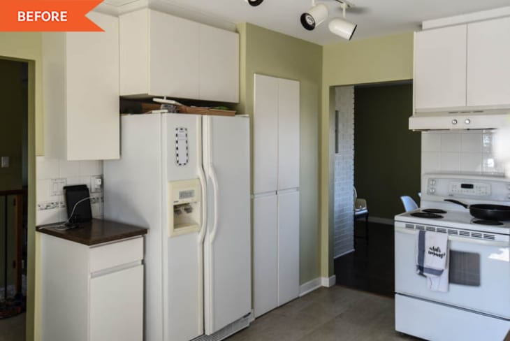
Before and After: Flipping the Layout of This ’90s Kitchen Made It Way More Spacious

Large windows that let in lots of natural light are a gift in any home or apartment, but that gift is rendered almost useless if the windows are blocked by trees or hedges on the outside or walls or half-walls on the inside that disrupt the flow of light.
Homeowner Colleen Pastoor, who runs the blog Lemon Thistle, had two great bay windows on opposite ends of her home in the kitchen and dining room spaces, but the problem was, a half-wall in the “before” kitchen was blocking the flow of light.
“When we were house hunting, this house had everything we wanted except that the kitchen wasn’t open,” Colleen explains. She and her husband, Shane, bought their 1990s house with plans to give it a more open-concept feel more on-trend for the 2020s.
To execute their vision, they decided to take out the wall between the kitchen and dining room and then swap the spaces so that the dining room moved to the front of the house with the kitchen located in back. “This made for a much bigger kitchen and opened it up to the living room,” Colleen says.
On her blog, she elaborates: “Moving the kitchen also let us gain back the wasted space that was at the end of the kitchen. (We are assuming it was meant to be a breakfast nook!). This made for a dining room the same good size as before, plus a giant (for us) kitchen. It’s night and day from what we started from.”
One of Colleen’s favorite parts of the layout switch-up? Now her view while she does dishes faces her backyard view of rivers and mountains. “I am most proud of making the bay window work in the design,” she says. “I had to go to several cabinet makers before I found someone that was able to make it work.”
Colleen says changing the layout, which was Shane’s idea, was the trickiest part of the redo, but it definitely paid off. The cosmetic upgrades, on the other hand, were easy and fun to pick out. That process came with very few hiccups except for removing the old tile floors, which had many layers of previous flooring.
Colleen and Shane chose green paint (General Paint’s Dakota) for the cabinetry, white paint for the walls and trim (General Paint’s Expert White), a white subway tile backsplash, quartz countertops, new stainless steel appliances, and light wood floors and open shelving. “I love the green cabinets with light wood details,” Colleen says. In a previous home, they’d chosen white cabinetry, and she’s glad they went with something a little more colorful this time around.
Their new light fixtures in the kitchen and dining room are from Wayfair, as are their leather barstools. There are a couple DIYs to note in the space, too.
Colleen created “custom” bamboo shades herself by cutting large woven panel curtains, folding and sewing them, and attaching them to the window frame with a brad nailer. “I priced out woven wood shades/bamboo blinds from every supplier ever, I’m pretty sure, but just couldn’t bite the bullet and pay the hefty sum for these four windows,” Colleen says on her blog. “This is the perfect solution for these windows. I get the look I LOVE for a pricetag that’s beyond reasonable.” About $40 of material covered all four windows in the space.
She also created the framed tapestry artwork above her espresso machine herself — including dyeing the fabric to create the pattern.
In all, Colleen loves how all the details in the kitchen came together, and she loves that they didn’t play it safe when it came to cabinet color. “I’m so happy we chose something we truly love,” she says.
Inspired? Submit your own project here.
