
How I Took My Stained 1970s Kitchen from Bland to Breathtaking (on a Budget!)
I got a great deal on this 1970s Boise, Idaho, ranch house back in 2021. The plan was to live there for a few years while fixing it up to eventually rent as a furnished, midterm rental (30 days to six-month contracts, usually to travel nurses, or other professionals). My husband and I removed all of the staples of the era — ripped out shag carpets, scraped off popcorn ceilings, and scrubbed cigarette smoke stains off the walls. We saved the kitchen for last because it was the most daunting, but now it’s the focal point of the home.

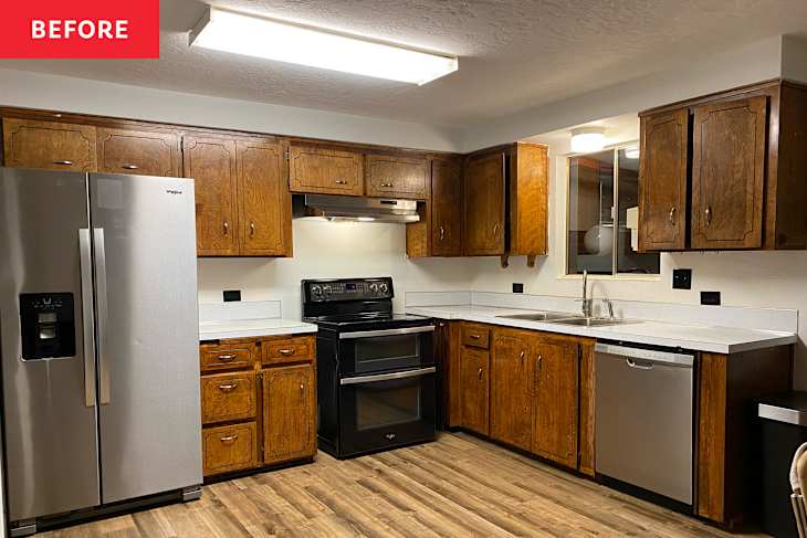
The kitchen was a mess. It was closed off with a half wall, had yellow stains on the cabinets from 30+ years of indoor cigarette smoking, and was a popular spot for mice to visit. The previous owners chose to put a 7-Eleven-esque fluorescent light on the ceiling, and pasted a floral wallpaper as a border between the ceiling and wall. It looked bad, and it smelled even worse.

When planning this kitchen remodel, we focused on lighting, opening up the space, functionality, and creating a vibe. Since we turned the house into a furnished rental, we also focused on adding high-quality kitchen gadgets and appliances that would make the place feel like home. These were the six additions that made the biggest differences in our kitchen remodel.

1. Opening up the space
The kitchen was originally closed off and stuffy because it was separated from the living room with a half wall. The first thing my husband did was rip out that wall to open up the space. The cost to do this? Zero dollars. The original door to the kitchen was a standard rectangle, but we bought arching kits to round out the main kitchen doorway, and the new opening that was created when we removed the half wall. The arches made the kitchen feel more open and gave it a vintage, mid-century modern look. The arch kits were $50 a piece, and the labor was free, since we did it ourselves.

2. A lot of lighting options
The giant fluorescent light on the ceiling was horrendous. It hurt your eyes to have it on, and it made that awful, office building buzzing sound. We couldn’t wait to tear it out. We replaced that one horrible light with a ton of options for different scenarios and vibes — we went with two globe lights above our recently installed island, a matching globe light for above the sink, and a long low light hanging above the kitchen table. We added under-cabinet lights for a low-lighting option during early mornings and late nights, and sconce lights next to our vintage artwork (which we scored at an antique mall in Salt Lake City) on the wall.

3. Moody colors
We’re big fans of moody colors, as you can see from the way we designed our Airbnb. We chose the lower cabinets as our focal point for a pop of color. Our cabinets were, by far, the most expensive part of our kitchen remodel, costing $4,000 for upper and lower: the Hampton Bay Designer Series from The Home Depot. The top cabinets were bought in white, while the bottom cabinets were a deep green.
We measured and ordered the cabinets ourselves, which took a lot of time (and some trial and error), but saved us money since our contractor only had to install them. The black accents of the sink hardware, cabinet pulls, and stove hood vent kept the moody vibe subtle against a white tile backsplash.

4. Texture
A little bit of texture went a long way in this kitchen. We bought a fluted wood panel to fix to the kitchen island to give a textured, classy look. It was easy to color match the paint of our lower cabinets, and we used a small paint sprayer for easy paint application. The countertops are “leathered,” which means that they’re finished with a texture that resembles leather.

5. Vintage-inspired touches
I love a little bit of vintage. We went for mid-century modern kitchen chairs with rattan back panels and an art deco look for the table. We’re big fans of antiquing, so when we sourced this print of Vladimir Tretchikoff’s “The Green Lady,” we knew it would be perfect for the kitchen dining area.

6. High-quality kitchen items
I always envisioned this home as a furnished rental, so it was important for me to stock the kitchen with high-quality items. I wanted renters to be able to cook any meal they wanted, entertain guests, and feel like we put care into the kitchen setup. We went with mostly Viking brand pots and pans, a Cutluxe knife set, Melitta automatic coffee maker, and teak cooking utensils.
Designing and building out this modern kitchen was a fun project that transformed the look of our entire home. The best part was knocking down the half wall and opening the kitchen up. When we let prospective tenants tour the house, the kitchen is what stood out most to them, which is no surprise to me.
This post originally appeared on The Kitchn. See it there: Before & After: This 1970s “Mess” of a Kitchen Got a Stunning, Moody Upgrade