See How a Home Stager Toned Down a Bold Home Without Losing Its Personality
Homeowners and renters should always feel good about personalizing their spaces to reflect their tastes, lifestyles, and interests. But when it comes time to put a home on the market, bold, eccentric design could be a turn-off for potential buyers — and distract from the home’s inherent strengths.
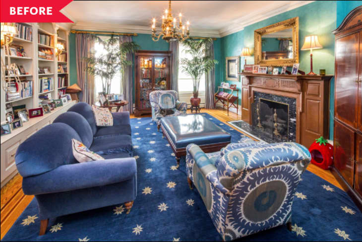
That’s where a professional stager comes in. Andy Stewart, founder and chief creative stylist of Red Cap Productions Inc., a home staging company in New York City, recently took on a historic six-story residence on the Upper West Side that was quite over the top: turquoise, purple, and blue walls; intricate woodwork from floor to ceiling; and a large, eclectic mix of accents.
Overall, the home had a maximalist vibe, which Stewart sought to minimize. “Clearly, it’s a very large beautiful house, but the furnishings were overwhelming and too distracting,” he says. “Finer details in the home’s construction were being swallowed up and not highlighted.”
However, it would’ve been too costly to paint and renovate the 8,820-square-foot home. “Staging the entire property full tilt would also not be cost-effective,” Stewart says. So he had to rely solely on cosmetic changes to make the home appealing to your average buyer.
The team focused on the bedrooms, parlor, formal dining room, living room, and bathrooms. “But we don’t leave anything untouched,” he notes. “Red Cap doesn’t do rental furniture, so by spending wisely with the agreed-upon budget, we also included entertainment [areas] on the two outdoor spaces, created a game room, a gym, and little touches here and there without any additional cost to the seller.”
The aforementioned living room needed considerable toning down. Stewart loved the turquoise Venetian plaster walls and wanted to keep them as an integral part of the design. “Like all the rooms in the home, it was huge,” he says. “By standardizing a sense of space with similar rugs throughout, I could ‘train’ guests in how to gauge proportions. By using sizable, intentional furniture, I gave guests an instant sense of what the room is about and how it works.”
Furniture choices were consistent with other parts of the home but left a lot for the imagination, he notes. The majority of the existing pieces had to go. “Most were too dark, too big, too much of an eyesore,” Stewart says. “So, now we’re left with pretty much a blank slate and need to start from scratch.”
The team had to decide how to fill that blank slate. “How do we make the room as big as possible? Do we fill it back up, or do we leave it sparse? What do we need to start telling this story? How do we ‘spread the wealth’ around the entire giant home? Since we couldn’t go too intense anywhere without dropping an exceptional amount of money, we had to keep this presentation in line with other rooms. The choice was made to do a bit of a bare-bones approach but always make it happy and appealing.”
A smaller sofa and a matching accent chair, both in pale blue, fit the space better, size-wise, and make the room look larger. (“I don’t usually go matchy-matchy on furniture, but I needed to seriously streamline here,” he notes.) A clear, minimal coffee table allows for uninterrupted sightlines to the back wall, and a smaller cool-gray area rug under the seating helps ground the room. Both the table and rug contribute to the illusion of more space. Previous accents that only crowded the room, such as two potted plants, some wall art, and window treatments, were removed to declutter the space and put the focus on the room’s strongest elements.
The wall with built-in bookcases was previously chock full of books, family photos, and other knickknacks, creating a cluttered look. Stewart pared down the items inside, and a few tweaks to the drawer pulls helped polish off that major focal point.
“So, now that we have basics mapped out, how do we really start breathing life back in? More color,” Stewart explains. The new items in the bookcase reflect the walls, bookcase, and hardware, tying everything together. Even the coffee table has a green hue. “That wasn’t by mistake,” he says. “We further pumped up the volume with the electric pink and orange accents. They really pop with the plaster color.”
He notes that the accents in the bookcase, on the coffee table, and even the orchid’s vessel are mostly modern takes on traditional themes, bridging the old style and the new. “That was also by choice to be a juxtaposition to what could have seemed antiquated,” Stewart says. “We needed to gain a wider appeal overall.”

