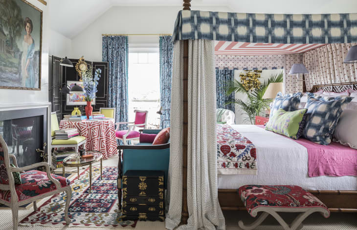
Why It Works: A Pattern-Packed “More is More” Bedroom

As the bedroom is a place in which you want to be lulled to sleep, its design is typically tackled in ways that could be described as “soothing” and “serene”. Soft colors and delicate patterns are the norm for a “sophisticated” retreat. But what if you want something with more pizazz? A room that’ll get you excited about the day the second you peel your eyes open? Well, follow along as we outline how to get a room full of personality without things getting crazy.
This room, fashioned for the 2017 Hampton Designer Showhouse by designer and tastemaker Eddie Ross (Style Director at The Mine), is the perfect example of an invigorating design plan for a more-is-more master bedroom. Though there is certainly a lot going on here, it still manages to feel cohesive, elegant and very pulled together.
How’d he do it? Well, we could outline it for you (a tight color palette and furniture style plan, a mix of large-scale and small-scale patterns, etc.), but we’ll let Eddie take the wheel here to share his expertise.
AT: How on earth were you able to pair so many different prints but still make everything feel super cohesive?
ER: Coordinating prints isn’t as hard as you might think. One way to do it is to start off the room with a great multi-color print you love and build from there. Another way is to pick a palette and use multiple smaller-scale prints on the biggest statement in the room. Here, it’s the dreamy canopy bed from The Mine decorated with bed hangings that upholsterer Grant Trick (genius!) custom-made using geometric prints in blue, white and coral-y pink. From there, I mixed in lighter and darker tones and prints in different scales. If you really want to go for it with color and pattern like I did, stick to neutral walls and floors. They give the eye rest, creating a canvas for every brush stroke you make.
AT: What was your inspiration for this room?
ER: This is a house for Traditional Home, so I wanted to create a room with a fresh, vibrant take on classic decorating in the Hamptons. You’ll see plenty of blue and white, of course, but to mix things up, I added tons of pink, periwinkle, fuchsia, chartreuse and red! Just because it’s a bedroom doesn’t mean it has to put you to sleep.
AT: How does someone who wants to create a similar look in their own home make sure they don’t end up with a big ol’ mess?
ER: But I love a mess! And the hotter, the better. It’s that more-is-more, less-is-a-bore approach to decorating (and living!) that ironically—it’s twisted, really—makes me feel calm. Whenever I do a room, I surround myself with all the colors, prints, books, pillows and accents that make me smile. My advice: Buy only what you love and a room will always feel right.
Repetition is power. It can give even the most peculiar element in a room purpose. — Eddie Ross
AT: How would you describe this room in just a few words?
ER: Fresh, energetic and playful.
AT: In your opinion, why does this room “work”?
ER: Repetition is power. It can give even the most peculiar element in a room purpose. So when you’re layering colors and prints, always picture them in a finished room. That splash of chartreuse on the chairs from The Mine looked a little left-field at first but in the end makes a home run with books and accessories in sunny shades.
Thank you Eddie for sharing this spectacular room (and advice!) with us!