6 Things to Know Before Painting with Red, According to a Professional Painter
After browsing a plethora of dreamy, intensely-hued homes during Apartment Therapy’s Color Month, you might be inspired to go for a bold color, like a cherry red or a lipstick fuchsia. But before you go painting the town (or your home) red, you need to know this: Bold colors like red are harder to paint with than others.
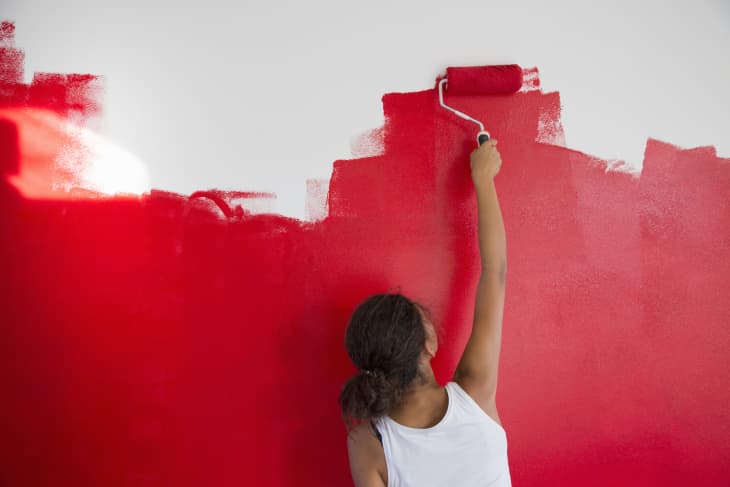
Take it from homeowner Katherine Thewlis (@hausmatter), who said it took five coats and tons of effort to transform her dining room and kitchen from white to a deep red — and that her wrist hurt from so much rolling afterward.
Joe Perry, a professional painter and the owner of Varsity Painters in Minneapolis, says there’s a reason why red is so difficult to work with, but that doesn’t mean you have to rule out the shade entirely. With his tips, you’ll be on a (smooth, even) roll in no time.
Why is Painting with Red More Difficult?
The base isn’t strong enough.
When you buy paint at a store, the can is often mixed behind the counter. Colorant is added to a white or oil base to create the shade on your paint chip. The problem with red paint from many brands — especially companies trying to cut costs — is that the paint actually doesn’t have that much color it, Perry says. “It’s almost like a clear Crisco oil, and they dump a bunch of tint into it,” he explains, “but tint doesn’t cover very well. It will take multiple coats, and it can be four and five, which can be a real challenge.”
It looks uneven when it’s dry.
Tint also doesn’t cover very evenly. “When you get a lot of tint in the paint, tint will dry shiny, so getting that sheen even can be a challenge, Perry says. “The color could be good, but the sheen could be uneven.”
How to Paint with Red Like a Pro
Choose a paint with a red base.
Although many paint companies pump too much tint into an oily base, some do make a red paint with a true red base. Perry recommends Benjamin Moore’s Aura line of paints because they are very color-rich.
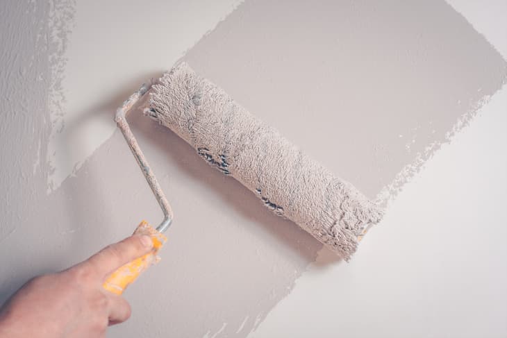
Prime with gray primer.
Using a white primer underneath red paint can result in a pinkish shade. To get the true darker red you’re going for, Perry recommends using a darker primer. Using a gray primer will do two things, Perry says. First, “you’ll darken up the wall because so many walls are fairly light,” and second, “it seals up the wall so that your finish coats will look more even in terms of sheen and color consistency.” If you don’t seal up a porous sheetrock wall properly, Perry says, unevenness is very visible with a dark shade like red.
Marry any brush strokes with roller stipple.
With a dark color like red, “you want to have as little brushstrokes showing as possible because they will reflect differently than a roller will,” Perry says. After cutting around windows and trim with a paint brush, Perry says to take the smallest roller you can find, like a 4-inch roller, and roll as close to the edge of the window frames and trim as you can. “What you’re trying to do is get roller stipple there so it marries up with the roller that you’re about to use on the walls,” he says. “If you don’t re-cut it with a roller, you’re going to stand back and look at your wall, and you can see everywhere that you’ve brushed.” Avoid the outline!
Keep roller direction consistent.
Finally, “when you roll the walls, you always want to finish in the same direction,” Perry says. In other words, make sure your roller direction is consistent on your top coat. “If I’m rolling top-down from the ceiling down to the baseboard when I’m doing my final roll, when I move my roller over to the next section, I want to keep finishing with the same stroke,” he says. If you don’t, “the roller will leave a different stipple each way that you go,” and it will be noticeably uneven.