Before and After: This Mid-Century Ranch Home Just Got Some Major Curb Appeal

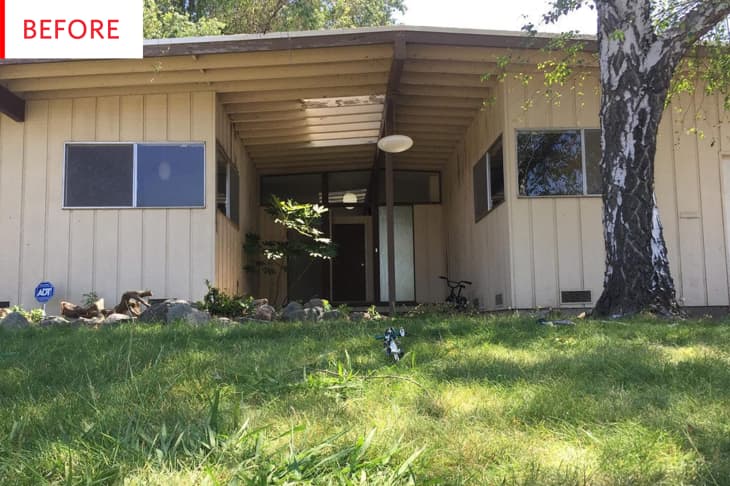
The exterior of this classic California home had not been painted since the 1960s and it was desperately in need of a spruce—and perhaps even a pop of color.
Melissa Johnson of Best Friends for Frosting gave this home a totally fresh and serene new look that’s worlds away from the previous beige-on-beige aesthetic. The pale, pale grey is absolutely dreamy—a neutral that glows. The gravel was perfectly chosen, its hue somewhere between the light grey and the white, with bits of the darker grey of the trim thrown in.
And while that might be enough beauty for the lovers of neutrals, the lovely aqua door pushes things over the edge. It’s a beautiful color that’s bright and lively, yet it manages to become part of the peaceful wash of grey and white.
The house is painted French Silver and the front door is Tahitian Breeze, both by BEHR.
Though this home appears to have the best of bones, it obviously needed needed some help:
I recently purchased a 1965 mid-century modern home in California. We’re planning a series of home renovation posts that will be featured on Best Friends for Frosting. It took us three years to find. It was a fixer-upper that was vacant for 20 years.
This photo more clearly reveals what a fantastic job the dark grey does in framing the geometry of the house. The accent grey, while not being incredibly dark, manages to effectively highlight and delineate the lighter grey, white, aqua, frosted glass, and clear glass fields. The white slatted ceiling does an excellent job making the entryway feel brighter and more welcoming.
The pendant light deserves special mention as well; it’s rare to see outdoor lights with such clean, modern style. Another big upgrade is the gravel border, which looks far more finished and elegant than the random rocks did.
Now that this exterior mid-century makeover is complete, Melissa is rightfully pleased and has some valuable time- and money-saving advice to share:
We love the after. We did it all ourselves. We did mess up by painting it three different shades of gray…
This is one of the biggest tips I can give you when it comes to picking exterior paint colors: get paint samples! We started with a darker shade of gray when we began this journey, but realized after it dried, and the sun hit it in certain spots, that it was too dark and definitely not the color for us. We then tried a lighter gray that looked like we had found the one, until the sun hit it and it and washed it out, making it almost look white. We finally picked out paint samples on a third trip to Home Depot and tried the samples on every side on the house, checking during all hours of the day. Outside house paint can look different during all parts of the day. We ended up deciding on Behr’s French Silver, a light to medium gray that was just perfect for our mid-century modern home!
Thank you, Melissa Johnson of Best Friends for Frosting!
