
This Jewel Box Studio is a Lesson in Monochrome Design
Take one peek inside blogger and photographer Allie Provost’s Upper East Side studio, and you’ll find yourself overwhelmed with pink—but in the best possible way. The space itself is a color-charged dream, filled with rich patterns, cheeky charm, and clever storage solutions that marry form and function with flair.
As the creative force behind her blog, Prêt-à-Provost, Provost primarily operates from home. So striking that delicate balance between a comfortable yet chic living and working space was key. After a year and a half of living with the boilerplate white walls and builder grade finishes her place came with, it was time for a refresh that put her personal style on display.
“I made overtly safe [design] decisions in fear of messing up,” says Provost of the original setup, which to her, lacked personality. “I wanted my space to be an extension of my style: Feminine, colorful, bold, and a little bit grandma-chic.” The photographer decided to enlist the help of designer Shannon Claire to revive the room with one principal hue that would reign supreme: pink. Here’s how they used a mostly monochromatic color scheme to make small studio seem like a larger, super customized space.
Carve out zones with subtle shade changes
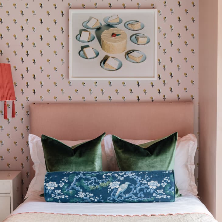
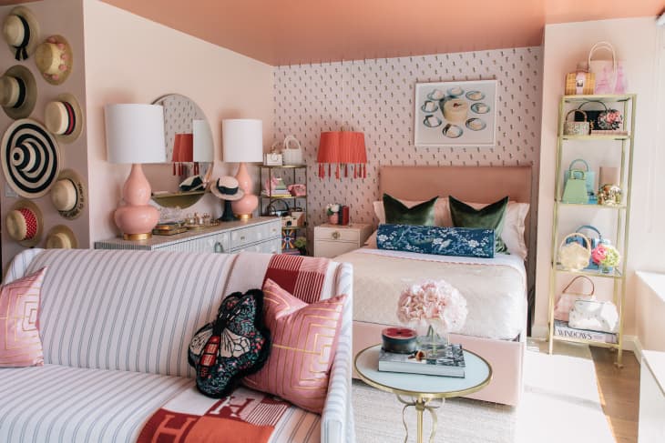
“I think it’s safe to say I love pink and wanted that to be the main color throughout the apartment,” says Provost. So the duo painted the walls in Farrow & Ball’s Pink Ground then highlighted the “bedroom” proper with an accent wall of Chasing Paper’s Blossoms removable wallpaper. The dusty tint of the paint, coupled with the delicate floral patterned wallpaper, set a feminine, playful tone that became the jumping-off point for the rest of the studio’s decor. Even if you’re working with just one color, a subtle shift in shade—or the introduction of a pattern with a background that’s similar to your wall color—can really separate a large space into smaller moments, making something like a studio feel as though it’s a bigger place.
Diversify your palette
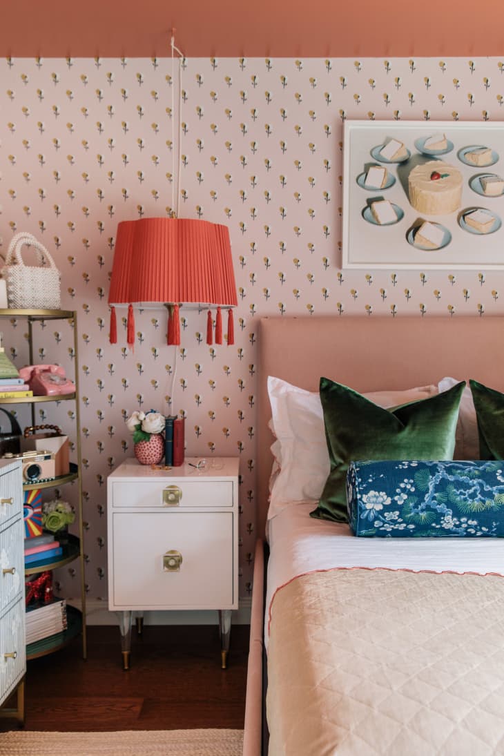
Again, the secret to pulling off a monochrome look is decorating with tonal variations. Not only can this help a space feel more defined, but this also will provide visual interest and intrigue. Designate your choice color for the standout components of the room—think walls, bed, sofa—and then introduce a handful of similar hues by way of smaller decorative accents for a dynamic finish. Provost’s spectrum ranged from soft pinks and off-whites to splashes of red and even a fiery orange tasseled pendant she cleverly converted into a plug-in!
Create some contrast
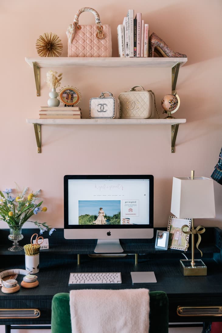
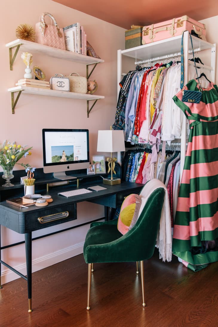
While there’s no arguing that pink is central to the entire space, Claire brought in a few cooler tones to offset the warmer ones and balance out the palette. Note how the striped sofa and dresser below may be more prominent in size, but the subtlety of their coloring prevents them from stealing the show from all the pink. The pieces that are higher in contrast, such as the indigo desk above and even some of Provost’s darker clothing and accessories, created a sense of depth between all the rich layers of pink. Plus, they’re clever corner placement ensured that they wouldn’t detract from the rest of their surroundings either.
Establish height with color
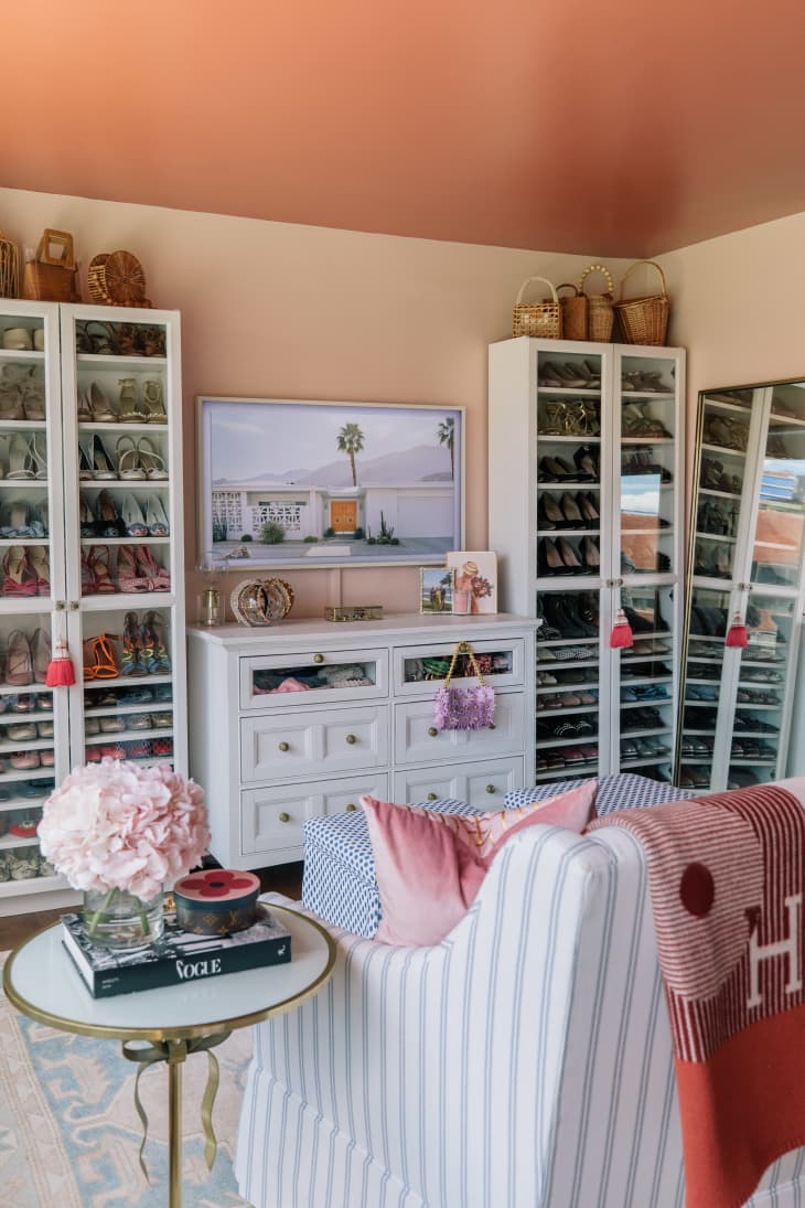
Decorating a small studio means leveraging every trick in the book to make it seem as expansive as possible. Claire suggested painting the ceiling to help draw the eyes up. “Adding a lighter color on the walls in contrast with the darker shade up top creates the illusion of taller ceilings,” the designer explains. They went with Farrow & Ball’s Red Earth, a light terracotta with red and yellow undertones that would blend beautifully with the neighboring pink.
Use accessories as accents
Given that closets can be a rare commodity in New York City studios, Provost had to get creative with her storage. “Every inch in my apartment had to be utilized,” she says. “In addition to my clothing rack and shoe cabinets, I have a storage bed to help with seasonal items, ottomans, and a media chest that I use a second dresser.” She also hangs hats on her wall, using them as a three-dimensional alternative to wall art.
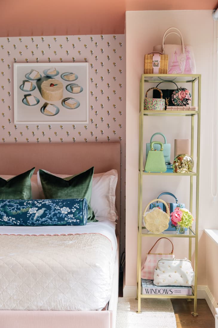
She hacked a pair of IKEA BILLY bookcases, adding more shelves inside to accommodate her shoes. Provost also used a combination of rectangular and round tiered etageres to house her handbag collection, which she positioned in different corners around the studio.
Work your walls but keep it light
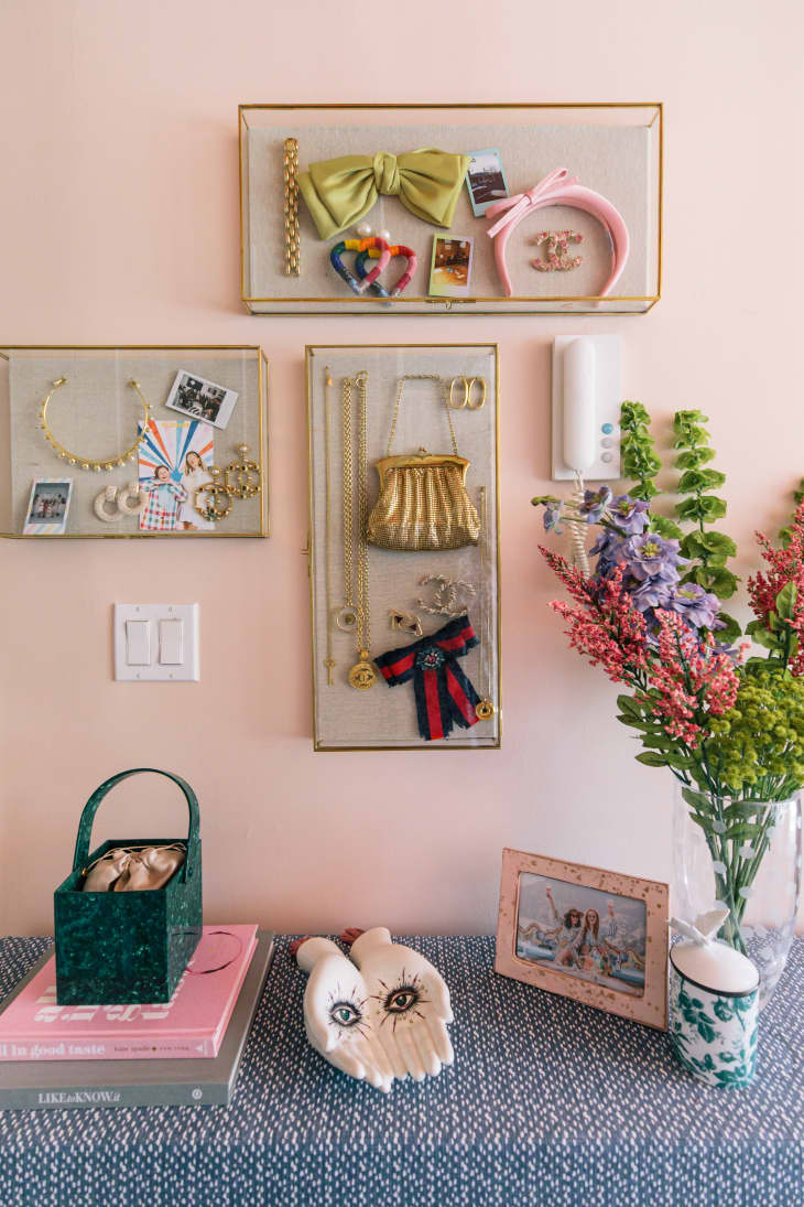
In a small space, it can be tempting to cover your walls with hooks, shelves, and decorative boxes for your things. This is a great way to max out your vertical space and offset the lack of square footage, but try to be strategic about the pieces you choose. It’s best to look for clear or light colored options, like these linen-lined decorative display cases. Visually, these materials are reflective and recede into the walls, so the focus is on your wares and not the storage solution itself. This will also keep your walls from feeling visually heavy and cramped.