
This Home’s DIY Renovation Is Pretty Impressive
Can't-Miss House Tours Straight to Your Inbox
Keep up with our latest house tours each weekday with our House Tour of the Day newsletter
Name: Christie Grotheim (and my husband, Niklas Andersson)
Location: New York, New York
Size: 1,000 square feet
Years lived in: 4 years, owned
My husband and I found this fixer upper in Harlem, sold “as is,” which in this case, was pretty atrocious. But we saw past the filth and peeling paint and realized the potential in the place right away. A corner unit on the third floor, it was flooded with light, and as a four-bedroom (converted to three) we would each have our own office. Before we even moved in, we spent three weeks scrubbing every surface, priming it, painting it bright white, and sanding down the floors—already a drastic improvement.
I’m a graphic designer and my husband is a lighting designer and we’re both want-to-be interior designers, and so we had fun—and more than a few arguments—designing the place ourselves. Since my husband is quite handy, we did almost everything in the renovation from the demolition to the reconstruction. What we didn’t know we learned from YouTube. For over six months we had no functioning kitchen, cooked with an electric skillet, and washed dishes in the bathtub. During our first holiday season spent in the apartment, our Christmas tree was surrounded by 20 industrial-sized bags of demo.
The major renovations—the kitchen and dining area—were finished within a year and then we continued room by room and have now been enjoying our finished space for the last couple of years. It’s comfortable and functional—which is a huge relief since neither of us are professionals. We love entertaining in the space and like that there are two distinct gathering areas—the dining area in the front and the large living room in the back. We consider this our little haven in the city. In fact we probably spend too much time here, sometimes not leaving the house for days!
Apartment Therapy Survey:
Our Style: I would call our style an eclectic mix of contemporary, antique, and rustic; some areas are quite minimal while others are intentionally cluttered. Both being visual people, we love texture: wood, tile, tin, with hints of color, and areas of wallpapers, from retro patterns to damask with flocking. We like our home to reflect our personalities and that means surrounding ourselves by objects we love and things that define us: books, music, visual art, and a few sentimental items like an antique cuckoo clock and coffee grinder that had belonged to Niklas’ grandmother in Sweden.
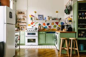
Inspiration: For our kitchen and dining room, I was inspired by French cafés, and I wondered, why can’t we design our kitchen to look like a charming artisanal café? We tried to achieve this with the faux tin ceiling and the repurposed wood (reclaimed from a Brooklyn brownstone) used in the window trims and custom shelving.
Favorite Element: My favorite element is the custom-built stove top structure and shelving alcove. Exposing the brick along this wall added instant charm, and as we tore down the dry wall we discovered a recessed indentation where a wood-burning stove used to exist. So we decided to retain the shape, putting our stove where the original once existed, and the built-in alcove made a great place for our glass spice rack. We felt wrapping it in floor-to-ceiling subway tile would tie in nicely to the back wall, and the end result was a unique—and very usable—architectural element.
I am also pleased with the custom lighting installation we designed around a metal plumbing pipe (bought from the hardware store) with electrical cable looping around and dangling raw bulbs, which can be reconfigured at any time.
Biggest Challenge: The biggest challenge was working with an apartment with a long hallway down the center—what one saw upon entering—with multiple doors to the four tiny bedrooms on either side. We knocked out a wall and three closets eliminating one bedroom, doubling the size of the kitchen and dining area, and my husband opened up two large areas of the hallway wall, letting light spill into the apartment and giving a lovely specious area to enter into rather than a dark narrow hall.
Proudest DIY: We rebuilt the kitchen and dining area from the rotten baseboards up. One of the most challenging DIY moments was pouring the self-levelling floor, which flowed like lava toward our feet! But I believe the project I am proudest of is doing all of the floor-to-ceiling subway tile work ourselves.
Biggest Indulgence: Well, it all adds up, and many of the items we used were affordable in themselves. The kitchen cabinets and appliances are from Ikea. One of the most expensive items was the countertops, and I’m very glad we went with the honed Caeserstone countertops in pebble gray, a color and texture reminiscent of concrete—which we originally considered—but much more durable, in a kitchen where we cook and entertain a lot.
Best Advice: Our best advice is to have the vision to see the potential of the place; don’t get deterred by a little (or even a lot) of dirt and wear and tear. By choosing a fixer upper, you can custom design every last detail to your liking. Because of the awful condition it was in, we got our apartment at a great price, and believe our investments of time and money will pay off. But more importantly, we have created a practical and aesthetically pleasing home that we enjoy every day—and it’s totally our own.
Resources:
PAINT & COLORS
Red in theater room — Benjamin Moore Million Dollar Red
Mint in kitchen/dining room — Benjamin Moore Spring Mint
Office — Benjamin Moore Jeweled Peach
ENTRY/HALLWAY
Hallway wallpaper — Graham & Brown Bark Wallpaper (bright white) (We wanted a textured wallpaper that would cover a few flaws and act as a bright canvas to display our art; our idea for the hall was to make it look like a gallery.)
Artwork — Painted by my husband, myself, and from friends and thrift shops
Lighting — Track lighting and egg-shaped track heads from Home Depot
LIVING ROOM
Wing-back chairs — STRANDMON Wing Chairs, IKEA
Two area rugs — IKEA
Bookshelves — BILLY Shelves, IKEA (black)
Theater chairs — Found/repurposed from old theater in Sweden
Media console — Mid-century console from West Elm
DINING ROOM
Kitchen table — Custom-made in Red Hook from molded iron legs (repurposed) from a manufacturing plant
Chairs — Rococo chairs in black velvet from Modani furniture
Chandelier — Jet black gothic crystal chandelier from Houzz.com
Cuckoo clock — Antique from Sweden
KITCHEN
Cabinets — IKEA
Floor Tile — Mazarri Montagna Dapple Gray from Home Depot
Subway tile — White subway tile from Home Depot with charcoal gray grout
OFFICE
Wallpaper — From Vintage Wallpapers in Belgium
Paint colors — Warm Red, Benjamin Moore; Jeweled Peach and Greenish Brown, Benjamin Moore Providence Olive
Credenza — USM Furniture
Thanks, Christie!
Share Your Style:
See More:
⇒ Recent House Tours
⇒ House Tours on Pinterest