
The Best Colors for Every Room in Your Home
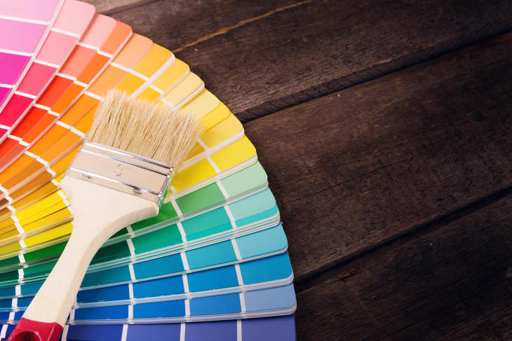
Paint color is all about creating an ambience for your home. That’s why it’s important to select paint colors based on how you want a room to feel instead of mindlessly adhering to trends. To prove our point, we called on color expert extraordinaire Leatrice Eiseman, Executive Director of the Pantone Color Institute and author of Colors For Your Every Mood, to help us break down the best paint colors for every room of your home. From moody bedroom blues to sunny yellow kitchens, read ahead for which paint colors Eiseman suggests to set certain moods throughout your home.
1. Bedroom
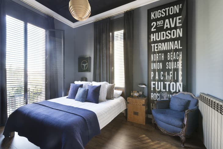
“Many people would agree that they want a bedroom to feel like a place to unwind and relax,” says Eiseman. “A blue and blue green color palette brings that clean “zen” feeling into a space, as do blue-grays and other cool neutral tones. If a bedroom does “double-duty” and incorporates a desk that serves as a home office, then opt for a brighter shade of blue (such as Pantone’s Lapis Blue) to add a little more energy into the atmosphere.”
2. Living Room
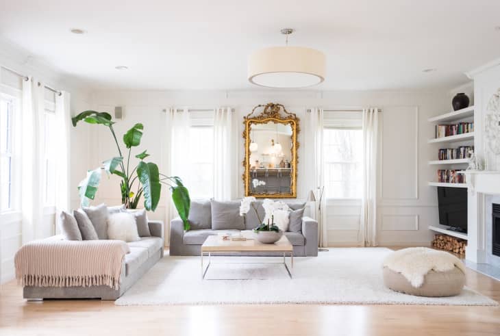
“Living rooms often demand a neutral background so that the atmosphere doesn’t get so noisy that it competes with the conversation,” explains Eiseman. “For example, using a nice neutral tone (such as Pantone’s Simply Taupe, which combines both beige and gray) on the walls allows art, rugs, and other bright accessories in the room to stand out without overwhelming the space.”
3. Bathroom
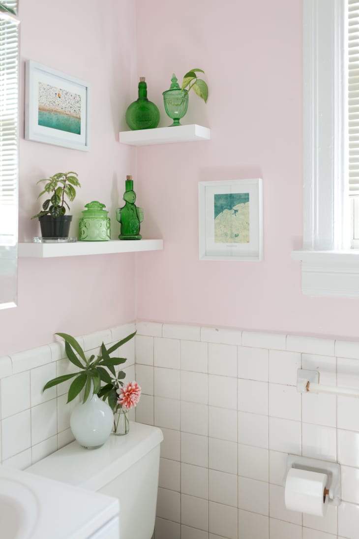
“If you want the bathroom to feel like a restful spa,” explains Eiseman, “softer sage and blue-greens (such as Pantone’s Spray Green or Pantone’s Aquifer) work very well. However, if you’re looking to set a more flattering ambience for your bathroom, rosy hues (like Pantone’s Rose Quartz) are often complementary to different skin tones.”
4. Kitchen
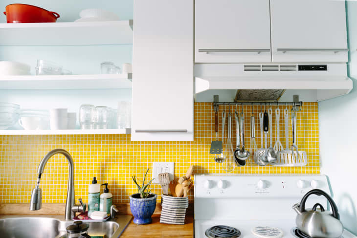
“The kitchen is the room where everyone gathers,” says Eiseman, “so it should be a welcoming space. Create welcoming warmth for your kitchen by using a sunny paint color, such as Pantone’s Primrose Yellow, which brings the illusion of sunshine into the kitchen. Or opt for a golden-based tone, like Pantone’s Coral Reef, that’s cheerful but not too bright.”
5. Entryway
“Your entryway is the introduction to your home, ” says Eiseman. “You want to set the tone for the rest of your space with the paint color. Take a drum roll approach to this area by employing an exciting color that offers some drama, but that isn’t too bright, such as Pantone’s Raspberry Wine, Wood Violet, or Teal.”
*re-edited from a post originally published 12.29.12