
Before and After: A Designer-Approved Paint Trick Totally Transforms This Living Room
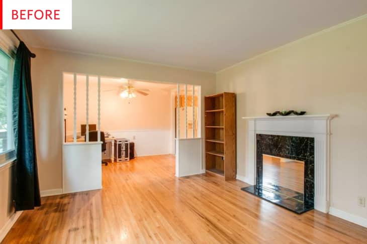
While Amy Runner’s home has some beautiful 1950s features—those gorgeous hardwood floors, the elegant flow—it also boasts some ’90s “improvements,” notably the fake fireplace with a fake marble surround and a mirror where the firebox should be.
Let’s find out a bit more about this home from Amy, and the pros and cons it presented when it was purchased:
“My husband and I purchased our first home in October. The home is in Nashville and was built in the 1950s, with renovations done in the 1990s that used some less-than-lovely finishes. This was actually a major selling point for me, because I couldn’t wait to try my hand at a few DIY upgrades after years of renting. The previous owners had installed a faux fireplace in the living room with a mirror at the base instead of an alcove and grate, with fake vinyl tiling underneath the mantle and on the hardwood floor.
Originally I had hoped I could remove the mirror and fake a fireplace setup with a candles display, but after peeking behind the mirror we discovered it was flat drywall.”
I love that attitude—though it doesn’t hurt to have those glorious original floors too, of course.
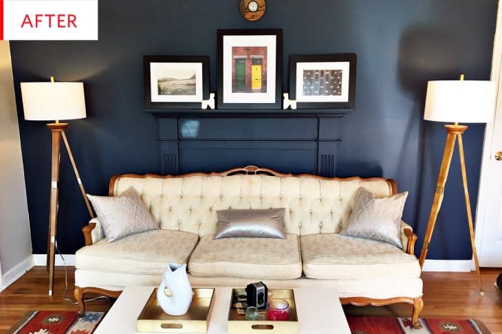
Amy Runner—@amysarunner on Instagram—has created a wonderfully unique combination of styles and eras that all come together like they were meant for each other. This is an excellent example of taking something far less than ideal like a mirrored, vinyl-tiled fireplace and turning it into a statement piece.
I love faux fireplaces painted the same color as the walls. (See this bathroom Before & After for another excellent example of the look.) When painted the same color as the wall behind them, bulky pieces—like consoles, armoires, bookcases, and mantels—suddenly seem like unobtrusive built-ins —or even like they’re not there at all. It’s a smart paint trick.
Here’s how Amy combined the worst of the 1990s with the best of the 1890s and came up with something perfect for the 2010s:
“So we got to work ripping out the vinyl and Goo-Be-Gone-ing the surfaces underneath. After some intense scrubbing and priming, the walls were clear of adhesive and ready for paint. I used a generous two coats of Benjamin Moore’s Gentleman’s Gray in a matte finish and fell in love with the monotone look of the wall and mantle together. The masculine moodiness of the color set just the right tone next to the light, feminine couch. I actually stumbled upon the inspiration to put an antique couch I scored off Craigslist in front of the mantle after watching 30 Rock—Liz’s apartment has a similar setup.
Finding a brick red rug in a bold pattern brought a more modern sensibility to the space and set a nice tone for the wood and gold accents I had on-hand, like the lamps, wall clock, animal figurines and coffee table trays. The mantle then became the perfect place to display some of my husband’s photography from his trip to Ireland, which was the perfect personal finishing touch to the area. Voila! “
That Gentleman’s Gray paint is the most fabulous color, a near-black navy that’s as elegant as it is edgy. I would be tempted to pair it with a completely white, black, grey, and wood palette, so I especially appreciate the vision that led Amy to pick out a bold rug that complements the blue-black fantastically. Similarly, the minimal look of the floor lamps and the monochromatic fireplace is awesomely complemented by the ornate sofa.
And as always, any decor inspired by 30 Rock—this clip of Liz working on her night cheese is the best example of the sofa-in-front-of-fireplace I could find—is a surefire winner: WWLLD?
Thank you, Amy Runner!