
9 Colors that Perfectly Complement Classic Blue, Pantone’s 2020 Color of the Year

It’s here! It’s here! Yesterday, Pantone unveiled its 2020 Color of the Year: Classic Blue. This big blue is a gorgeous mid-tone hue that Pantone describes as “the sky at dusk”—could there be better motivation for incorporating this feel-good shade into your decor? The hard part: Figuring out what to pair with such a vibrant color. Pantone offered some curated palettes to help blue enthusiasts (enbluesiasts?!) incorporate it into their homes, but we wanted to see how those look in action. We turned to paint and color experts for their tips on what tones look best with Classic Blue, and how you can use it in your home. Read on for their tips.
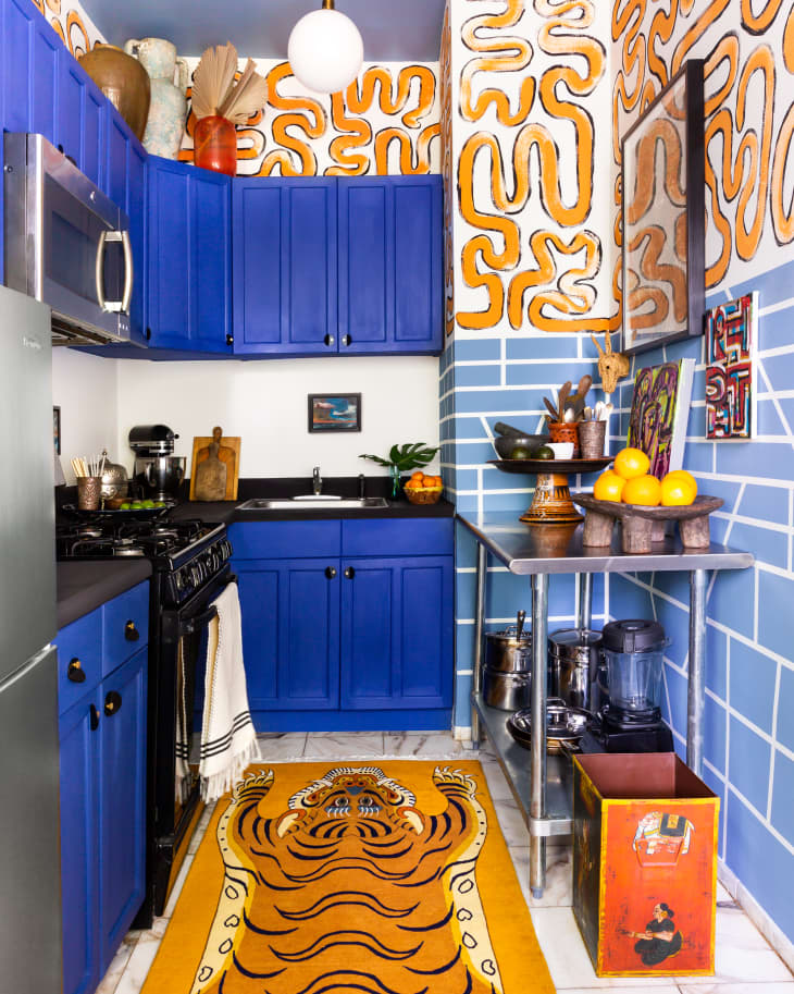
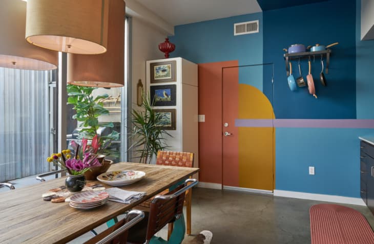
Punch it up with orange accents
For a bold look, Annie Sloan, color expert and creator of Chalk Paint, says this mid-tone blue pairs well with golds and coppers. “The complementary of blue is yellow—and as you move slightly around the color wheel you find orange, hence the copper and gold tones working well,” Sloan says. Her best match for Classic Blue is Napoleonic Blue by Annie Sloan. “It’s reminiscent of the ultramarine and cobalt blue pigments use in neoclassical interiors, yet it still looks fresh and modern,” she says. For a super bold look, take a cue from this rental kitchen—designed by Anthony Gianacakos—and pair the rich blue with a vibrant orange (Barcelona Orange by Annie Sloan).
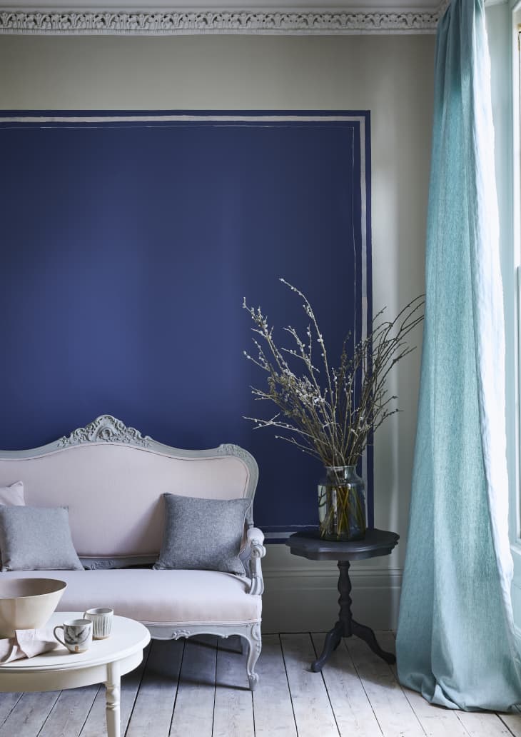
Tone it down with soft pastels
Another good option, says Sloan: Pairing the big blue with more subdued colors, like the pale pink (Antoinette by Annie Sloan) and off-white (Old White by Annie Sloan) shown on the sofa here.
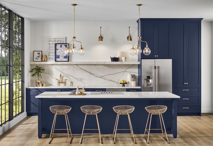
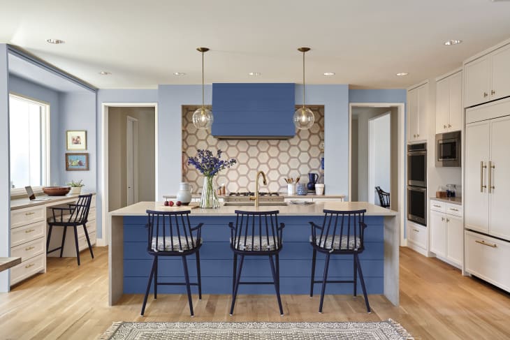
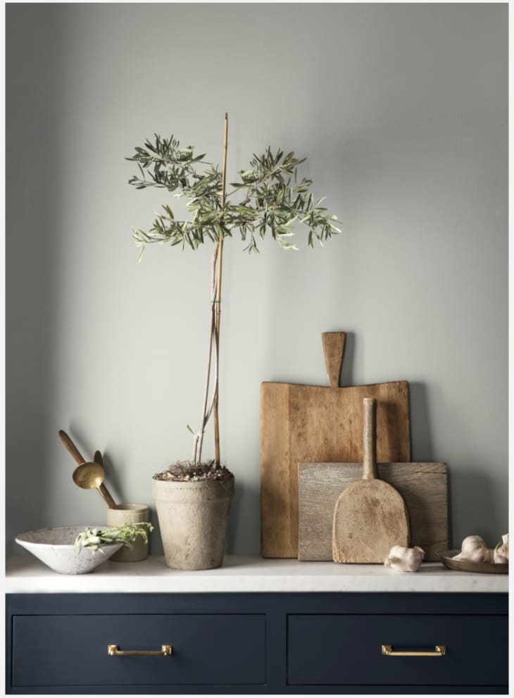
Go clean, crisp, and classic with white
A bright white is a natural complement to Classic Blue, says Sue Wadden, director of color marketing for Sherwin-Williams. “A crisp white room accented with blue on one wall or cabinets is a classic pairing, but is still fresh,” Wadden says. “And depending on your decor, it can work for traditional, coastal, or glam styles.” Wadden recommends Snowbound by Sherwin-Williams to get the look of the kitchen shown here. Blueblood by Sherwin-Williams is the closest match for Classic Blue, but if you’re looking for a darker, moodier blue, Wadden suggests Naval by Sherwin-Williams.
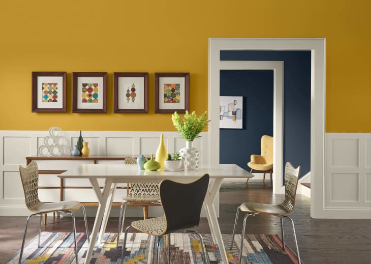
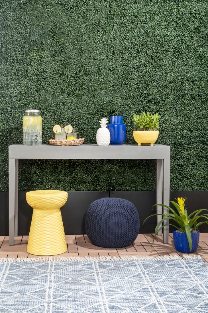
Grab some sunshine with golden yellow
For a more modern and zingy look, says Wadden, try accenting Classic Blue with yellows and golds, like Midday by Sherwin-Williams. “Cheery yellows like brighten up a room for a burst of positivity and color, with golden tones that act as a nod to Art Deco,” Wadden says.
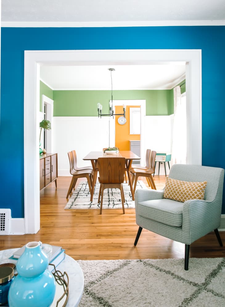
Add in a leafy green
Green helps give the bright blue a more natural look, says Wadden. The lighter green above is a close match to Oh Pistachio by Sherwin-Williams; for a more dramatic look, Wadden suggests a deeper green like Kale Green by Sherwin-Williams. Or, she says, incorporating green “can be as simple as bringing a fig or palm tree into your space for a burst of fresh air.”
Make your space monochromatic
If you really like blue, this one’s for you. Erika Woelfel, color expert at Behr, suggests complementing Classic Blue with other lighter blue shades. “I love to layer shades of blues in a monochromatic palette that adds depth and variety,” Woelfel says. For the look above, try Optimum Blue by Behr paired with a lighter blue like Loyal by Behr.
Pepper in some terra-cotta
For a surprising complement, try this trending shade that Woelfel calls an “on-the-rise neutral.” To get the look of the painted accent above, try Cider Spice by Behr.
Make it pop with buttery yellow
This offers a more playful look than yellows that lean orange or gold. The yellow hue helps warm it up, says Adeline Krieger, assistant brand manager at Rust-Oleum. For the look above, she recommends Satin Summer Squash by Rust-Oleum; Satin Ink Blue by Rust-Oleum is the best match to Pantone’s Classic Blue.
When in doubt, reach for gray
An always sleek pairing? Neutral cement gray, says Hannah Yeo, Benjamin Moore color marketing and development manager. “It’s a great addition if you’re looking for a modern color scheme,” Yeo says. She suggests Thundercloud Gray by Benjamin Moore and Blueberry Hill by Benjamin Moore to get the above look.