
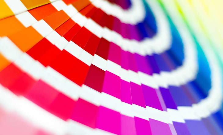
This Is Pantone’s 2022 Color of the Year
This year, the world has been tested to find comfort in the unknown. The more it became apparent that nothing was going back to “normal,” the more everyone learned to adapt to a new way of living. And while nothing is certain, the 2022 Pantone Color of the Year brings a positive spin to the future as we continue to open to new possibilities — and, according to their prediction, it’s looking pretty bright.
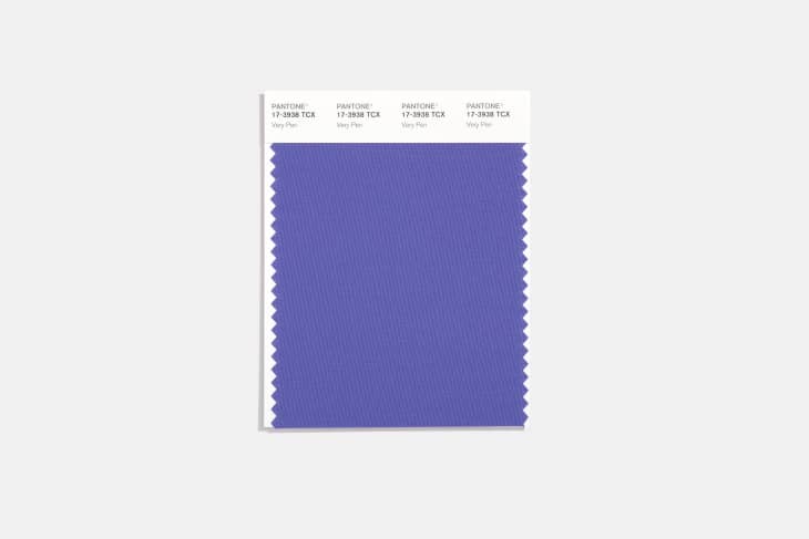
It’s been two years since the Pantone Color Institute selected Classic Blue as its Color of the Year, and the global authority is returning to the blue family yet again by introducing their 2022 choice, Pantone 17-3938 Very Peri, a periwinkle blue with a violet-red undertone. The new shade, which was created specifically for 2022 Color of the Year, is meant to evoke comfort with a courageous twist, symbolic of the reassurance we all need during unpredictable times while encouraging hope, newness, and creativity.
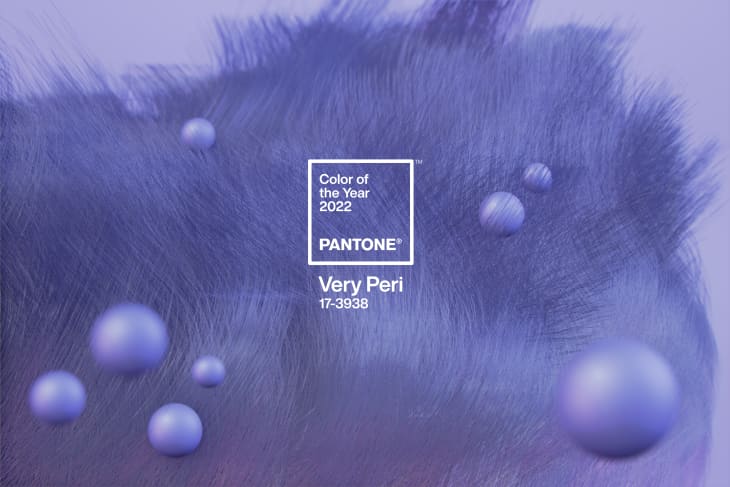
“As we move into a world of unprecedented change, the selection of PANTONE 17-3938 Very Peri brings a novel perspective and vision of the trusted and beloved blue color family,” says Leatrice Eiseman, Executive Director, Pantone Color Institute, in a press release. “Encompassing the qualities of the blues, yet at the same time possessing a violet-red undertone, PANTONE 17-3938 Very Peri displays a spritely, joyous attitude and dynamic presence that encourages courageous creativity and imaginative expression.”
At its core, Very Peri is a combination of the digital world that everyone has grown accustomed to and the physical world, or what is seen in nature. The Pantone Color Institute has identified periwinkle blue as a color that is present in digital design and gaming, while also existing in the outside world in the form of flowers and bluebirds, among other things. This represents the merging of the two worlds in our current lives, a balance which will continue in the foreseeable future.
The global authority describes the color as “courageous,” “empowering,” “spritely,” “joyous,” “dynamic novel presence,” “imaginative,” “whimsical aesthetic,” and “futuristic,” making it a shade that offers up hope as we enter another year of uncertainty.
If you’re wondering how this hue translates into the home, Pantone says that it’s all about being that much-needed pop of color. Very Peri can bring in brightness while meshing with an array of materials, textures, and finishes, according to the press release. A great way to start infusing Very Peri into your space is through accessories that can easily be swapped in and out, or for those feeling more bold, you can go right to painting an accent wall or ceiling that creates depth.
As Laurie Pressman, Vice President of the Pantone Color Institute, told Apartment Therapy, “Even though we’ve all been shaken a lot to the core, at the same time it is exciting, because we’re looking at the future and we’re imagining a whole new way of living, and it opened a whole new perspective on life, what we value, and where do we go from here.”
What do you think of Very Peri? Let us know in the comments!