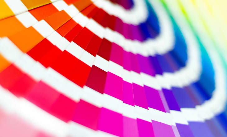
Pantone Just Released 315 New Colors—and the Blues Just Keep on Coming

Just when you thought Pantone couldn’t expand much further from their already existing 2,625 color palette, the color experts just dropped 315 new hues (and our jaws dropped as a result).
Today, Pantone announced that they’re releasing a new color collection that was “strategically selected to reflect current and future color influences across fashion, home furnishings, interior, and product design,” according to the official press release. There are 70 new shades of the ever-popular color blue—adding to the already hyped Color of the Year, Classic Blue—as well as 50 shades of pink, a testament to pink continuing to be popular on an international scale.
Leatrice Eiseman, Executive Director of the Pantone Color Institute, mentioned that in addition to traveling the world, the institute listens very closely to its international audience and what people are asking for. “In the blue family in particular, it’s such a universal favorite that you might think you’ve got every shade of blue imaginable, but maybe it’s just another nuance of a color that was this close but not quite there,” Eiseman told Apartment Therapy.
She also went on to explain how pink has historically been popular in fashion and cosmetics, but over time has risen as a home favorite. “I will tell you the rise in pink in the interior is something we absolutely could not ignore,” Eiseman said. “We knew there was really a spot to add more pink, and particularly to use variations of pink because some are really going to work in the interior, and others might be great for fashion but not necessarily the interior. We were enabling people to have more choice and choose a pink that really speaks to them.”
Out of the new family members of pink is Pink Cosmos, a color that reflects new technology coming out that helps us see the cosmos like we never have before—and unintentionally represents the increased popularity astrology has seen over the years. “There’s this new Webb Telescope that’s going to enable us to see colors in the cosmos that we have never seen before,“ Eiseman said. “When we were naming the colors, I was thinking about that and I thought, Pink Cosmos! We’re going to be able to see even shades of sandy tones in the cosmos that have a pink glow that’s attached to them.”
In addition to the blues and pinks, some orange hues will be added to Pantone’s growing color palette, which Eiseman says has gone up in consumer awareness and acceptance—especially with popular shades like peach and coral.
“We’re not just talking about bright party balloon orange, we’re talking about lots of variations of orange,” Eiseman said. “It’s educating people to understand that if you want the warmth of orange but you don’t want the brightness, there are other ways to attain it. Or if you want to take it to a softer level, here are the options that are available to you.”
