
Before and After: A Builder-Grade Entry Finally Gets Its Wow Factor
There are a lot of things you want guests to feel when they step inside the entry to your home, including welcomed and comfortable for starters. And, if you’re like Lacy Hoysradt (@livingawilderlife), you want them to feel a little bit of “wow,” too.
“The entryway is the first impression of our home when you open the door,” Lacy says. “I wanted to give it that ‘wow’ factor that made you want to see more.”
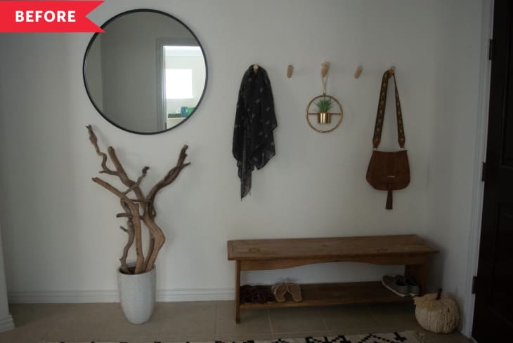
As it was, though, it was not exactly wow-worthy. The plain white entryway didn’t have any special features—Lacy calls it “very basic and builder-grade.” The front of the house had another problem, too: “We had a pretty good size entry, but very few windows in the front of the house so it just felt dark when you walked in the door,” Lacy says. “Overall it just made me feel underwhelmed every time I walked in the door and didn’t reflect our style at all.”

A few high-impact elements totally transformed this space in just about a week. Lacy started with board-and-batten painted crisp white (Benjamin Moore’s Chantilly Lace) on the bottom half of the walls, which adds some texture and dimension to the space. The small ledge offers a place to perch a mirror and other artwork, and minimalist wooden hooks make room for hanging bags, coats, and more.
Lacy filled the space over the wainscoting with black-and-white herringbone wallpaper that adds some graphic interest. “I am so in love with the wallpaper,” Lacy says. “It gives it that feeling of being different from every other house on the block.”
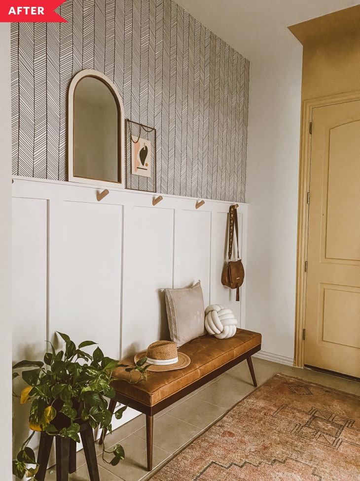
Lacy also added a new leather bench from Poly and Bark and a faded, vintage-looking rug on the floor for max cozy vibes. One other major change? Painting the inside of the front door in a mustard-y tone, which brightens the space way more than the old black. (Psst: Painting the wall space above the door, and part of the ceiling, makes it look even taller than it is—a smart design trick!)
“The texture of the board and batten combined with the pattern of the wallpaper made this space so much fun to walk into,” Lacy says—exactly her goal. “It’s still functional but now it’s also beautiful.”
Inspired? Submit your own project here.