
Refresh Any Room with This Vibrant, Nature-Inspired Paint Palette

Lush and organic decor, full of natural materials and rounded shapes, is having a moment. We’re bringing the trend into high-def with a paint palette that plays off its most captivating colors: verdant greens, sunset pinks and oranges, and soft neutrals. Together, they’re a combination of energetic and calm that makes any day — and any room — feel breezy and inviting. Meet the color palette we’re calling Mint Julep.
Curated by designer and visual artist Sara Weissler, Mint Julep brings the head-clearing charm of nature indoors. Apply it in your bedroom for energizing mornings, or use it in your living room or WFH space to give yourself moments of refreshment throughout the day. The colors all come from Sherwin‑Williams®, where you’ll find high quality paint and helpful color solutions for making your next paint project easy. Now, on to those mint juleps!
What Inspired It
Color expert Sara Weissler took her cue from the plethora of bold prints and colors she’s seeing in design these days. “It’s a style I see popping up more often, and I find it very exciting,” she says. “These juicy hues inspire happiness. This palette, mixed with plants, chinoiserie prints, and other patterns, would create a chic, coastal vibe.”
Those bright, poppy colors have also been taking over on Prism, the photo tool that helps you find color inspiration on Apartment Therapy. Sara used Prism to pinpoint trending colors that work with the palette’s theme, and you can do the same. When Sara fell love with Jovial SW 6611 (it happened at first sight), she was able to see how it’s used in real homes all over our site. Click the rainbow button in the corner of any photo on AT to discover your next favorite hues.
Why We Love It
Like its namesake cocktail, Mint Julep is refreshing. And because these colors are from Sherwin‑Williams®, you can expect a smooth finish, rich saturation, and long-lasting results.
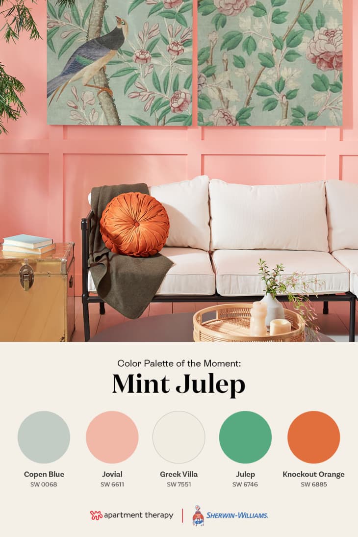
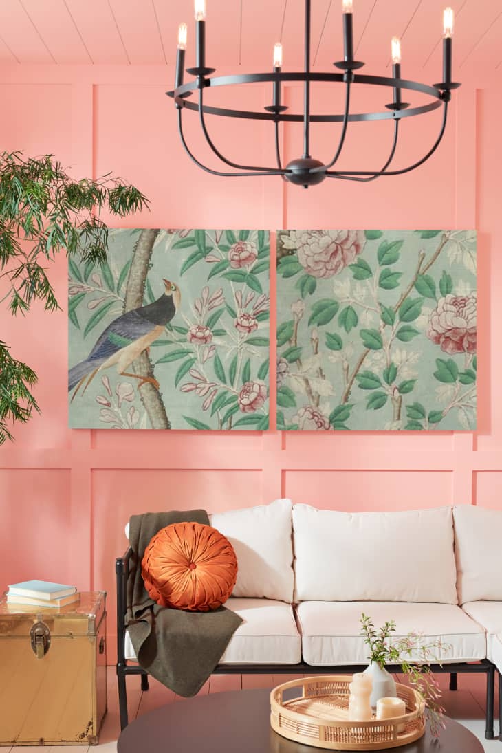
Jovial SW 6611 is a coral pink that’s subtle enough to use liberally, plus it contrasts beautifully with an earthy rust color like Knockout Orange SW 6885. Julep SW 6746 and mineral Copen Blue SW 0068 keep everything grounded, while Greek Villa SW 7551 adds a warm neutral touch. All together, they evoke warm breezes, blooming gardens, and out-of-office replies.
How to Use It
“This palette would look great in any room that gets lots of light,” Sara says. For large washes of color, like a full wall or even the ceiling, look to Jovial SW 6611 or Copen Blue SW 0068 — perhaps paired with Greek Villa SW 7551 for a two-tone effect.
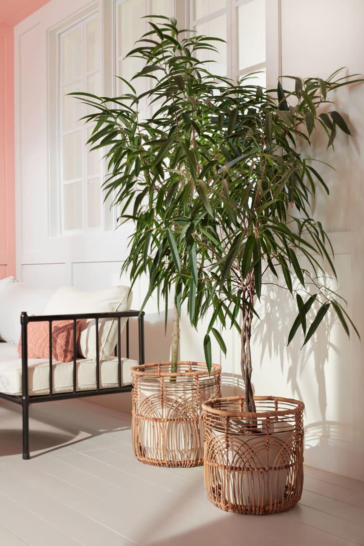
The darker notes of Knockout Orange SW 6885 and Julep SW 6746 make them ideal accent colors. Think throw pillows and tabletop decor, plus contrasting painted elements, like the interiors of shelving. And remember: There’s no such thing as too many plants. Some greenery and fresh flowers will complement this color palette beautifully.
But of course, part of what we love about this palette is its versatility. Let your favorite hue lead the way, then incorporate the others around it.
See any Sherwin‑Williams® color in person by getting FREE color chips mailed right to your door. You can also check out their easy to use Peel & Stick color samples, which come in their most popular colors. Peel & Stick color samples let you quickly try on colors with no mess or dry time, so you can find the color you love with confidence.