
See How 5 Designers Made the Same Paint Colors Look Totally Different

The Small/Cool Experience is a shoppable online home design showcase and social event full of decorating tips and tricks from your favorite designers. Thank you to our sponsors BEHR® Paint, Genesis G70, LUMAS, Overstock, Tuft & Needle, Chasing Paper, and Interior Define for making this experience possible.
From wall-to-wall murals to freeform painted shapes to solid statement walls, 2021 really is a playground for paint, as was the 2021 Small/Cool Experience.
As Erika Woelfel, Behr’s VP of Color & Creative Services, said on Instagram over the weekend, the “immediacy of paint and its ability to transform without a lot of time and cost” is definitely evident on the walls (and floors and ceilings) in many homes right now. With just one paint color, you can completely transform your space, and that one color can look completely different depending on the room it’s in.
Whether you’re splitting a can of paint between two rooms in your apartment or making use of a friend’s leftover DIY project paint, you can make a shade look specific to your space with decor choices and, well, more paint — by taking inspiration from Small/Cool, of course.
See how five Small/Cool designers put their own twists on the same shades of Behr paint in the rooms they designed.
Baseboards vs. Bold Pops
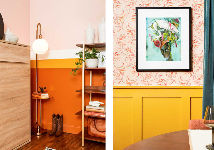
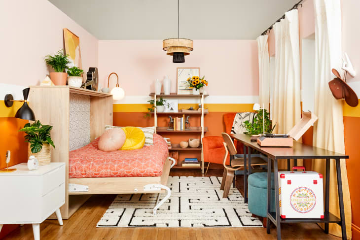
David Quarles IV and Natalie Papier both used Saffron Strands, a sunny gold with just enough notes of tan to make it work as a room-anchoring moulding choice or as a or a small pop of color reinforced through decor.
Quarles IV’s dining room, “Make it Maximalist,” features Saffron Strands on the wainscoting and trim to balance out the blue and pink statement pieces without becoming too overpowering. Papier’s multifunctional room, “Flexible Spaces,” uses the gold shade to round out the room decor. Note how the sunflowers and the tufted SAFAVEIH pillow match the single stripe on the wall.
Tropical and Warm vs. Classic and Cool
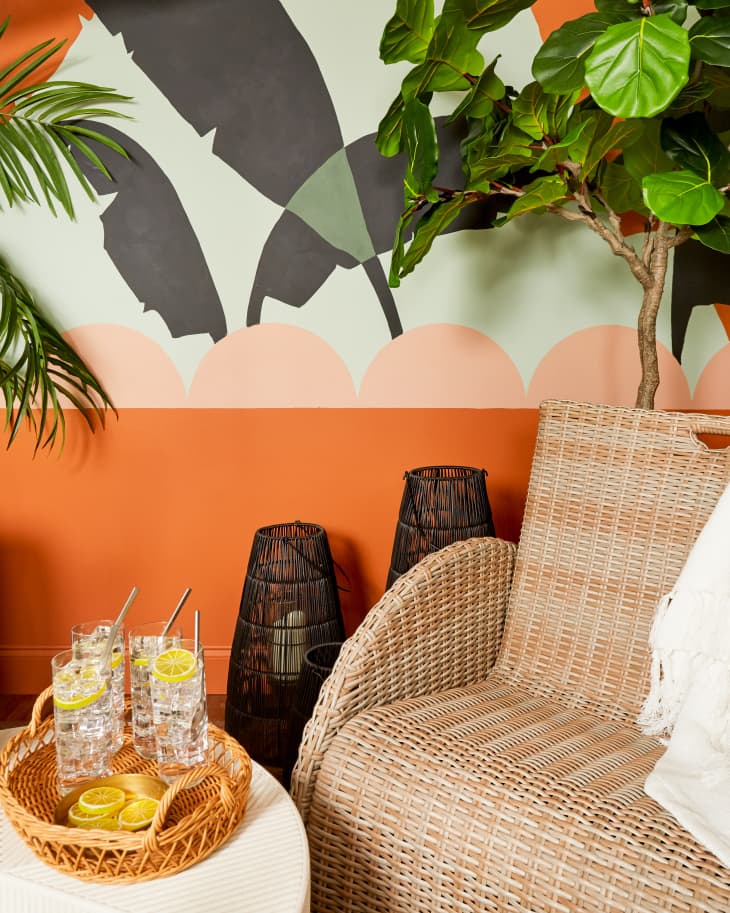
The cinnamon-y orange of Maple Glaze might make it feel too bold at first, but Liz Kamarul and Noz Nozawa prove that’s not the case in either of their Small/Cool spaces, which make use of the color in two very different ways.
In “Bringing the Indoors Out,” Kamarul went bold. Her block of Maple Glaze is big and brings the warm, fun, tropical vibes. “I kept all of the furniture that I brought in fairly neutral and then wanted to really make sure that the paint was the star of the show,” she said of her design on Instagram. Maple Glaze is classic but unexpected in Nozawa’s room, “Classic Redux” where she added the warm shade in small doses to frames on the wall.
Classic Complementary vs. Blue, Orange, and Boho
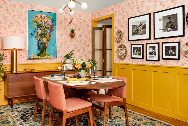
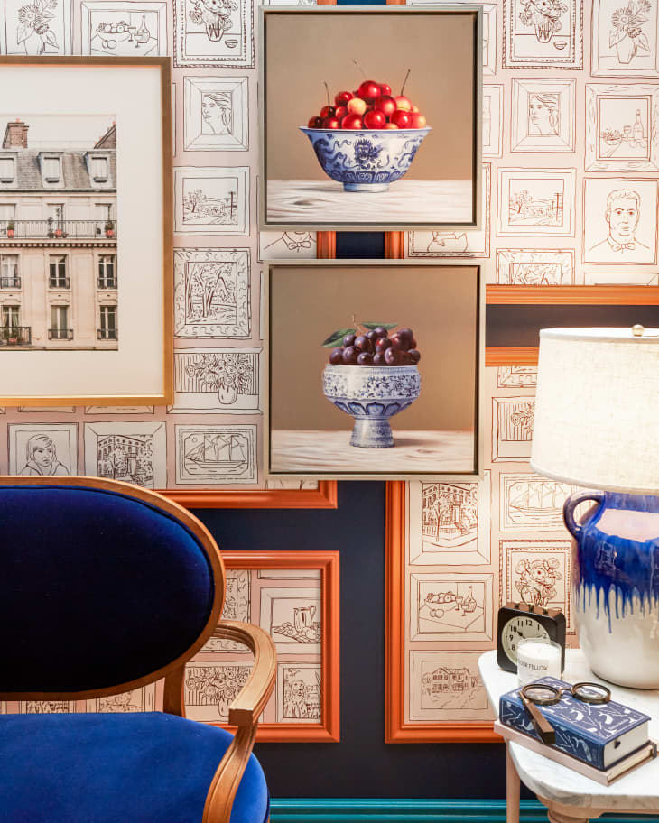
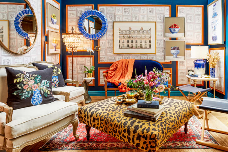
In addition to using Maple Glaze in her space, Nozowa used a shade all the way across the color wheel, Nocturne Blue. It’s a deep, soothing choice that served as the perfect backdrop for her layered look. “I was really excited about the idea of pretty much subverting the notion that classical and traditional design had to be sort of conservative,” she said of her color combo on Instagram.
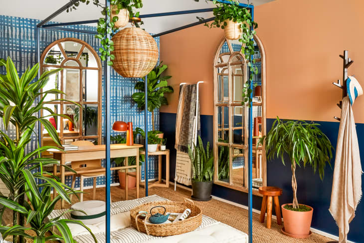
Estelle Bailey-Babenzien also paired warm with cool in “Biophilic Beauty,” where she paired Nocturne Blue and other blue shades with orange-y terra cotta. Her styling is more relaxed and boho than Nozowa’s but equally as small and cool.
…
So are you inspired and looking for a shade to try two ways? Nozowa and Kamarul are here to help. Those who tuned in to Small/Cool’s 2021 Paint Color Forecast know that right now, Kamarul is loving a Moss Stone/Canyon Dusk color combo, and Nozawa is having a moment with super-bright neon yellow and ultramarine, and on the more neutral side, brown. As the Small/Cool spaces above show, any of these statement shades can be versatile and suit your style depending on how you fill in the rest of the space.