Sherwin-Williams On What Color Palettes Will Take Us Into 2020 and Beyond

It’s still August, but you can bet 2020 will be here before you know it. With the new decade comes a new batch of colors of the year, and by the looks of it, we’ll be starting off on a well-hued foot.
Paint companies will often release a color trend forecast before their official pick of Color of the Year—usually with the new COTY hidden in plain sight amongst its palettes. We chatted with Sue Wadden, director of color marketing at Sherwin-Williams, over email to get her take on the latest trends.
“Wellness means something different for everyone, but the theme exemplified by our palettes is that there’s no one single way you can—or should—achieve it,” Wadden says. “Wellness requires being well-rounded, and we designed each of the five Colormix palettes to represent the many components that make up mindful living. Sometimes being our best selves requires slowing down and taking stock, but other times it may mean embracing change and opportunities to engage with others. When it comes to choosing color and designing spaces for our homes, this means being really thoughtful about the purpose of a space and how it can round out a sense of wellbeing at home.”
When it comes to color’s role in our wellbeing, she says, “Color helps shape our day-to-day environments and can greatly impact our mood—whether we’re consciously aware of its impact or not. For example, airy or washed-out shades can help instill a sense of relaxation; bright bolds can offer a boost of energy and focus; and warm neutrals can make a space feel friendly and inviting. When choosing paint colors, really think about how you want the particular space to feel and let those emotions guide your decision.”
Take a look at Sherwin-Williams’ Colormix Forecast for 2020 and beyond, and see if you can guess which hue will rule them all.
Haven
“Haven reflects the growing need for places of retreat away from our busy world,” says Wadden. “It was designed with Earth’s seasonal, renewing cycles in mind, drawing upon shades of sea (Granite Peak SW 6250), sand (Beige Intenso SW 9096), forest (Acacia Haze SW 9132) and sky (Stardew SW 9138).”
“The power of a neutral palette is something that can never be underestimated,” says designer Jean Stoffer. “Soft blue hues, shades of rich grey and a perfectly formulated pure white are timeless classics and essential staples in design. There is a plentiful amount of beauty to find within the natural world, so when those same hues are draped within interior spaces, the comfort of nature resonates within its inhabitants. The inclusion of live plants and psychologically proven calming color palettes are on trend at the moment and prove an interesting shift in dynamic within the design industry. If this mindset were to continue in the years to come, I am certain that the wellness movement will result in unprecedented growth and positivity within the home.”
Alive
According to Wadden, “Alive is inspired by optimism that comes with a blank slate and the importance of being present to soak up every moment. It features Naval SW 6244, a deep and grounding blue, balanced by nurturing neutrals and the rich, rejuvenating Ripe Olive SW 6209.”
“We are feeling a movement from the days of ‘the hustle’ to a balanced, better work ethic,” says Latham Gordon and Cate Dunning. “The concepts of authenticity, intentionally taking in the present moment, and self-care are ideas that are influencing the way we work, our personal lives, and how we design for our clients. We are using deep, rich colors that have an intense soothing quality to them more than in years past. We are going full force – painting every surface in a room navy blue or olive green. The choice gives the room purpose and a reserved intensity that we are relishing. It’s the equivalent of a thought-provoking novel that leaves you content vs. the beach read or intense thriller.”
Mantra
For Mantra, Wadden says it “came out of the intersection between East and West—particularly the ongoing desire for Scandinavian simplicity and elegantly efficient Japanese design. Muted neutrals like Grayish SW 6001 and Software SW 7074 effortlessly shift from warm to cool, offering subtle versatility.”
“Encouraging clients to use color is in my daily conversation,” says designer Kim Lewis. “I have always said there is a psychology in colors, and how they evoke emotions in design. I love that the combination of colors in the Mantra palette take a cooler turn, sweeping through the paint deck like a breath of fresh air.”
Play
“Play is wholeheartedly devoted to the need to let loose and have fun—something adults can easily forget,” Wadden says. “The saturated Juneberry SW6573 feels decidedly grown up, but surprising pops of Eros Pink SW 6860 and Gambol Gold SW 6690 keep things lighthearted.”
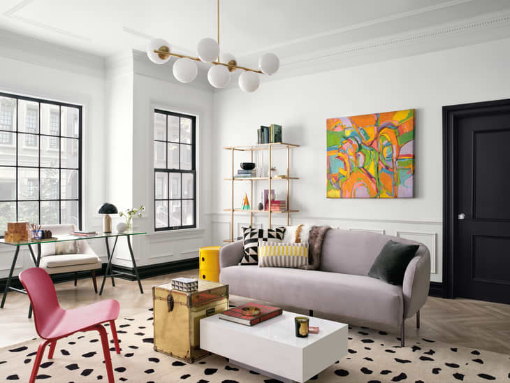
“I naturally gravitate towards the Play palette because large, bold original art set on Pure White SW 7005 walls (one of my fave SW colors) is a standard combination in our designs,” says Kelly Kole. “I also think that every room needs a touch of black (I prefer matte) and Caviar SW 6990 is perfect a perfect black with a tiny touch of brown.”
Heart
“Heart is based on our need for comfort and personal connection—sensations that are easily lost in our digital world,” says Wadden. “To bring those emotions forward, we took inspiration from bohemian design and create a harmonious palette of silky earth tones like Dark Clove SW 9183, Angora SW 6036 and Coral Clay SW 9005.”
“The colors in the Heart palette are so calm and inviting, yet bold if and when they need to be,” says Amber Clore. “Realizing that when it comes to paint, sometimes it needs to be the star of the show, and other times it needs to fade to the background. This palette does that so naturally.”