
These 7 Cool Paint Projects from Small/Cool 2020 Are Easier Than You Think

The Small/Cool Experience at Home is bringing 20 trends to life by 20 designers—all in less than 120 square feet. Check out the whole virtual experience online and at @apartmenttherapy on Instagram from May 15-17. Thank you to our sponsors BEHR, Amazon Handmade and Tuft & Needle for making this experience possible.
When it comes to totally transforming a room on tight schedule and an even tighter budget, it’s hard to beat a really great paint color. But why limit yourself to just one? For this year’s Small/Cool Experience at Home, a few designers went big and bold with their paint jobs—using multiple colors, creating abstract art, playing with shapes, and more. The high-impact looks definitely seem complicated, but don’t be intimidated: with a little patience, you can copy the look at home, whether your walls are blank or wallpapered. Read on to see some of the most creative paint looks from the Small/Cool Experience at Home, and learn how to do them yourself.

Ombre wall arch
Infinite Storage, designed by Apartment Therapy home director Danielle Blundell with Jamie and Fillip Hord, features a cool gradient arch behind the shoe shelves. This was done with six different Behr paint colors, but you could also create the gradient look with a single color mixed with different amounts of white.
To do it, grab a quart of your favorite paint color that’s in the mid-tone range. Decide how many shades you’d like to feature—this one has six—then pour your paint into that many separate plates or bowls. Mix white paint into each dish in increasing amounts to create six distinct shades of the same color.
Start slowly at first in adding white—it’s easier to add more if needed than try to balance out too-light shades.

Abstract wall mural
In this room, “Fields of Color,” by designer Orlando Soria, the walls are the art. The space has a lot going on, but if you break the walls down into individual paint projects, it’s a lot simpler than it seems. Tape is your friend when it comes to creating abstract shapes like these. Feeling brave? Apply the painter’s tape in random shapes without measuring; you can always move it before you start painting.
For even stripes, it’s easiest to paint the lighter shade first, then go back later to measure and tape out stripes before painting on the darker shade.

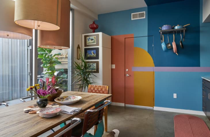
Color-blocked walls
This wall treatment from “The New Natural,” designed by Apartment Therapy’s Home Director Danielle Blundell, works with high-contrast colors or two shades of the same hue. Paint three walls in the darker shade of your choice, then for the fourth, measure the wall and divide it roughly into thirds. Apply painter’s tape, and paint the center section in the darker color; make the two outer edges the lighter one.
This technique is especially great for showing off artwork, as shown here with the abstract triptych.

Circle wall feature
For her “Sunset-Inspired Palettes” room, designer Michelle Lisac took her inspiration to the walls. “We chose to paint the walls with a simple yet fun circle pattern that represents a sunset and incorporates soft pinks, yellows, and burnt oranges,” Lisac says. To copy, create a makeshift compass with a thumbtack, a piece of string equivalent to the radius of the circle you’d like to draw, and a pencil. Tie one end of the string to the thumbtack, and the other to the pencil.
Once you decide where the center of your wall is, push the thumbtack into place. Pull the string until it’s taut, and use your pencil to trace all the way around until you have a full circle. Use a 2-inch paint brush to fill it in with paint; you can also draw a line in the center to paint each half a different color, like Lisac did. The rest of the room is easy: Use painter’s tape to divide the walls in half, and paint your darker shade on bottom and your lighter shade on top.

Half-circle wall feature
Designer Gunnar Larson also used a circular feature in his design, “’80s Explosion.” For this look, pick a lighter color to serve as your base color for all four walls. Then, choose a darker color—like this mossy green—for the half-circle. Create a compass as outlined above, but instead of pushing your thumbtack into the middle of the wall, push it in at the base of the wall (it should still be horizontally centered). Then, pull the string taut to sweep your pencil around to create a half circle. Paint it in using a 2-inch brush.
Painted stripes with a two-tone color scheme
In her “Mix and Match” space, designer Carmen René Smith created lots of drama and interest without a lot of paint. Most of the walls are white, but for an updated take on crown molding, Smith created three thin black stripes that run all the way around the top of the room’s walls. You can get the effect by blocking off three thin stripes with painter’s tape, and filling them in using a small 1-inch or 2-inch paint brush. The middle of the feature wall showcases a large black band—you can get the effect by copying the technique for color-blocked walls above, but turning the middle stripe on its side.
Bands of color
This paint effect, seen in Kelley Carter’s “Bright Monochromes,” is another that requires just a bit of measuring. First, paint the walls in your first color; you can leave space near the baseboards and ceiling empty, since you’ll fill those in later. Once that’s dry, use painter’s tape to section off one to two feet at both the bottoms and tops of all four walls. Paint in with your second paint color to create a two-tone effect.