
See How a Stager Used Subtle Tweaks to Enhance a Canadian Living Room
Even the best of us need a little practice every now and again. That’s what happened when an elderly couple invited Christine Markulis, owner, lead stager, and stylist at Upmarket Interiors in Toronto, to stage their living room for free and have it professionally photographed for her portfolio.
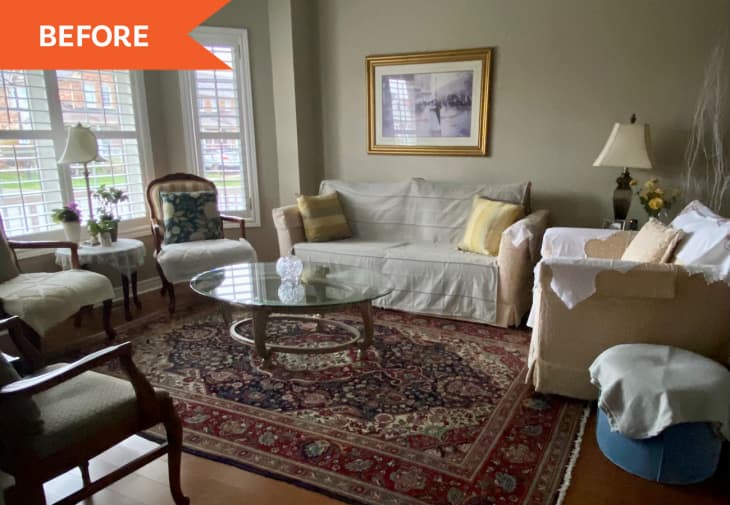
The four-bedroom, two-and-a-half-bath home in Markham, Ontario, spans 2,100 square feet, but Markulis only tackled the one space — and it certainly presented enough of a challenge. Thanks to poor furniture placement and excess seating (including a mix of new and antique pieces), the living room looked “busy and off-balance,” she says. “Also, the rug, wall art, and other accent pieces were a little too personal in style and heavy-looking.”
Since the living room is the first space that visitors see upon entering, it was important to create a brighter and larger space that would appeal to today’s buyers and get on their short-list of properties to view — if the home were really on the market. Considering that the couple had very traditional taste, modernizing the space while maintaining its elegance was a tightrope walk. However, she says, “several small changes can make a big impact.”
So, instead of starting from scratch, Markulis leaned into key elements of the room, including the tan sofa and taupe walls, for a neutral transitional design. Luckily, even though painting wasn’t an option, the walls were in good shape.
“We just needed to inject light neutrals and reflective surfaces to help lighten up the house,” she says. Also, to bring attention to the spaciousness of the room, the 9-foot ceilings, the bay window with California shutters, and the hardwood flooring, she needed to eliminate distractions and focus on the flow of the room.
To winnow down the number of items, Markulis provided the homeowners with a list of items to pack and place in storage. She removed the Persian rug, which was too dark, and worked with the sofa, upholstered in a subtle peachy-pink chenille fabric, as a starting point.
“We knew we were working with a monochromatic color scheme, so we brought in two properly proportioned armchairs and positioned them in front of the bay window in a linen fabric similar in color to the sofa,” she says, adding that, without the large armchair that was previously in the way, the sofa could be centered on the primary wall. “This new seating arrangement was welcoming and just made sense for the space.”
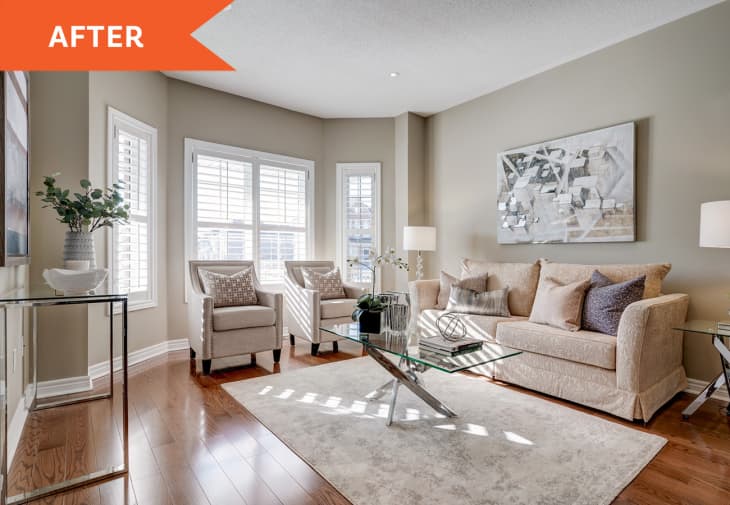
Next, two end tables and a matching coffee table in a shiny chrome finish help bring more light into the room and look great in photos. For above the sofa, Markulis found a piece of wall art in just the right colors to complement the monochromatic palette. “We lucked out with that,” she says. “I couldn’t imagine another piece working as well as this one did.”
With those elements balancing that primary wall — which became “so calming to the eyes” with those changes, she says — Markulis felt an ivory rug with a light taupe pattern would brighten up the space even more. Opposite the sofa, a chrome console table mirrors the other shiny furnishings, and a large piece of art over it creates further balance in the room and makes it feel much larger.
To finish off the look, she incorporated details like feather-filled patterned pillows, a bit of greenery, and artful accessories.
So, how did Markulis think her staging experiment turned out? “All of these little changes combined made such a huge improvement to this living room,” she says. Mission accomplished.