
This Bold Jewel Box of Colors Will Transform Your Space

Subtlety is nice, but this year we’re more into style that shouts a bit. For those who don’t shy away from color, we created a paint palette that will add a little shine and sparkle to your home. Full of lush jewel tones and vibrant pastels, it’s like a treasure chest of baubles — a.k.a. the perfect accessory. Meet the color palette we’ve named Crown Jewels.
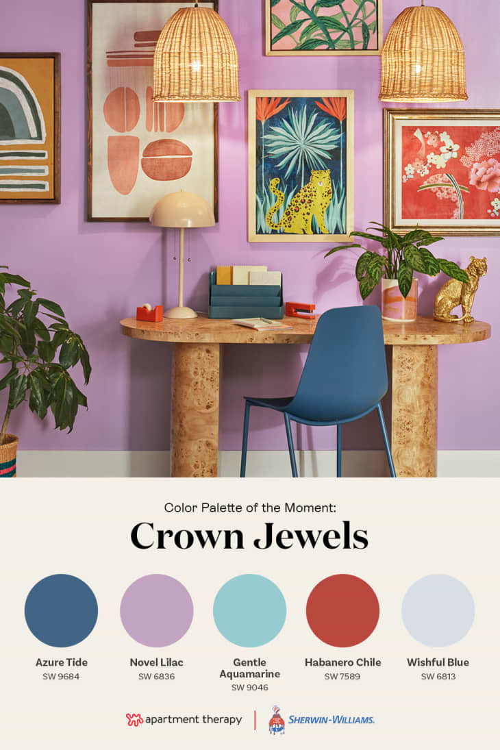
Created by designer and visual artist Sara Weissler, Crown Jewels is now the way to keep your home’s style exciting (but not overwhelming) to you day in and day out. Together, these paint colors banish boredom from any room, and because they all come from Sherwin‑Williams®, they’ll brush on easily and stay vibrant for years. Let’s take a look!
What Inspired It
For this palette, AT color expert Sara Weissler leaned into the unexpected. “I was imagining opening a box and watching vintage jewelry and scarves come tumbling out,” Sara says. “These are bright colors that people rarely put together, but when they’re done well, they inspire so much joy, and it just somehow works.”
We regularly see jewel tones saved in personal palettes on our Prism tool, so we also have you to thank for providing inspiration for this palette. Sara paid attention to trends on Prism while designing Crown Jewels, and used what she saw to guide her color choices. After seeing Novel Lilac SW 6836 in real homes on the site, she knew it would fit perfectly. Click the little rainbow button on the bottom of any AT image to join the color convo!
Why We Love It
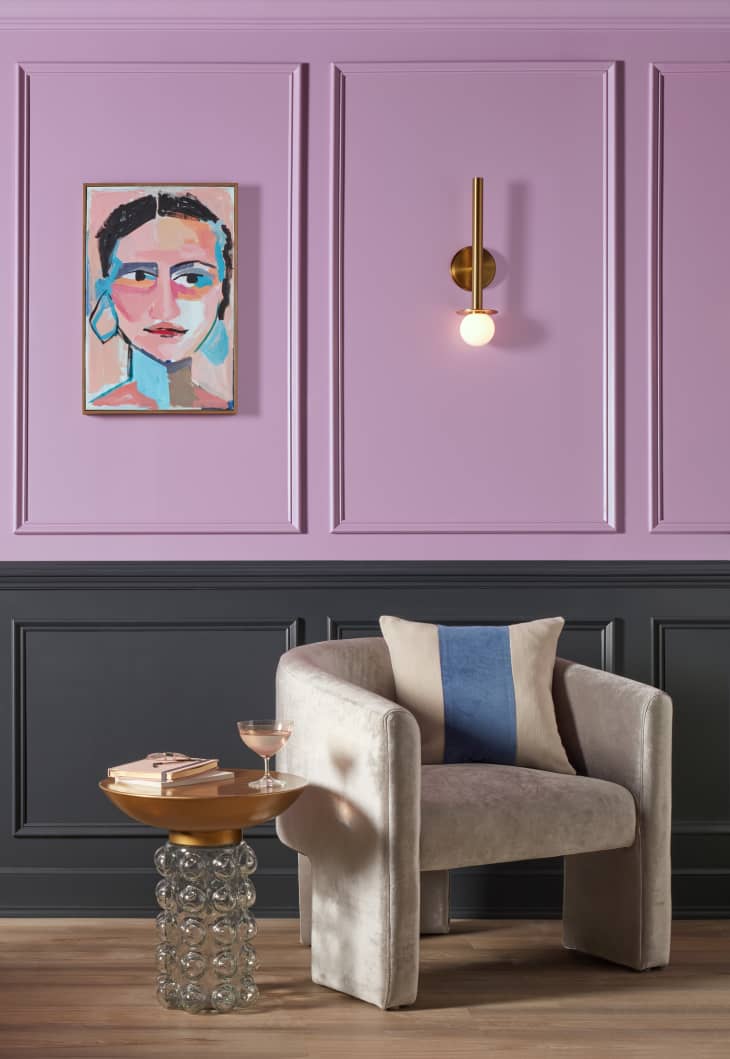
What’s not to love about jewels? The rich pigmentation of Azure Tide SW 9684 and Habanero Chile SW 7589 lend depth and heat (no pun intended). The easy touches of Gentle Aquamarine SW 9046 and Novel Lilac SW 6836 bring balance. And we’re obsessed with the barely-there Wishful Blue SW 6813, which is light enough to act like a neutral without being boring. Put ’em all together and you’ve got opulent dinner parties, modern art museums, and more-is-more vibes à la Iris Apfel.
How to Use It
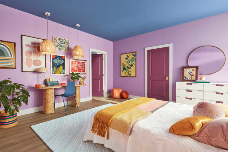
“Azure Tide SW 9684, Gentle Aquamarine SW 9046, and Novel Lilac SW 6836 could be used in big bold statements that fill an entire room and are then layered with lots of other rich colors and textures,” Sara says. “This type of maximalist space would allow for unexpected moments, such as a door or piece of furniture painted in Habanero Chile SW 7589 or Wishful Blue SW 6813.”
And these colors are just begging for a gallery wall: Use your favorite hue as the base, then incorporate the others in your prints and frames.
Need a little help going bold? Book a FREE Virtual Color Consultation from Sherwin‑Williams® to snag a 30-minute chat with one of their color consultants. They’ll provide expert color recommendations, a personalized project plan, and more so you can choose your colors with confidence.
And with their Peel & Stick color samples — available in their most popular colors (with free shipping!) — you can see exactly how colors look and feel in your space before you start painting.