This TikTok Tip on Color Matching Will Change How You Build a Color Palette

Picking a palette and matching those colors across items in a room seems like something that should be simple. Just pick a few shades and get started, right? Unfortunately, it can be harder than it seems. From hardwood floor hues to paint colors for interior trim, there’s a lot to think about — even in a single space.
That’s where TikTok comes in: Interior stylist Julie Sousa (@the_avantgarde) broke down one way of successfully matching interior colors in a now-popular video. Sousa offers a method for making sure your room doesn’t fall flat by being a little too matchy-matchy.
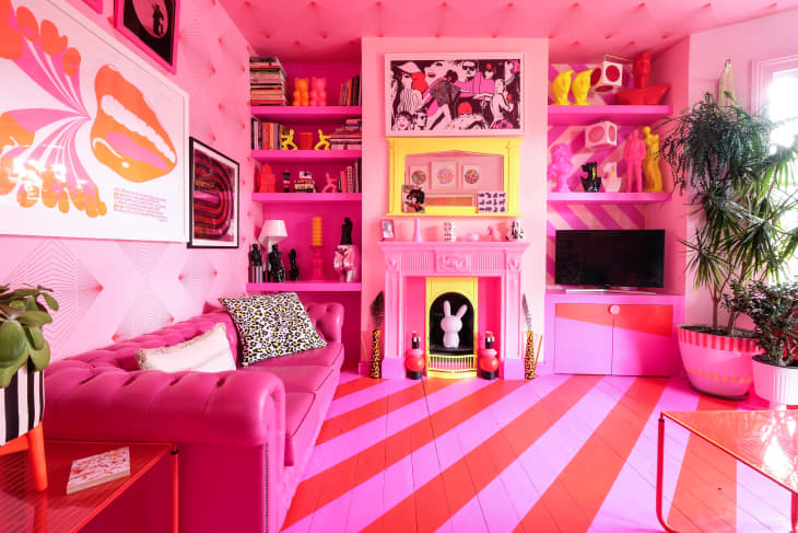
“One of the most common mistakes people make when decorating is matching things in a room,” she says. That’s right — repeating the same color or a trio of colors over and over in a room, according to Sousa, is a mistake. Too much repetition can result in a monotonous look. Instead, she advocates for creating “a more complex color palette,” namely through adding shades and tints of your palette’s main colors. So if you start, for example, with three main shades in your palette, you’d want to build out from there with one to two variants of each of these main hues, typically by going either lighter or darker in tone.
Take this Melbourne bedroom, for example. The main color palette at work here is peachy pinks and mustard with a pop of blue. But to create a lovely, layered look, the homeowner chose a darker coral quilt to add a bit of saturation to the mix. The blue on the printed bedspread creates an eye path to the piece of art hanging above the bed, which is framed in a natural wood that also echoes the side table’s finish.
Designer Lynn Stone, co-founder of Hunter Carson Design, is 100 percent on board with this method of palette building. “They can help define the mood of a space and affect how people feel when they are in it. Layering in shades can take a space from ‘just another room’ to something truly personal, bespoke, and inspiring.”
Laura Williams, the owner and lead designer of ATX Interior Design, points out that there are other ways to make a matchy-matchy color palette work. You could go in a completely different direction by amending your original palette with accessories in complementary shades. A pop of a hue that’s on the other side of the color wheel may add just the variety you need to craft a well-appointed space.
No matter how you choose to build a palette (whether it’s some variant of the matching colors strategies discussed here or otherwise), Stone offers one last piece of advice: Think like a designer does, and order samples so you can view your shades in real life.
“You need to see how a paint sample works with the sofa, rug, pillows, or whatever else you’re designing,” she says. “Consider the undertones of the colors and how they interact with one another. Then make sure it works in the space you’re creating.”
