
8 Surprisingly Perfect Paint Colors Designers Swear Work in Every Room
If there’s one thing interior pros agree on, it’s that paint ideas have real power. A single shade can shift the mood of a room, make awkward layouts feel intentional, or tie together pieces that never quite looked right before. In Apartment Therapy’s latest State of Home Design 2026 survey, 140 designers shared the paint colors they return to again and again. These are the surprising shades they trust across the board, whether they are renovating a compact apartment, refreshing a dated living room, or pulling together an open plan that needs a sense of flow.
What emerged is a clear set of timeless hues designers rely on to solve all kinds of design challenges. These paints show up in bedrooms, bathrooms, kitchens, living rooms, and the smaller spaces in between. They add depth without overwhelming a room, and create harmony without fading into the background. They are flexible enough to work with different styles, and durable enough to survive shifting trends. Ahead are the eight paint colors designers consistently call their go-tos — the tried-and-true favorites that prove themselves year after year.
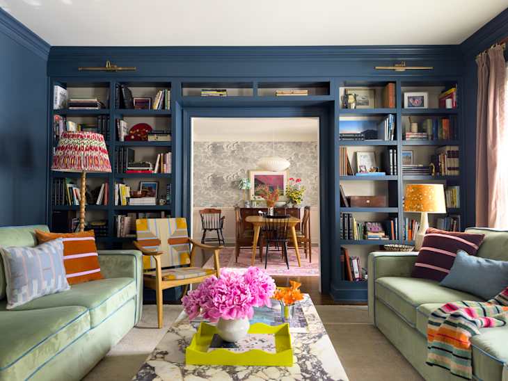
And an honorable mention goes to Farrow & Ball’s Stiffkey Blue (No. 281), which designer Mary Kathryn Wells used in the gorgeous sitting room meets library above. A few other pros gave this shade a shout-out, too, but it was just edged out by the competition below.
Sherwin-Williams’ Urbane Bronze (SW 7048)
“Urbane Bronze is a game-changer, and is my favorite color of all time,” says designer Marlaya Ross ofStudio One Nine Design. “It can work in any space with any color.” This shade brings a grounded, modern feel that instantly makes a room look more pulled together.

Benjamin Moore’s Love & Happiness (1191)
Love & Happiness offers a subtle hit of color that feels fresh without taking over the space. “This soft pink is the perfect touch of blush for any room,” says Rebecca F. Jones of Rebecca Frye Design. “It works beautifully in a bedroom but also in a more public room, like the living room.”
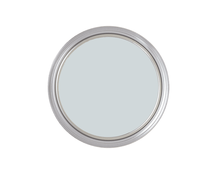
Farrow & Ball’s Borrowed Light (No. 235)
Designer Kevin Francis O’Gara of Kevin Francis Design calls this pale blue “uniquely versatile,” noting it never reads too cold and pairs beautifully with warm woods. Paige W. Dick of Paige Designs adds that Borrowed Light is “soft, airy, and versatile” and makes any room feel bright, calm, and effortlessly put together. This hue’s ability to shift gently with natural light makes it especially adaptable in homes where rooms serve multiple functions.
Sherwin-Williams’ Greek Villa (SW 7551)
“It is a warmer, cozier white that typically goes in any space,” says designer Emily Roose. Greek Villa creates a welcoming backdrop that works with a wide mix of furnishings and finishes. You can see that at play in the room just above here by designer Amy Studebaker. She previously described it to Apartment Therapy as the perfect modern white.

Benjamin Moore’s Revere Pewter (HC-172)
“It’s a forever-favorite warm gray that adapts beautifully to both cool and warm tones,” says designer Kristen Keyes. Revere Pewter’s flexibility makes it a reliable choice for open layouts or transitional spaces, just as you see here in a hallway by Anand Sheth, an architect, designer, furniture maker, and curator. If you’re looking for a beige-meets-greige chameleon, you’ve found your match here!

Farrow & Ball’s Setting Plaster (No. 231)
Designer Parul Jain Ghei of Studio Jai loves colors that act like neutrals with personality. “They add instant depth without shouting for attention” and feel like a quiet friend who makes every room better. That’s why she’s all about Setting Plaster in particular. It has a soft, lived-in quality that helps a space feel warm but still airy.

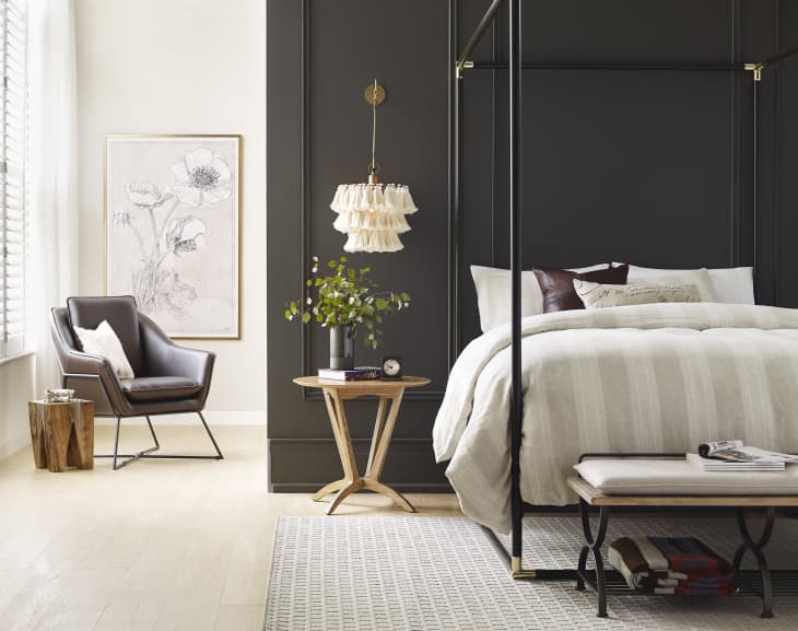
Sherwin-Williams’ Iron Ore (SW 7069)
Designer Kaylee Pauley uses this rich, cozy black everywhere from paneled rooms to pantries. “It pairs beautifully with brass, medium brown woods, and nearly every tile or warm white,” she says. Iron Ore is a great option if you want contrast but still want the space to feel inviting.
Benjamin Moore’s Lucerne (AF-530)
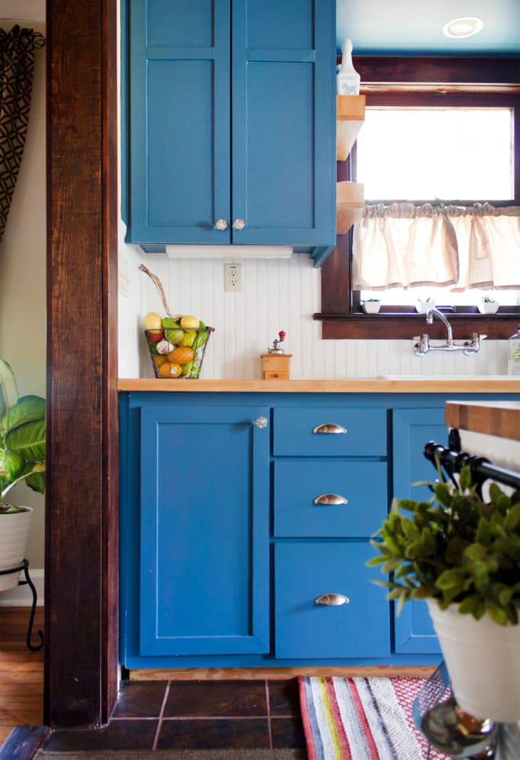
“It’s my favorite moody blue-green that adds instant depth to any space without feeling too dark or heavy,” says designer Sarah McCarty. Lucerne creates a cocooning effect that works especially well in rooms meant for relaxing or resetting. Or you can try it in a kitchen; it looks fantastic here in this Austin home.
Design Defined
Never miss the style inspo and recommendations you crave with Design Defined. Follow along each week as our Home Director Danielle shares the best style advice, latest trends, and popular decor finds you just can't miss.