
3 Unique Color Combos to Inspire Your Next Decor Project

The Small/Cool Experience is a shoppable online home design showcase and social event full of decorating tips and tricks from your favorite designers. Thank you to our sponsors BEHR® Paint, Genesis G70, LUMAS, Overstock, Tuft & Needle, Chasing Paper, and Interior Define for making this experience possible.
Black and white. Blue and green. Yellow and gray. These tried and true color combos work for a reason. But decorating a home doesn’t need to be so prescriptive. If you’re looking to break out of a color rut and explore more hues, just take a look at these gorgeous spaces from Apartment Therapy’s Small/Cool Experience.
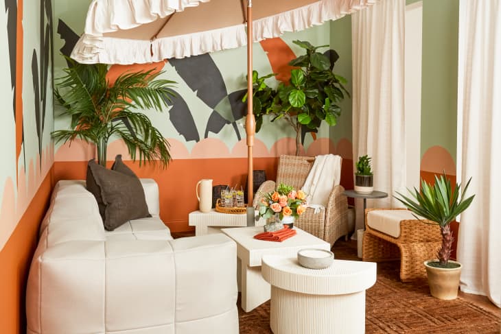
Red, Green, and Gray
In the Bringing the Indoors Out room, Liz Kamarul mixes desert reds and pinks with sagey greens and charcoal for a space that’s warm yet refreshing. Wondering why this works without looking like a Christmas display? Kamarul used two different saturations of her main colors, red and green, and balanced them with a neutral deep gray.
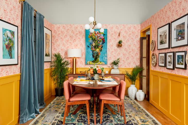
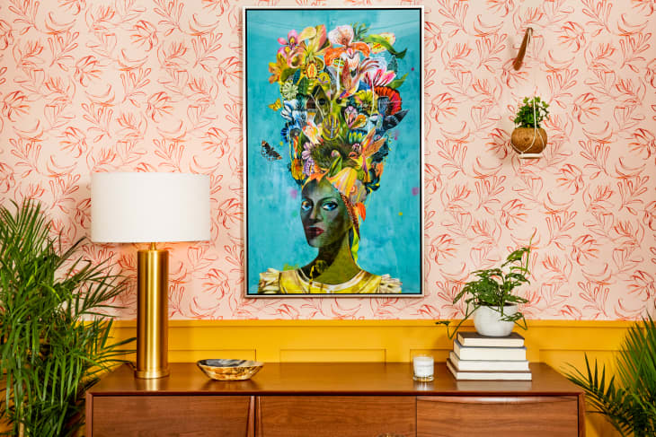
Saffron, Pink, and Turquoise
David Quarles IV’s Make It Maximalist room, it’s a dining space that’s also a feast for the eyes. Everything you need to know about why this room works is hiding inside your printer. Yellow, magenta, and cyan (along with black) make up the hues that create the full range of color in print form — these are just slightly different tones of those three pigments.
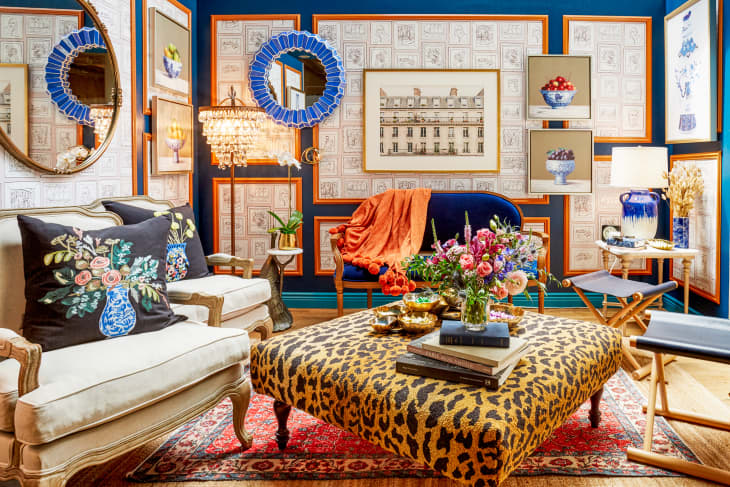
Navy, Teal, and Orange
Before you write off orange and teal together as being too much, take a look inside the Classic Redux room designed by Noz Nozawa. She uses navy as a grounding neutral on the walls, and adds an unexpected twist with colorful moldings. The rest of the room helps keep the balance with linen upholstery, wood accents, and a leopard ottoman (yes, leopard is a neutral).
See the rest of our Small/Cool Experience coverage here.