Before and After: This New Kitchen Has a Very Unique Tile Backsplash

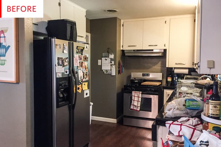
This kitchen had a ton of pros—stainless steel appliances, wood flooring, tasteful paint colors, granite countertops, a window—but its cons were difficult to work with. The owner called it, “poorly lit, claustrophobic, and tight.” With the help of some professionals and the removal of a wall, the kitchen is now light, bright, and feels much more roomy.
Jenn Hair of Jenn Hair Photography is the proud owner of this jewel of a kitchen. With its delicate green cabinetry, subtly veined countertops, gold accents, and unique tile arrangement, the kitchen is pretty and unique. The new paint, tile, and counters bounce light beautifully, which flows better thanks to the removal of a wall. And though the pale aqua paint adds plenty of color, Jenn goes a step better by adding a teal vase and Dutch oven and an orange tea towel and rug. The resulting look is vibrant yet tranquil.
The paint on the lower cabinets is Halcyon Green by Sherwin-Williams. The white tiles are from All Modern and the black tiles are by Merola Tile from Home Depot. The pulls are by Lewis Dolin from The Hardware Hut, and the countertops are Calacatta Gold from Silestone.
This kitchen has some obviously enviable qualities, but let’s learn a bit more about what living with it was really like:
Our original kitchen was poorly lit and lacked both storage and functional counter space. The original countertops, while a nice granite, were black tile, which sucked even more light out of the space and meant dealing with tile grout which never felt clean. We had an interior wall where the refrigerator was seated that made the whole space feel claustrophobic and tight. I cooked meals in one small corner of the kitchen and when we had parties the kitchen quickly felt overwhelmed with people. It was also poorly ventilated, and my (not that bad) cooking would occasionally set off smoke alarms despite running the vent hood.
We decided to start our remodel in the fall of 2017 when I got a new job and we knew we’d be sticking around Austin for awhile.
The black tile stripe—almost like a statement wall within a wall—is a fabulously striking feature. It breaks up all the white, and makes the stove appear as the kitchen command center. It also helps the black portions of the stove tie in with the rest of the room.
It’s wonderful to see that the gleaming hardwood floor is still in place after the renovation. It provides such a rich, dark base for the pale hues of the kitchen to float above. The orange rug is a clever touch, the perfect complement to the aqua cabinetry.
This is the wall that was removed to open up the kitchen, and it unfortunately concealed an expensive issue:
We enlisted Blue Diamond Remodeling to carry out the plans and worked with them closely on the design, picking out everything from the countertops to the hardware, the paint colors to the appliances and fixtures. They demolished our original kitchen early October 2017 and we were done by mid-January 2018 so it took about three months. Removing the wall where the refrigerator was seated revealed an unwelcome surprise: early washer/dryer hookups were hidden in the wall. I’m not sure who would have placed their washer/dryer in the original 1957 kitchen, but it was a fun extra charge for jackhammering down into the foundation to cap them off below the surface so we could have the open kitchen plan we were wanting.
Where the refrigerator wall was located is now more counter space and a breakfast bar—an excellent way to get more utility out of the floorspace without creating a crowded feeling. The stools are a lovely touch, coordinating with both the wooden floor and the black wall tiles.
While the charms of this kitchen are obvious, Jenn reveals a few hidden touches that make it really work:
We have tons more light and counter space, which makes cooking in there a total joy. When we have people over, they no longer feel crammed into a tiny, dark space when they naturally gravitate toward the delightful smells of cooking food. We have fantastic custom built-ins like a slim spice rack to the left of the oven, a Lazy Susan spinning shelf to fill the awkward L-shaped space to the right of the oven, a built-in space for trash and recycling in the island, and a large shelf for small appliances like our microwave and toaster oven on the inside of the island. The only thing we might have done differently is expand out into the backyard for even more space—something we explored early on but decided we couldn’t afford.
The pendant and flush-mount light above the sink are both from CB2. The stained-glass pennant is by fluxglass on Etsy, and the champagne faucet is by Delta from Ferguson.
Now that the kitchen is complete, Jenn has some great advice if you’re considering working with a company to renovate your home:
Getting estimates for remodeling work is a frustratingly opaque process—our bids covered a huge range and it was hard to know who was going to be the best company to work with. I highly recommend getting personal recommendations from friends or family—or getting a list of references from the remodeling company you’re considering to ask them questions as a second-best option.
Thank you, Jenn Hair of Jenn Hair Photography!
