
What Are the Colors of 2013? Paint Trends from Room for Color

This year’s Room for Color contest, sponsored by Chip It!™by Sherwin-Williams, is notable for the boundless array of different palettes. So much variety! We love seeing readers’ personal styles shine through their use of colors in so many creative ways. And though each entry is unique, some trends are becoming apparent. Here are some trends we’ve spotted—let us know what we missed in the comments!
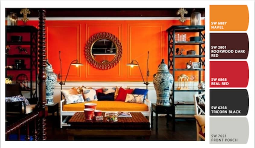
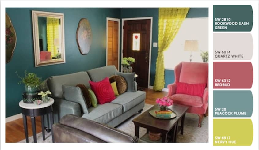
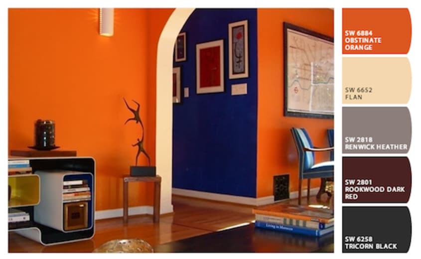
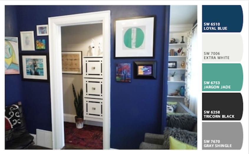
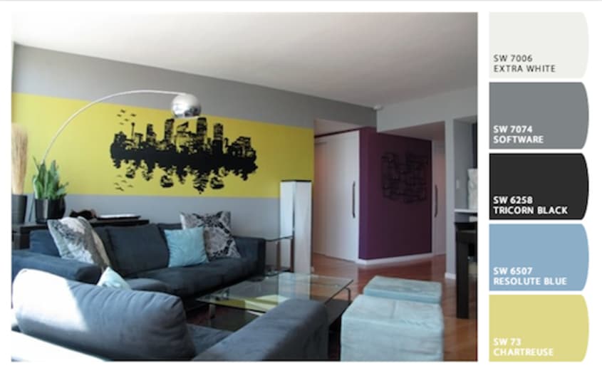
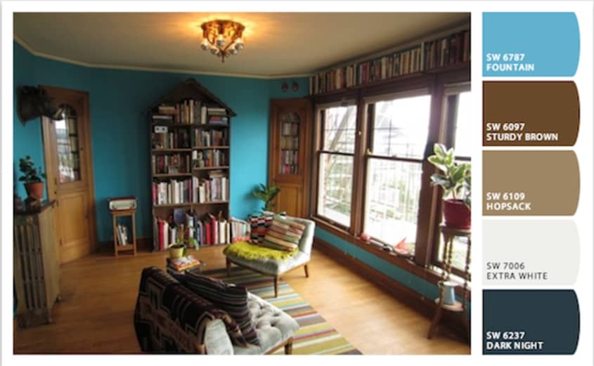
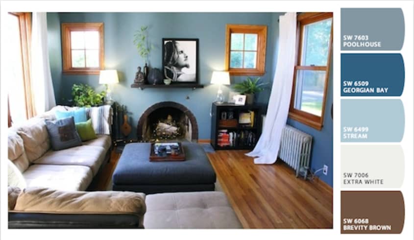
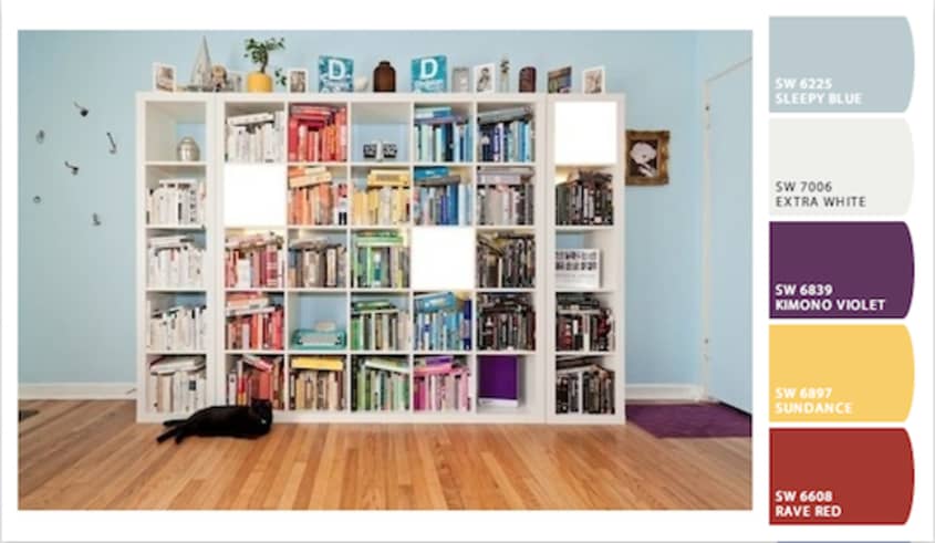
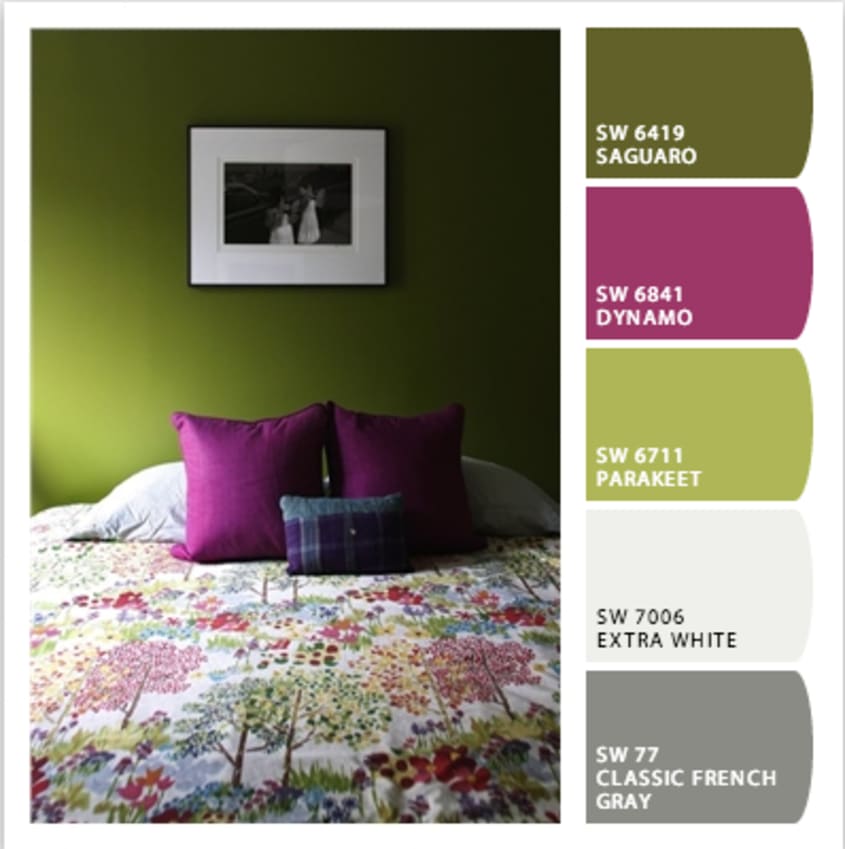
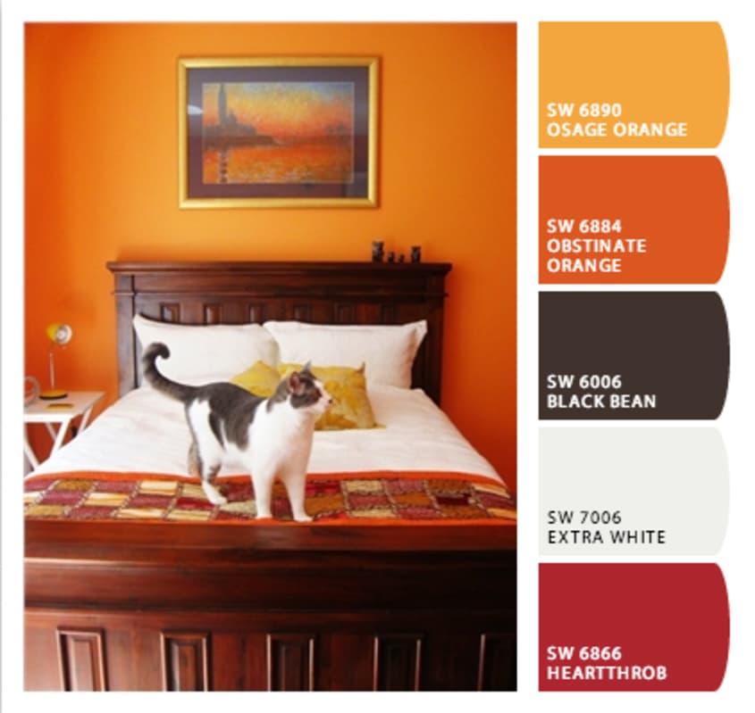
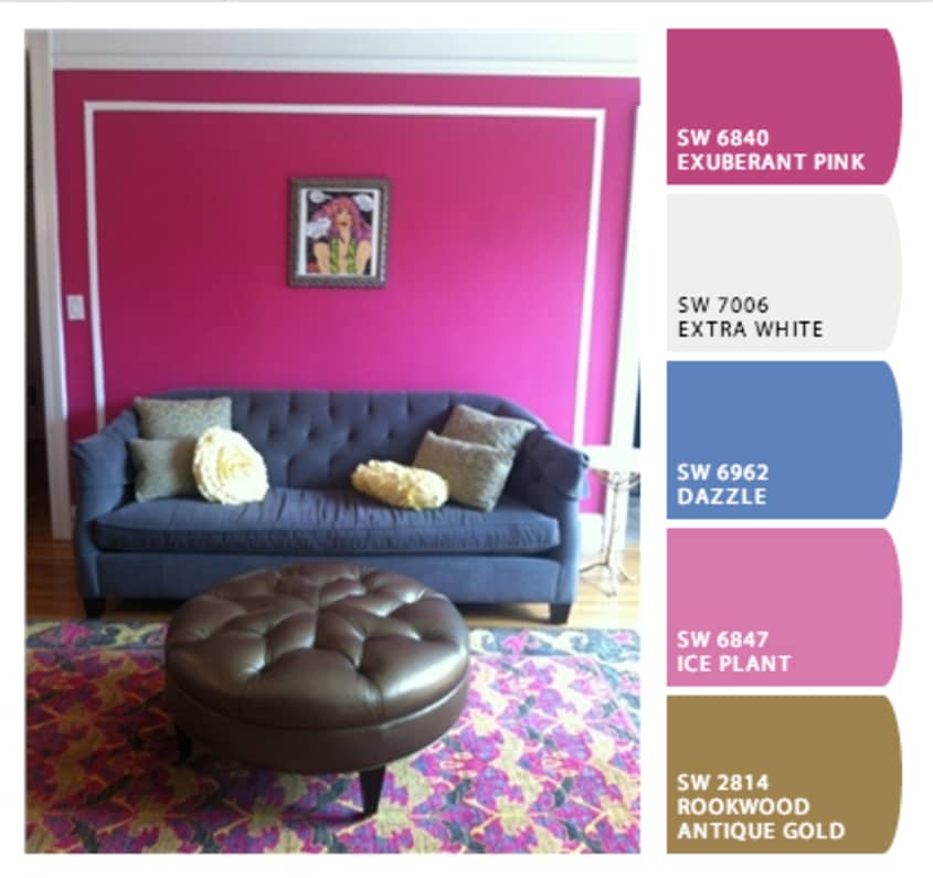
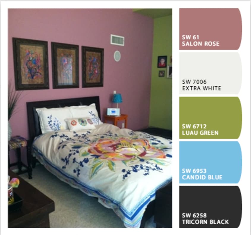
Super-Saturated Colors: We’re seeing so many rich colors. People are not afraid of some serious saturation! Some of the most successful examples balance those deep colors with calm whites, but we’re also noticing a lot of saturated colors paired with other strong colors.
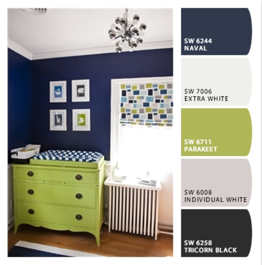
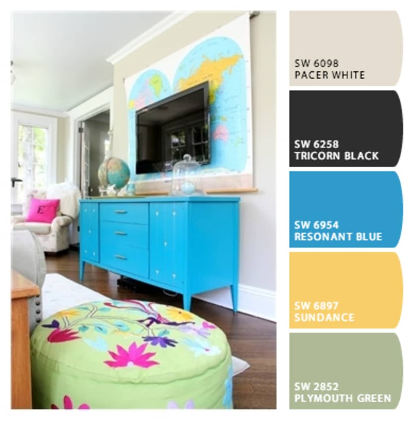
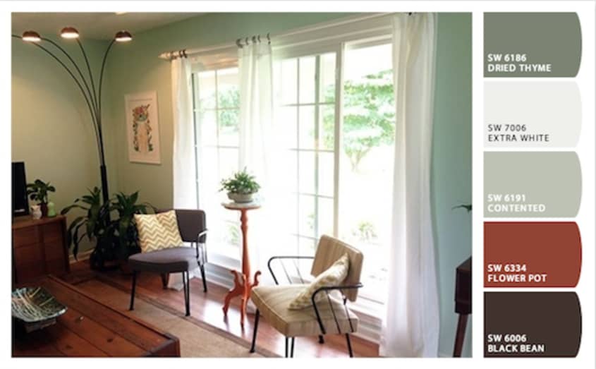
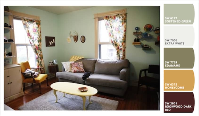
Light Walls with Colorful Accents: Renters, have courage! There are so many wonderful examples of rooms with white walls that still use color in fabulous ways. A lot of light-walled entries add color and texture through accessories like curtains and pillows; others use painted furniture for their color fixes.
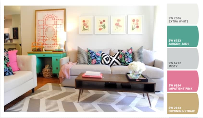
Pattern Mixing: We consider ourselves pretty fearless when it comes to mixing colors, but patterns are a different story. Several entries, though, know just how to use pattern to create a sense of whimsy or sophistication—or both.
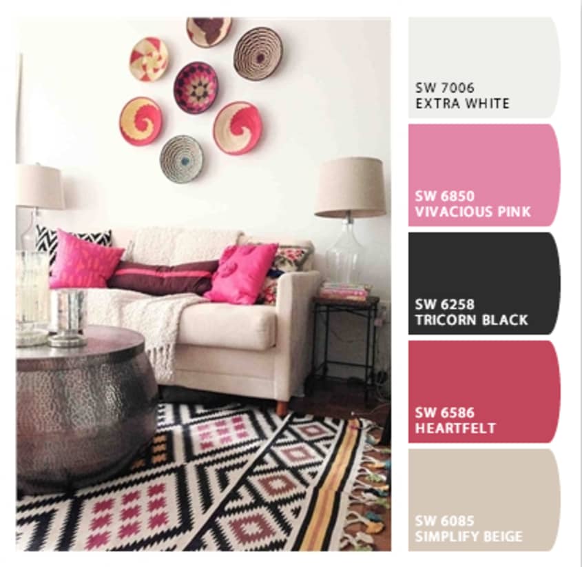
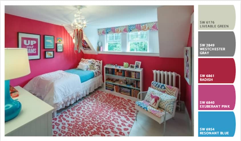
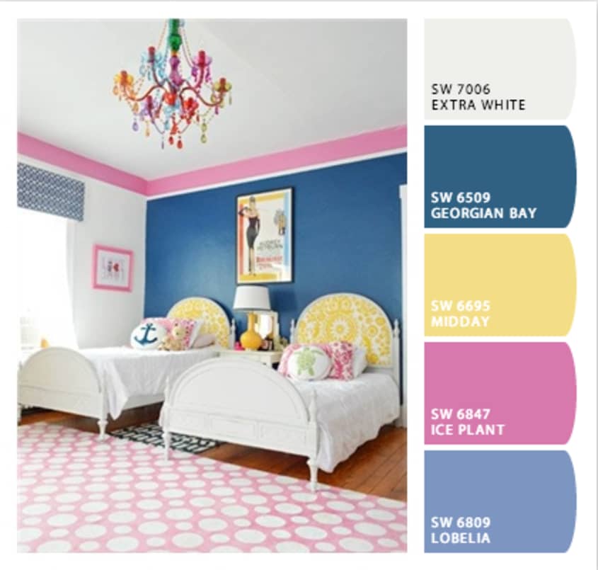
Okay, but what are the most popular color families? Did you guess? So far, blue is the winner (as it was last year), followed by green. But we’re really interested in some dark horse favorites: Orange is having a big year, with some seriously bold entries. But the biggest increase over last year’s entries comes from the pink family. From baby pink to Schiaparelli-esque shocking pink, that hue is having a real moment.
What are your favorite trends from Room for Color 2013? Tell us in the comments!