
This Builder-Basic Kitchen Got a Makeover That “Feels Quietly Elevated”
Kitchen expansions are dramatic (and sometimes necessary), but often expensive. If you can find a way to keep the same footprint and add function in a kitchen makeover it’s often the most efficient, time-wise and cost-wise — and the least messy because there’s not as much demo or construction required.
For homeowners Erica and Joe Chekanoff and their interior designer, Molly Blain Cochran, the goal was to rework the layout of Erica and Joe’s 110-square-foot kitchen without having to expand the space.
“The layout just didn’t work,” Erica says. “The refrigerator jutted into the middle of the room, and one entire wall sat empty. We put a freestanding hutch there, but it was really wasted space that we couldn’t afford to lose.”
One existing element Erica and Joe liked about their kitchen? The hardwood floor. But they disliked the peeling cabinets, dated finishes, and aforementioned poorly planned layout.

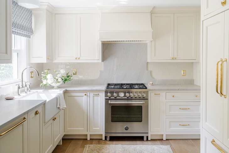
The sink stayed put, the fridge moved, and the stove is now the centerpiece.
Erica and Joe worked with Molly — plus a contractor — to make the kitchen more functional for them, and they started by discussing the Chekanoffs’ kitchen routine. They like to host functions with friends and serve up appetizers and light bites, and Joe likes to bake. So Molly came up with a kitchen design that worked better.
“Rather than expanding the footprint, we focused on reimagining the layout by relocating the stove and refrigerator to create a more efficient and intuitive flow,” Molly says. “The sink remained centered beneath the window, while a new range and full-height quartzite backsplash became the visual centerpiece of the room.”


The color palette is creamy white.
Erica and Molly both say the backsplash is their favorite part of the makeover, and Molly says the tiles (from Tilebar) “add subtle texture and depth to the kitchen.” Not only do they make the kitchen feel layered, but they were also budget-friendly at $8.46 per square foot.
The color palette for the kitchen is largely shades of white, with panel-front appliances, white stone countertops, Benjamin Moore’s Ballet White paint on the cabinets and walls, Sherwin-Williams’ Ceiling Bright White paint on the ceiling, and a large white farmhouse sink, the latter of which is one of Erica’s other favorite details.


Don’t underestimate window treatments in a kitchen, according to this designer.
There’s also a pop of blue in the kitchen, thanks to the fabric choice for the new Roman shade above the sink. “Window treatments truly go a long way in making a room feel complete and thoughtfully finished,” Molly says.


Brass details complete the kitchen.
Erica says that she likes the brass details, too. “The unlacquered brass hardware adds warmth and patina,” she says. “I love that it will evolve with us and become more characterful over time.” The cabinet hardware and light fixture are from Rejuvenation.
Everything “feels more intentional,” Erica says. Not only does it function better, but it’s also beautifully designed, calming, and “feels quietly elevated,” she says.
Inspired? Submit your own project here.