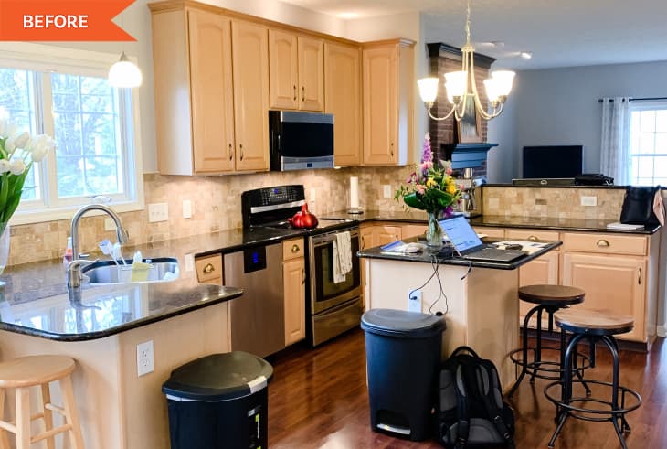
Before and After: An Early 2000s Kitchen Gets a Contemporary New Look for $1,000

It can often be pretty easy to guess what era a kitchen was designed in. The 1970s favored earth tones, the 1980s was all about the white laminate cabinet with wood trim, and 1990s and early 2000s kitchens often had wood-toned (reddish or orange) cabinets and dark counters. But now, 20 years later, the current trend is something of the opposite, with white countertops and white (or very dark) cabinets at the forefront.
The problem with modernizing your kitchen a decade or two is deciding what to keep or how to make some of the more dated features look new again. Often, the counters or cabinets from a kitchen are perfectly good quality, they just look a smidge dated, as was the case in Lianne Luce’s kitchen, which she recently made over as part of the One Room Challenge.
Lianne pulled off her $1,000 refresh without having to demo anything — except the tile backsplash, which she scrapped for a blank white wall. She kept her black counters but decided to paint the cabinets, which she described as “more orange than [she] wanted.” The white she chose (Sherwin-Williams’ Warm Putty) has just enough warmth to it that it doesn’t feel stark.
“If I had to do things differently, I might choose a slightly darker color for the cabinets so there was more contrast from the walls to the cabinets,” Lianne says. (Her current wall color is Sherwin-Williams’ Crisp Cotton.)
“I am reminded that my main goal was to brighten up the space, and I do like the color I chose but would be interested in exploring something that contrasts more,” she says. She also says she might paint her cabinet hardware a darker bronze color if she were to do it over again.
One cabinet detail she loves? Her choice to leave one of the cabinet doors off “to create a little ‘moment’ in the corner near the stove and easier access to cookbooks and items for cooking,” as she describes.
Lianne also loves the corner shelves she added behind her kitchen sink and the new extra-long custom towel rod beneath the sink. To make the shelves, she and her husband, Matt, bought lumber, Matt cut the shelves to size, and Leanne stained them. The couple also installed a three-pendant light fixture above the sink in addition to swapping out the lighting above the main kitchen island.
For her custom towel rod, Leanne used an adjustable rod to get the exact length she wanted. It started black, but she painted it gold to match the hardware. “It’s just under 3 feet long, and I had to try three different room-darkening curtain rods to find the right size and fit,” Lianne says.
“It doesn’t really stand out necessarily, but it’s really rewarding to know I came up with a creative solution, and it puts a smile on my face every time I dry my hands,” Lianne says. In general, she’s proud of the out-of-the-box thinking that went into giving the kitchen a facelift. “Updating the kitchen makes a positive difference for the flow of our whole house,” she says.
She says that before, the dining nook between the kitchen and living rooms felt “randomly thrown together,” but now, it’s inviting, and she spends a lot of time there. “I love the lightness of the space and the coziness,” she says — not just in the dining area, but the whole kitchen.
“Seeing what we accomplished with this space inspires me to update other rooms in our house and feel more confident in my eye for design,” Lianne says.
This project was completed for the Spring 2022 One Room Challenge, in partnership with Apartment Therapy. See even more of the One Room Challenge before and afters here.
Inspired? Submit your own project here.
