Why It Works: The Brooklyn Brownstone I’ve Been Crushing On for a Year

For just under a year (as of last June, to be exact), I’ve had a serious crush on the Brooklyn home of Jae and Devin. The architecture alone of their brownstone, with those amazing moldings, ceilings and floors would make any design lover completely and totally jealous obsessed. Their lust-worthy abode is more than just really great bones, however, and I’m going to break down why their combo living room and dining room just plain works.
It’s the perfect balance of light and airy but is still full of character.
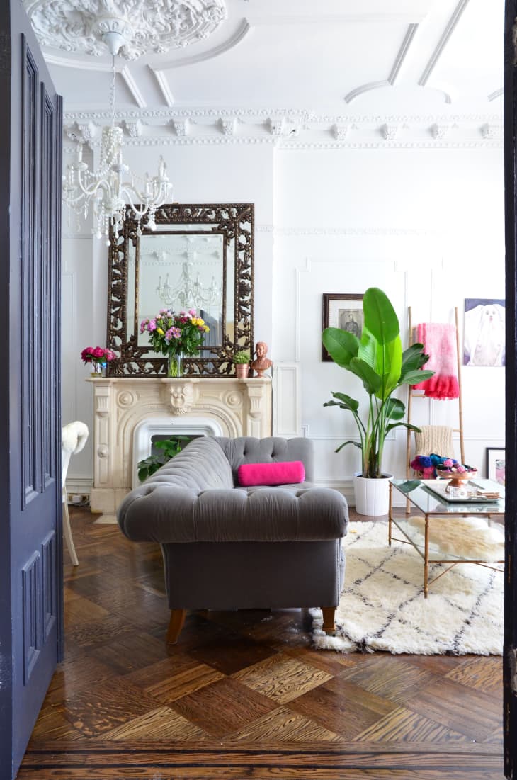
Let’s start with my absolute favorite photo from this home: the lead shot in this post. A visual feast for my eyes, I don’t know where to look first. Not because it’s overwhelming or unbalanced, but because I love everything in this image. And though it’s hard to choose which element is best, let’s talk about that navy door first. It works so well against the rich wood floors because it stands out as it’s own element. Had the door been wood or painted white, it would have blended in with the walls or the flooring. This is an idea to steal for your own home, surely. Consider painting the interior of your front door if you’re in an apartment or condo (it’s easy enough to paint back, and I say that from experience).
The scale of decorative items is just right.
The large ornate mirror on the mantel perfectly balances the height of the room and having it leaning up against the wall keeps things casual (with elements that could feel quite formal).
Ideal sofa placement makes the space appear even larger (but well distributed).
Another winning point here is where they decided to place the sofa. With such a long room, Jae and Devin were smart to float the furnishings, creating a visual divider between spaces. They could have easily decided to put the sofa up against the wall opposite the TV, but that would have likely left awkward negative space where the fireplace is and actually make the whole room appear smaller.
Unexpected decor is delightfully surprising.
Vintage papasan chairs, funky decor items and bright pops of pink are unexpected in a room with such stately architectural elements, and for that, I applaud the homeowners. Of course, there is something to be said about remaining “true” to the period of your home, but I find it refreshing to break the mold and have a little fun.
On the other side of this long room is the couple’s dining room, which continues the dashes of fuchsia in the chairs and artwork. Fornasetti plates on the right wall are quirky, perfect for a room that doesn’t take itself too seriously.
Modern molded plastic dining chairs (along with ivory acrylic head chairs) juxtapose a traditional toile-covered wingback chair, which is another example of Jae and Devin’s propensity for mixing decades (actually, centuries!) with their decor.
