
This Dated Yellow-Toned Kitchen Gets an Airy Craftsman Refresh
Designer Samantha Tosti of Tosti Design knows a thing or two about streamlining a space — and making it more practical (and pretty) for her clients. Just take this California kitchen in a home built in 1978, for starters, which was large in size but not quite right for her clients in terms of its flow or aesthetic.
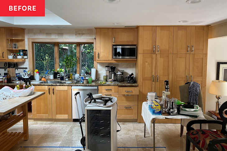
“When I first got to this home, the kitchen had three different espresso makers, glasses for absolutely every occasion, and multiple drawers devoted to the art of Tupperware,” says Tosti. “It was literally lived in by the hostess with the mostess.” The only problem? The kitchen’s appliances, finishes, and visually imposing cabinets were bringing the space down, and the room wasn’t set up for entertaining at all, despite being connected and open to the living room on one of its ends.

“The kitchen felt small, dark, and claustrophobic,” says Tosti. “Nothing operated well, from the layout to the actual cabinetry. The cooktop was in a corner with very little counter space, and there was no [built-in] island. The cabinets were a dated yellow that clashed with the taupe tones of the travertine floors.”
Ready for “their kitchen to match their lifestyle and personality,” Tosti’s clients enlisted her design firm to reimagine the space essentially from the ground up. “The goal was to create something that felt big and bright and happy yet didn’t feel overcrowded with built-ins and cabinets, but provided a home for every piece of cookware and cutlery as well as some extra space to grow the collection,” says Tosti. “The homeowner is a collector of fun and unique things, and we didn’t want her to feel like she had to give that up in order to have a beautiful kitchen.”

As Tosti homed in on her clients’ wish list, she began drawing up plans, elevations, and 3D mockups. “We listed out all the items that needed a home as well as the client’s personal preferences and found a way to incorporate them, “ says Tosti, who brought on Fassino Construction as the contractor for the project. “Together we reviewed plans, created a budget and timeline, and then we started shopping and selecting materials.”
While the footprint of the kitchen stayed the same, Tosti improved the flow of the room in a few key ways. The team expanded the opening into the kitchen, which made the room brighter and more connected to the living room on the whole. They were also able to raise the ceiling of the room, which gives the space a sense of loftiness and grandeur. Both of these moves allowed the existing window and skylight to work their magic with natural light like never before, further contributing to the light and airy feel of the finished space.

The appliances, which felt crammed-in and not well-situated for cooking or entertaining before, were upgraded (save the refrigeration and wall ovens). While the sink stayed in the same spot to take advantage of the window view, the cooktop, refrigerator, and wall ovens were all relocated to improve function.
Clad in walnut and topped with a green leathered quartzite countertop, a large kitchen island rounded out the new setup and became the pièce de résistance in the space. The island is furnished with Arhaus’ Kirsten Stools, which add another subtle but dimensional texture to the room.

The clients saved by keeping the gorgeous cross-cut travertine floors and having them refinished. Around that feature underfoot, they built a warm, creamy neutral palette with a mixture of painted wood cabinetry and polished quartzite fusion counters, which extend to a curvy seamless backsplash on the sink and cooktop wall.
A slightly more modern solution with a subtle nod to the home’s Craftsman style, raised panel cabinetry was selected. Certain cupboards feature textured glass fronts, making them perfect for displaying the homeowners’ tableware collection. The cabinets are painted in Pratt and Lambert’s Toasted Wheat (2044), which was selected in a satin gloss finish.


The lighting became the jewelry of the space and a jumping-off point for the room stylistically. “In the midst of the boxes and boxes of stuff, I unearthed a pair of matching antique sconces that the homeowner had found on a layover decades earlier at an antique shop in New York,” says Tosti. “Their swooping shape and old-timey elegance unlocked some of the necessary drama that we ended up bringing to the entire space.”
Hung over the island, Visual Comfort’s Griffin Grande Linear Chandelier provides a streamlined counterbalance to those vintage vibes. Its silhouette is also elegant and thin, which allows the skylight to do it’s thing without any major obstructions.

One final smart building solution also made all the difference in the look and feel of the space. “At the edge of the kitchen, the floor level changes by 2 feet, dropping suddenly into an adjacent living room,” says Tosti. “There were stairs, but they only ran a short way across.”
Safety was a concern in this spot. So the designer came up with an idea to build a walnut cabinet that would straddle the change in the floor; it acts as a serving buffet on the kitchen side (and as extra storage from the living room side). “This turned out to be one of our favorite elements in the kitchen and gets used daily,” says Tosti

In the end, the kitchen became the perfect hybrid of old meets new, dark and light. And the homeowners couldn’t have been happier about the result.
“We were able to mix the more maximalist antiques with a clean and modern aesthetic by including some classic elements in the design,” says Tosti. “I love the colors — how they contrast and work together to honor the client’s style. I love the flow of the space and how it feels so open, yet every square inch serves a purpose.”
Design Defined
Never miss the style inspo and recommendations you crave with Design Defined. Follow along each week as our Home Director Danielle shares the best style advice, latest trends, and popular decor finds you just can't miss.