
These 28 Stunning Kitchen Makeovers Will Leave You Speechless

There’s something extremely satisfying about a great before-and-after — and that’s especially true for kitchens. While every room has the potential for total transformation, the kitchen usually has a lot more going on, from cabinets to shelving to counters to backsplashes. Changing even just one element can make a huge impact.
Aside from all that, the kitchen is the heart of the home. You’re sure to hit it at least a couple times of day for meals, of course, and it’s also a gathering place, a homework zone, a home office, and more.
If you’re looking at your kitchen and thinking it could be doing more for you, your inspiration is right here. Below, 28 of the best kitchen makeovers Apartment Therapy has ever featured — from DIY kitchen cabinet refreshes to all-out kitchen renovations. Let these dramatic kitchen transformations get your creative design wheels turning.
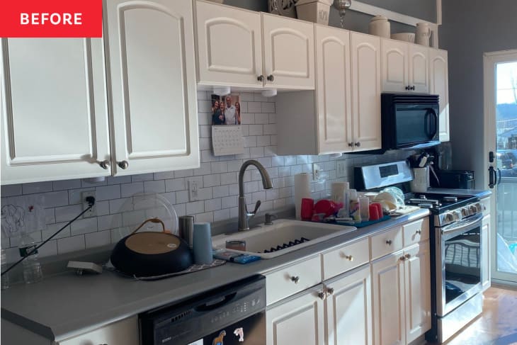
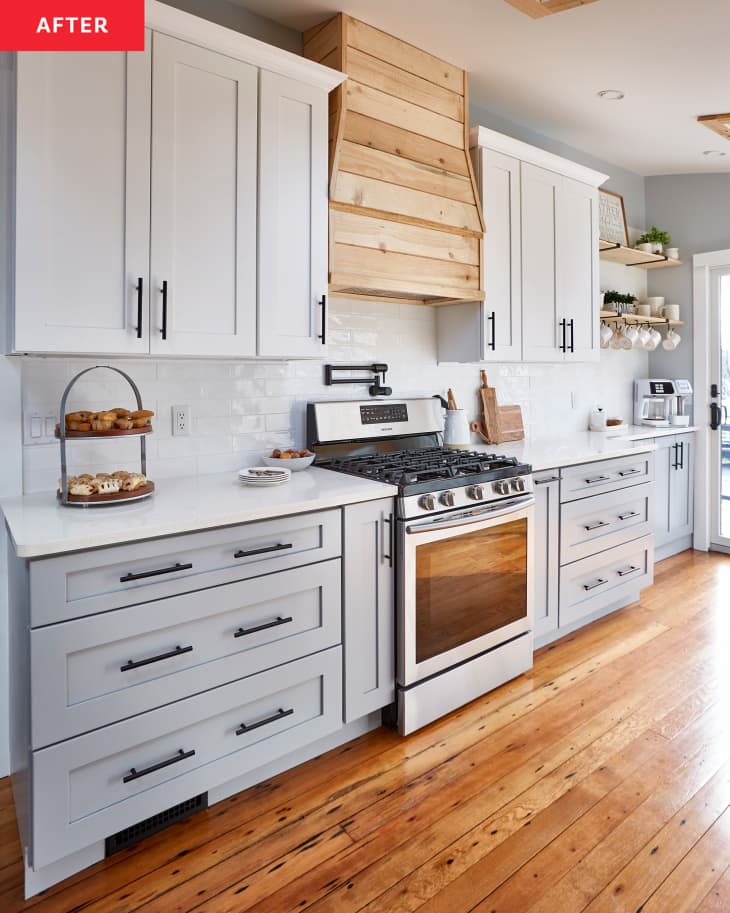
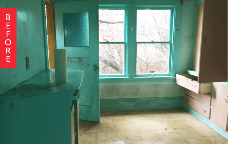
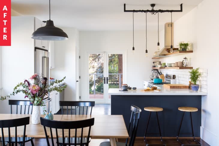
1. A “Falling-Apart” Kitchen Gets a Fresh, Light-Filled Makeover
When Alicia Ragonese and her husband bought a 1930s lake cabin in New Jersey, they knew they needed to make some major renovations. But they decided to wait on a kitchen makeover until they used it for a few years and truly understood how they used the space. That waiting paid off — now they get to enjoy their dream modern farmhouse kitchen with bright cabinets, a window to the patio, and chic wood accents.
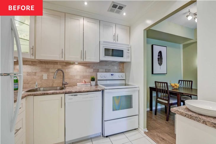
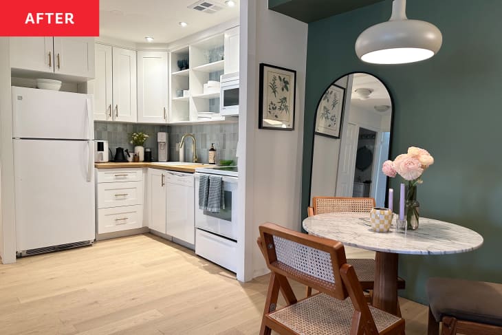
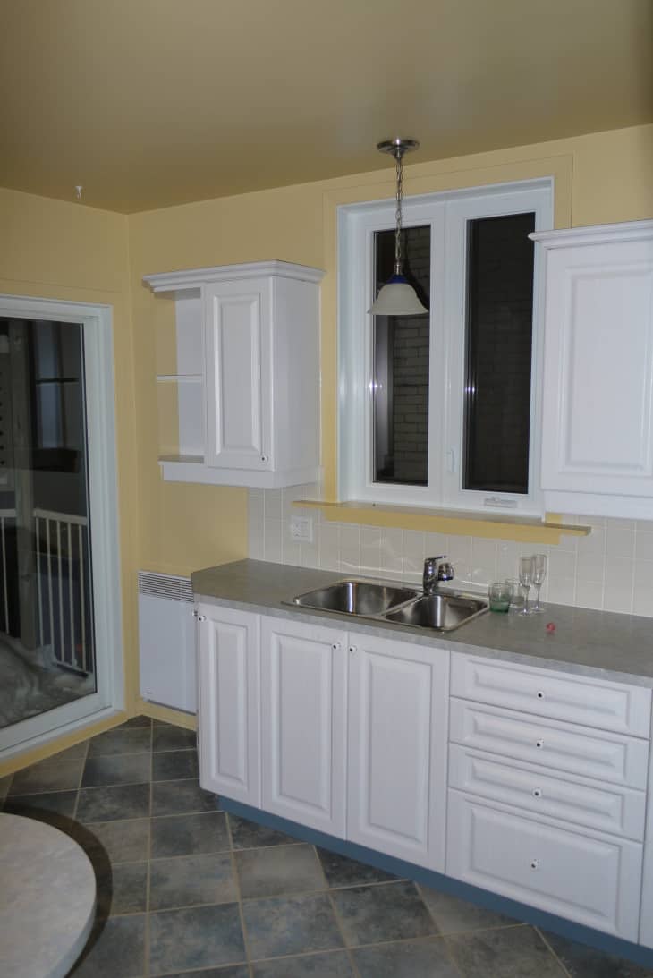
2. A “Beige on Beige Mess” Kitchen Gets a $225 Renter-Friendly Redo
Renting and renovating don’t normally go hand in hand, but Devin and Jess VonderHaar’s landlord was gracious enough to allow the couple to transform the kitchen in their drab rental. To bring new life into the space, they painted a light eggshell color over the dated beige cabinets and sage green over the walls. Gold hardware on the cabinets was another budget-friendly addition.
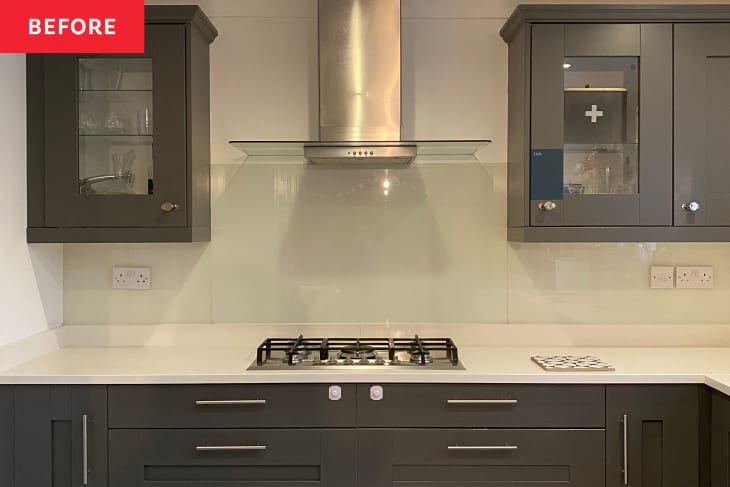
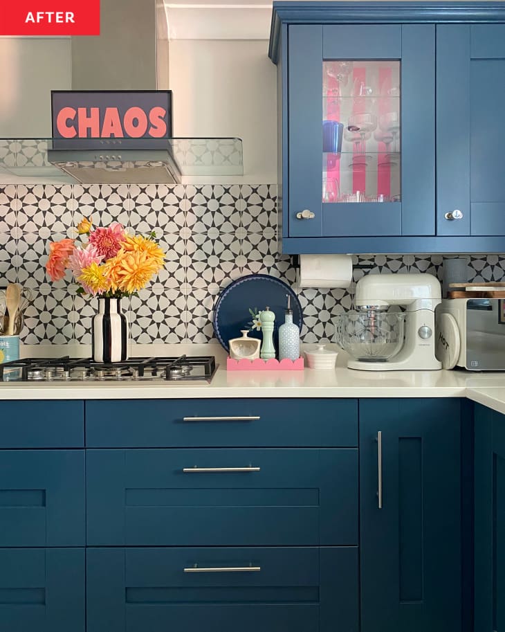
3. This Maximalist Kitchen Makeover Features a Clever $8 Cabinet Hack
As far as Tamzin McGillen is concerned, there’s no room for boring kitchens. She added some much-needed color to this black-and-white space over time. She kicked things off by adding sleek hardware and a patterned backsplash. She went even further by painting the cabinets blue, which contrasts with the white countertops without dampening things.
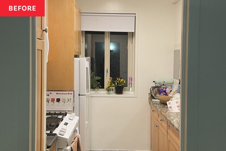
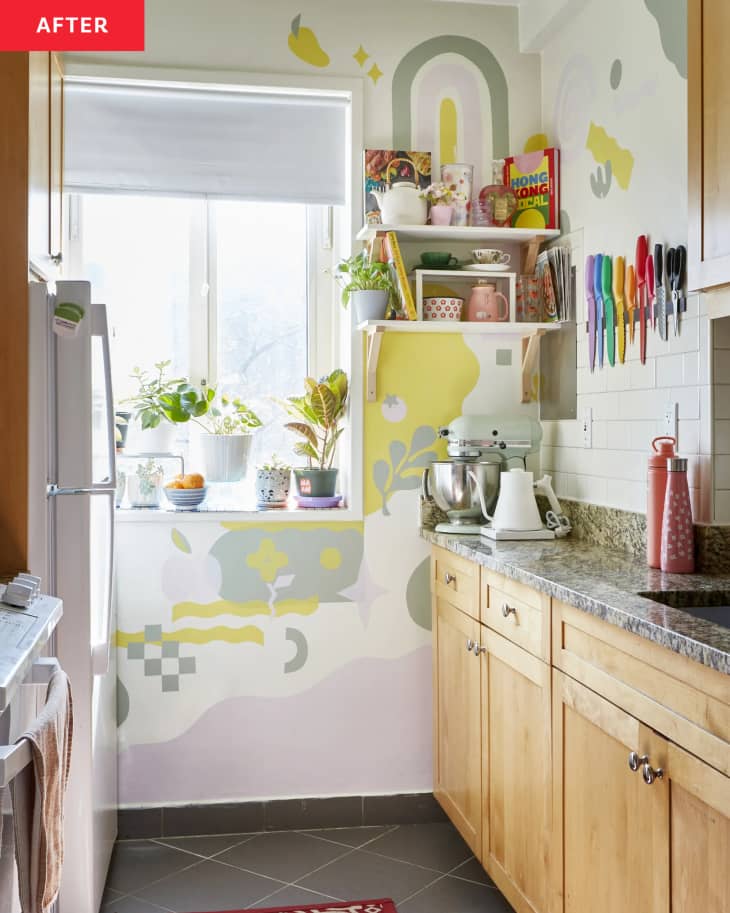
4. A $30 DIY Project Adds Rental-Friendly Maximalism to a Blank Kitchen
This kitchen was dark and boring before illustrator Gica Tam got her hands on it. The challenge? It’s a rental. With a pair of scissors, a pencil, and peel-and-stick wallpaper, Gica made a renter-friendly mural full of colorful shapes and patterns that instantly brighten up her kitchen. And since the DIY decals are removable, she’ll still get her security deposit back.
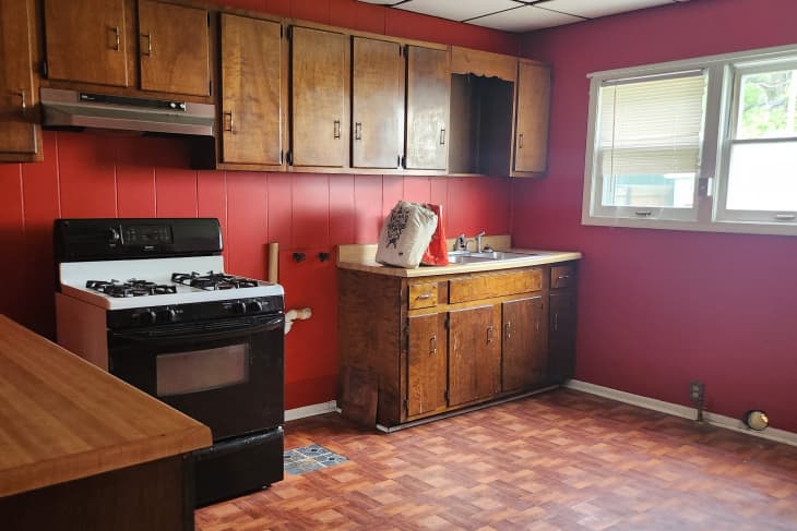
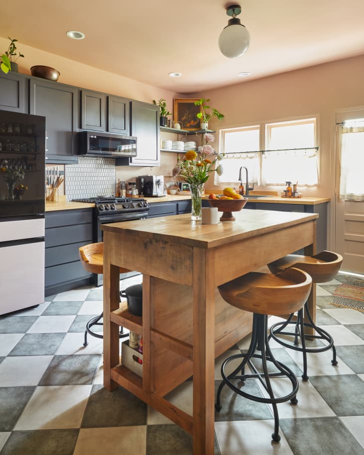
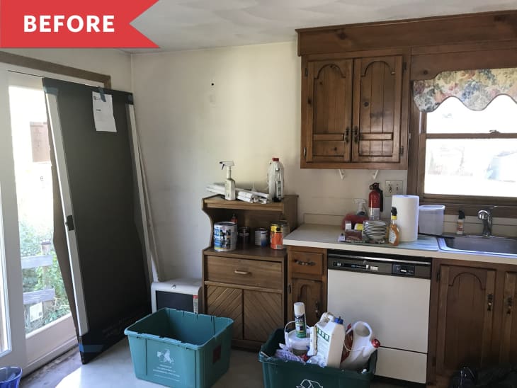
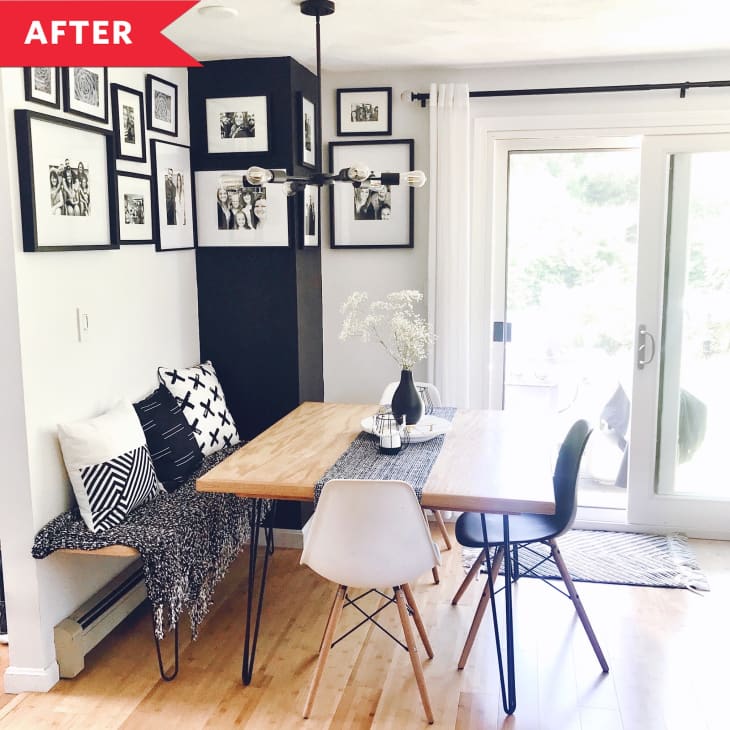
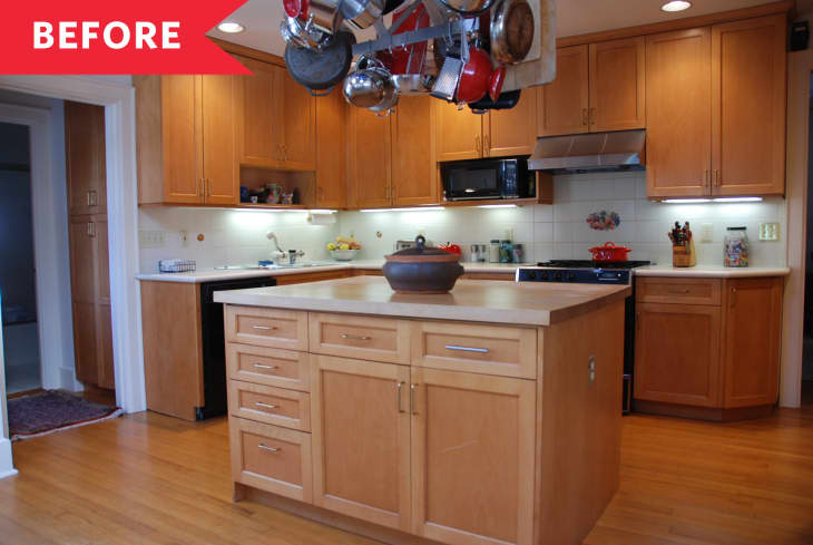
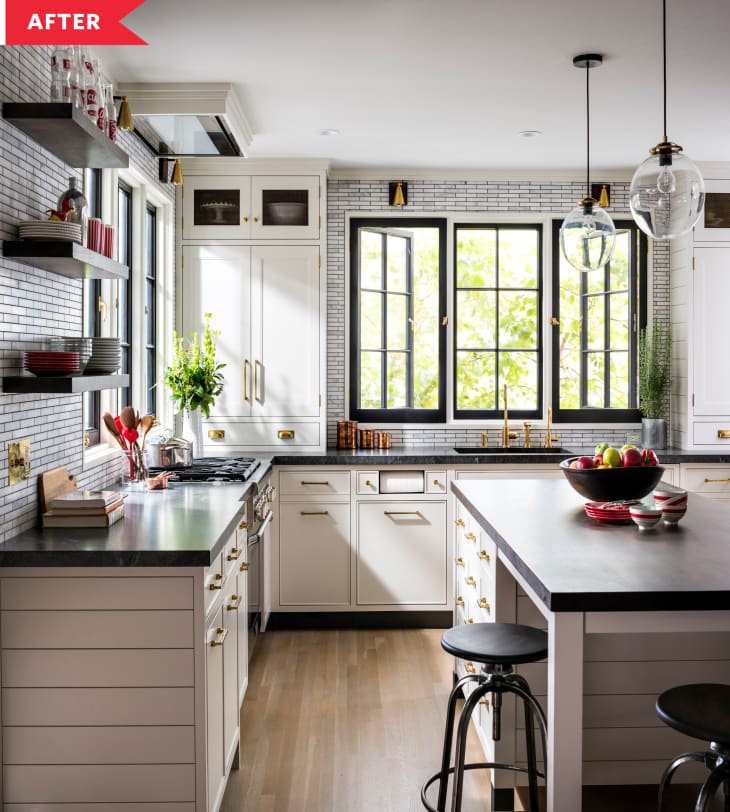
5. A Dated Kitchen’s Gut Reno Unearthed a Beautiful Brick Wall
Kitchens should be functional without sacrificing style. That’s exactly what Dana McMahan was thinking when she was dreaming up her kitchen makeover in this 1883 home. After tearing out the entire kitchen, she changed up the layout to make things more practical, moving the sink underneath the window overlooking the yard and tucking the laundry in the corner. She added a big, beautiful timber frame island with four stools in the center of the room for space to prep food, work, and more.
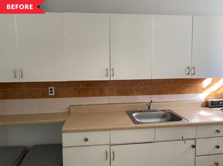
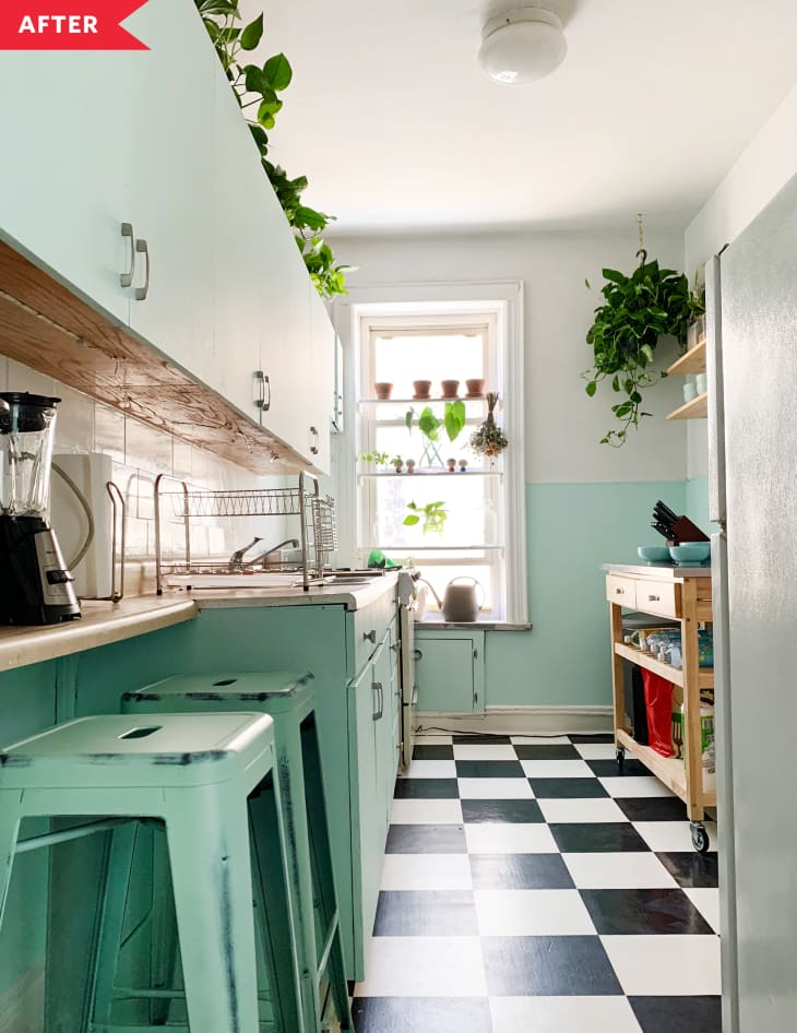
6. A Renter-Friendly Kitchen Redo Packs Big Style into 85 Square Feet
This rental kitchen got the dreaded landlord special, but renter Daniella Caruso found a way to give it character while leaning into its 1950s charm. She painted the white cabinets a teal-gray color to add installed colorful peel-and-stick wallpaper and flooring to make the space charming, but still renter-friendly.
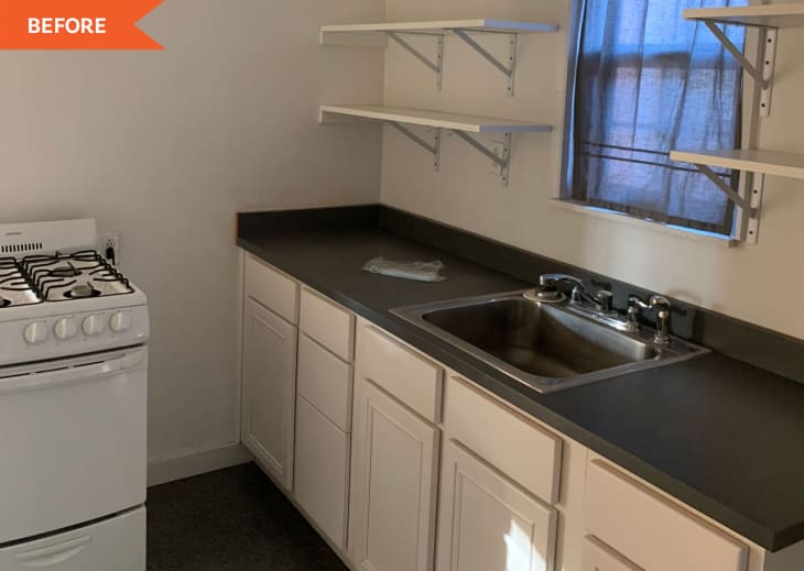
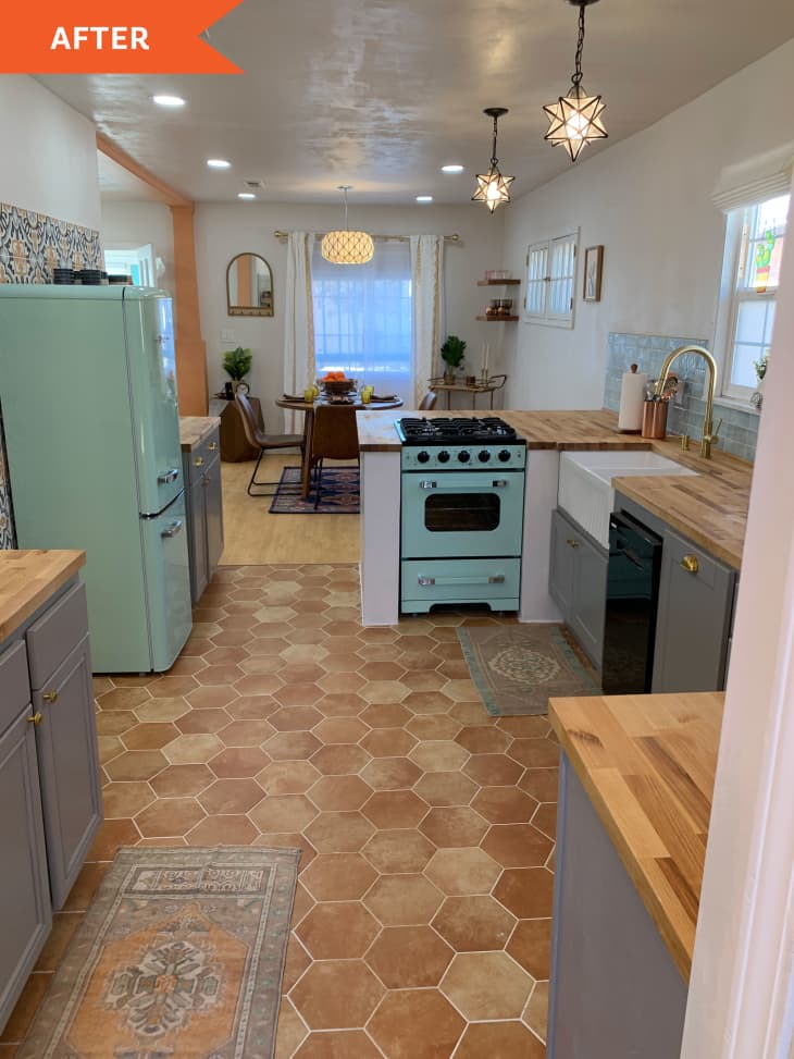
7. An Uninspiring White Kitchen Gets a Cheery Southwestern-Style Makeover
This stunning kitchen makeover proves that you can make any kitchen into your dream kitchen. This space was awkward and dingy when Lara Parra moved in. To transform the space, she knocked down a wall to open things up and create room for bar seating. To open things up even more, she replaced the original solid kitchen door with a glass-top one. A mix of vintage accents, like a mint green fridge, make the kitchen feel retro chic.
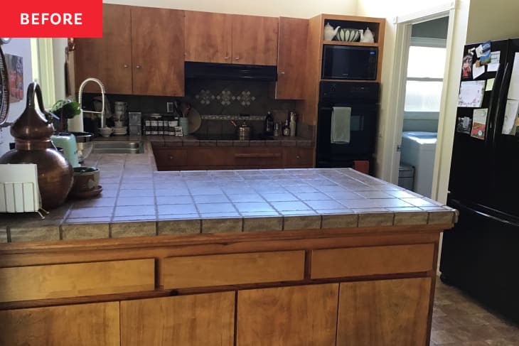
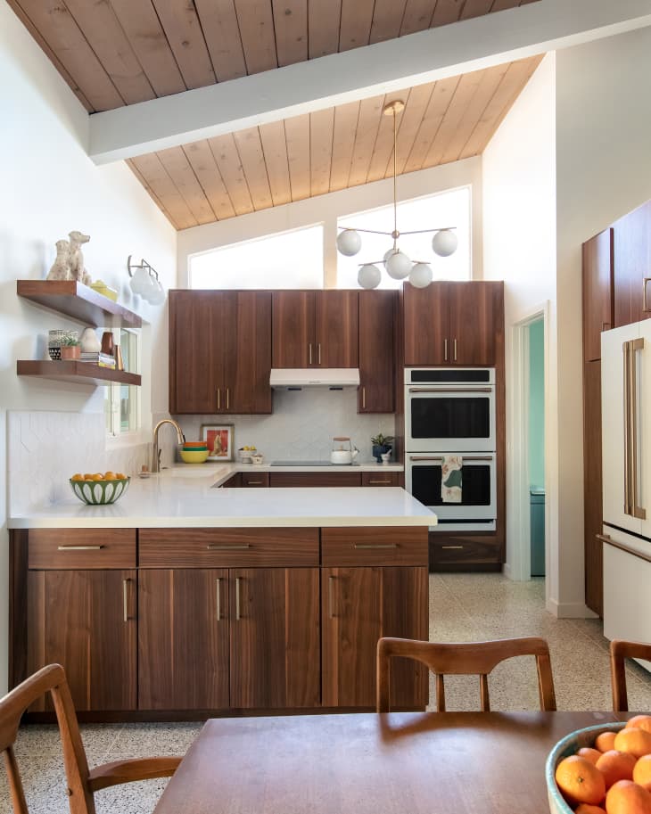
8. A Design Firm Makes Magic in a Mid-Century Modern Kitchen Redo
A kitchen that looks modern and airy but also makes you feel like you’re living in an episode of “The Brady Bunch”? Sign us up! Blythe interiors brought this 1961 kitchen into the 21st century with brand new finishes and contemporary amenities. Keeping things neutral, designers replaced the outdated linoleum floors with stunning terrazzo. The new matte white appliances look modern, while the sloped ceilings and wood accents maintain the mid-century look.
9. This Chic Kitchen Redo Is a Prime Example of How to Renovate in Stages
Kyra Petticrew described her condo kitchen as “clinical and cold” when she moved in. With lots of beige and absolutely no personality, her kitchen was the definition of boring. But she gave it character by updating the countertops and painting the cabinets a bright white to match the walls.
10. A $15,000 Two-Tone Kitchen Has a Fresh Take on Gallery Walls
Being in this Massachusetts kitchen was like slipping on brown-tinted glasses and time-traveling back to the 1980s. With help from her dad, Kayla revamped the room with new white upper cabinets, black lower ones, and gleaming brass pulls. Oak open shelving and a black-and-white photo gallery wall create an inviting dining nook.
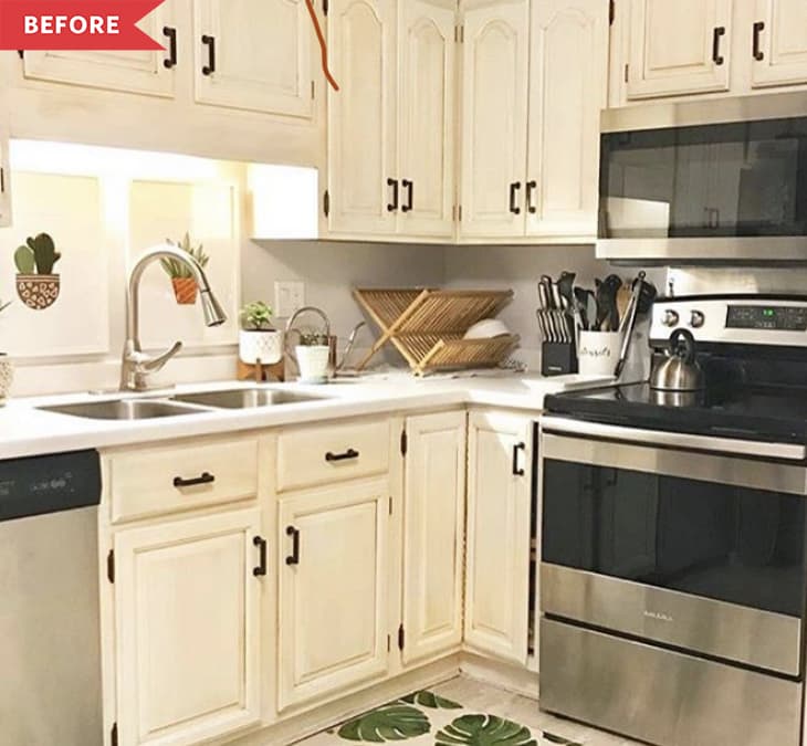
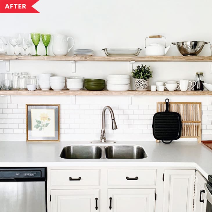
11. You Won’t Believe How Little This High-Design DIY Kitchen Reno Cost
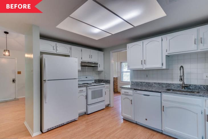
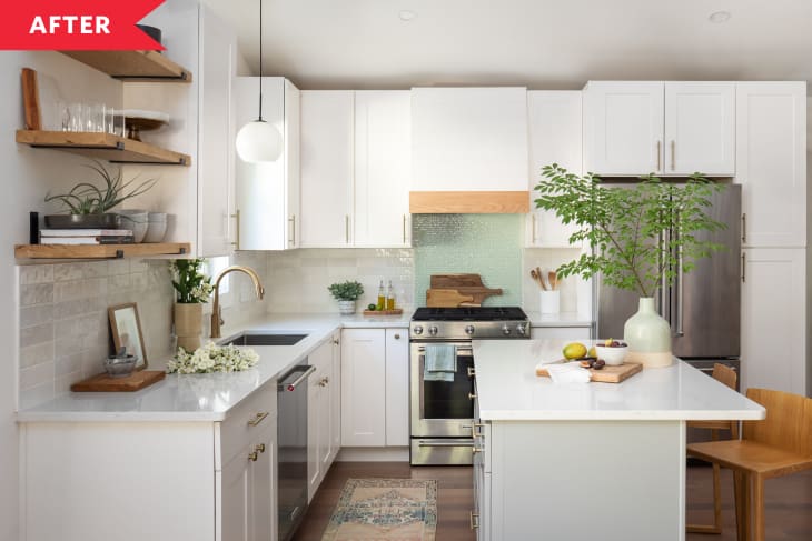
Designer Basma Masood was happy with her Virginia home, except for the stark white 1970s-era kitchen, which had some odd angles and didn’t flow with the rest of house. Basma’s DIY remodel moved the kitchen to the former dining room, which created an inviting, modern space with white cabinets, oak floating shelves, and a surprising pop of color behind the range.
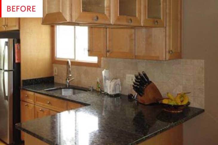
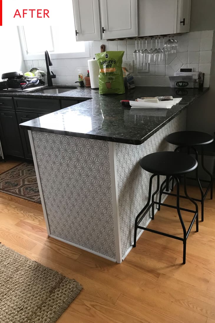
12. A Three-Week $500 Kitchen Facelift
This kitchen had a lot going for it, with warm wood cabinets and matching floors, dark granite counters and stainless appliances. But it was missing pizzazz. The homeowner gave it a fresh look by painting upper cabinets and backsplash white, painting the lower set a charcoal grey, and adding some fresh pattern to the island. Best part? All together, it only cost $500.
13. An Unbelievably Bold Blue Kitchen Gets a Modern Makeover
Brett and Brendan were thrilled with the Craftsman home they bought in Oakland — except for its kitchen, which was painted an electric ocean blue and had a very worn linoleum floor. They gutted it to create a bright Scandinavian feeling kitchen with an L-shaped counter, white cabinets and counters, open shelving and a white subway tile backsplash with dark grout.
14. A Dark, Dingy, and Dated Kitchen Got an Incredibly Cute Update for Only $500
Justin Russo and his boyfriend Pierce Atkins wanted to give their drab kitchen a look that felt at home in their 1920s-era NYC apartment. Using just $500, they turned it into a colorful retro kitchen with mint green cabinets, a work area with a rolling cart and open shelving, and black-and-white flooring.
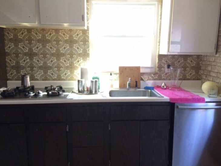
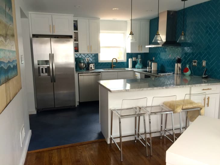
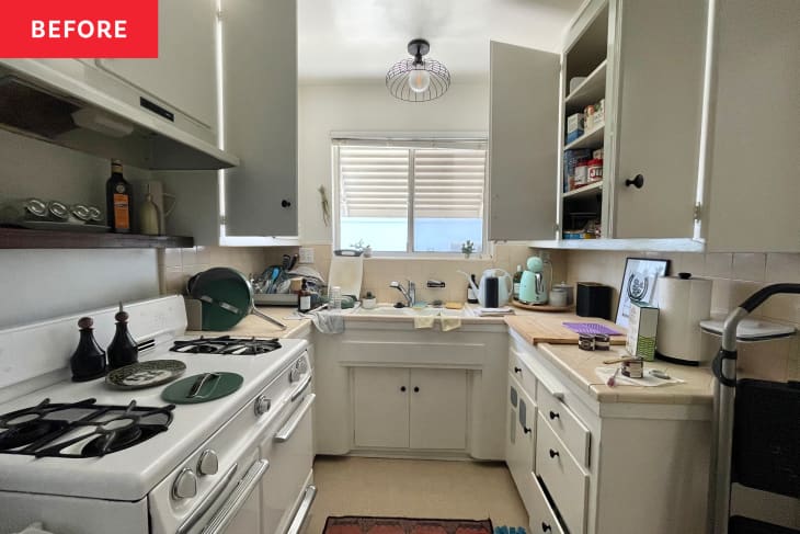
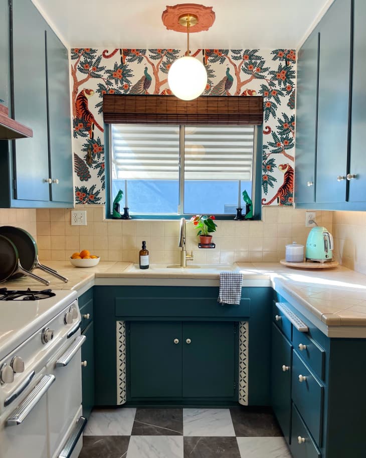
15. Sabina’s “Dated, Depressing” Kitchen Gets a Bright Makeover
It doesn’t get more drab than Sabina’s Pittsburgh kitchen, with its dull gray wallpaper, dated gray backsplash, and dusty-looking floor. She gutted the room and gave it new life with turquoise tile in a herringbone pattern, white cabinetry, gray marble counters, and deep blue floors.
16. A Smart Kitchen Transformation in Hell’s Kitchen
Taking down the wall that blocked off their NYC apartment’s kitchen allowed Dan and Mike to design a modern kitchen with European feeling cabinetry, an eat-in counter, and open shelving.
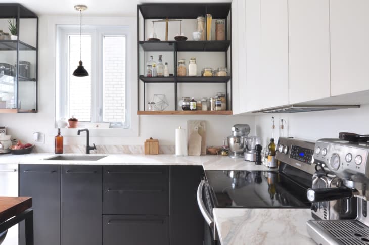
17. An Industrial Kitchen Created with IKEA Cabinets
A yellow and white traditional kitchen might make some people happy, but it wasn’t right for Gaëtan and Violane’s style. Gaëtan, an architect, designed the new kitchen for their Montreal home himself, using IKEA’s SEKTION cabinets to create a sleek industrial black-and-white kitchen.
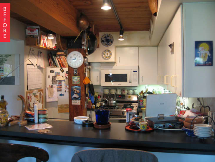
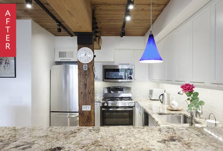
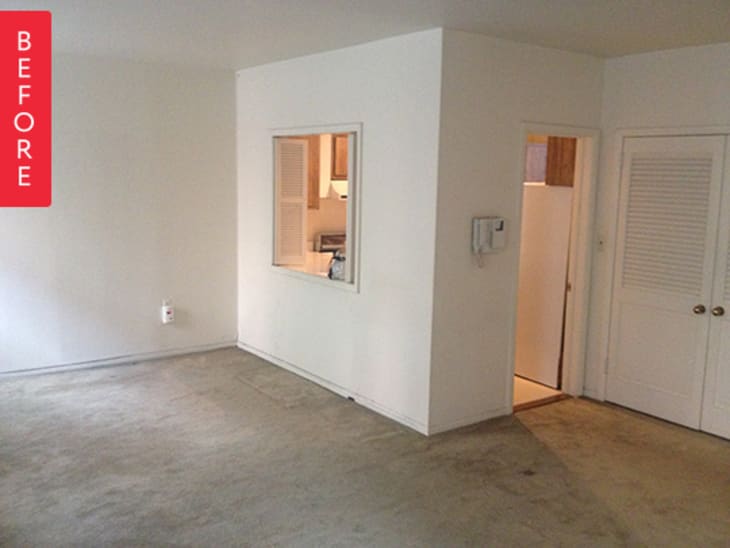
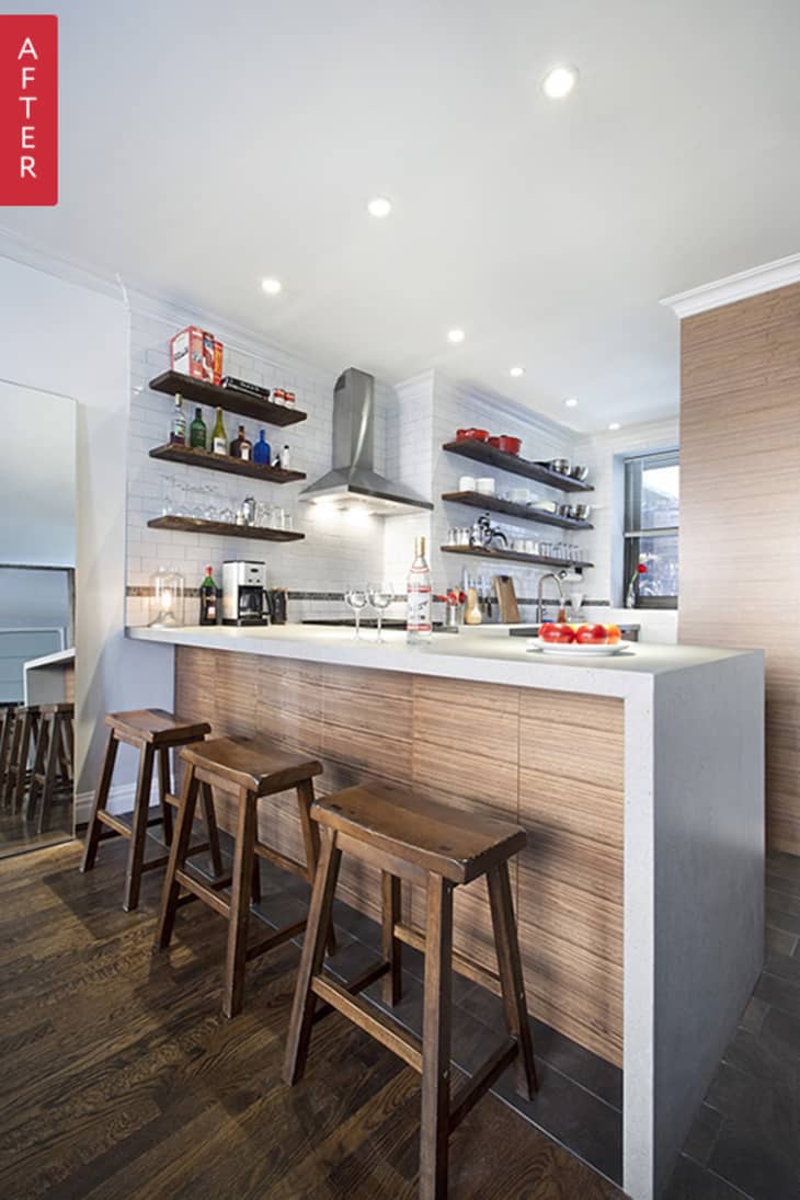
18. Barrin’s (18 Years in the Making) Updated Kitchen
After 18 years of living there, Barrin’s Brooklyn apartment kitchen was so cluttered it was hard to find space to work. But removing a wall allowed him to add more functional custom white cabinets to free up counter space — and the kitchen’s new modern-meets-rustic look isn’t too shabby, either.
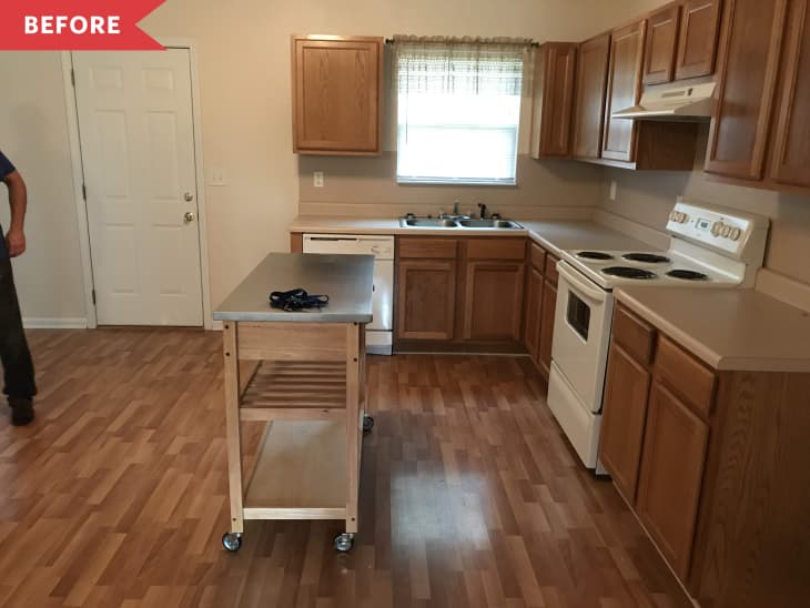
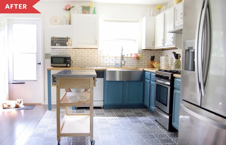
19. $3000 Later, This Brown Builder-Grade Kitchen Is Unrecognizable
This “open” kitchen was really a small area with a tiny sink and a shortage of counter space, and boring builder grade cabinets. But owner Brooke Littel and her husband transformed their kitchen with a wisely spent $3,000. Since the cabinets were in good shape, they painted the uppers white and the lower cabinets blue. Adding an extended wood counter, double farmhouse sink, rolling cart “island” and a classic Spanish tile pattern floor made it look like a whole new kitchen.
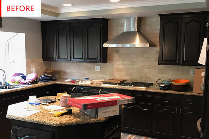
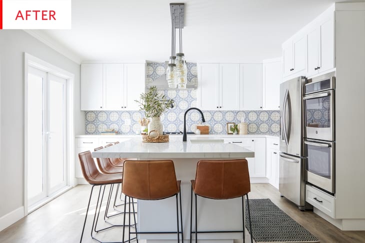
20. A Once-Dark Kitchen Is Brightened and Has a Bold Backsplash
Shiny black cabinets, a dark painted backsplash, and hexagonal island made this kitchen look dark and dated. Katie Griffith of Sundling Studio started by opening the layout and swapping a window for French doors. Gleaming white cabinetry cheered up the room, while an oversized island makes a more practical food prep and dining zone.
21. Updating the Kitchen in “The Ugliest House on The Block”
This kitchen was dark and closed-off, with wood paneling, cabinetry that looked like plastic, and a serious lack of counter space. The owners gutted the entire home, and remade the kitchen with an L-shaped island topped with white a fresh white-on-white color scheme and lots more storage.
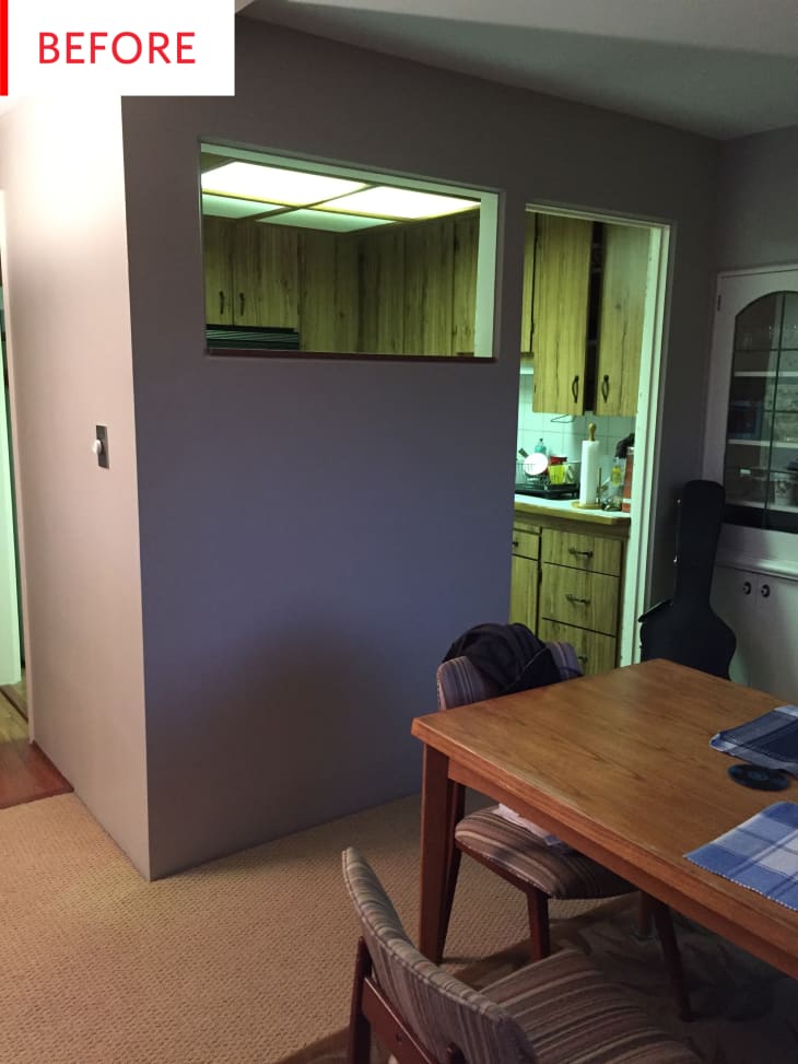
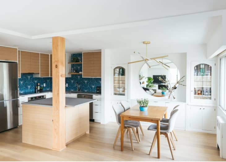
22. A Condo’s Closed-Up, Dated Kitchen Is Now Modern and Marvelous
This 1950s condo started with a small kitchen with faux-looking cabinets and claustrophobia-inducing wall dividing it from the dining room. Designer Yumi Murayama of YU+ME Design took down that wall, and refreshed the kitchen with sleek white and light oak cabinets, open shelving, and geometric tile in bold teal.
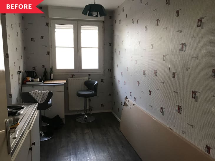
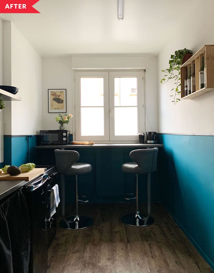
23. This $500 Rental Kitchen Redo Is Packed With Great Ideas
When Anna and her boyfriend found a spacious Paris apartment, they jumped on it, even though the kitchen was dingy — think gray wallpaper, exposed pipes, and almost nowhere to work. They transformed it with turquoise and white color-blocked paint job, black skirting to hide under sink storage, and a smaller sink to allow for more counter space.
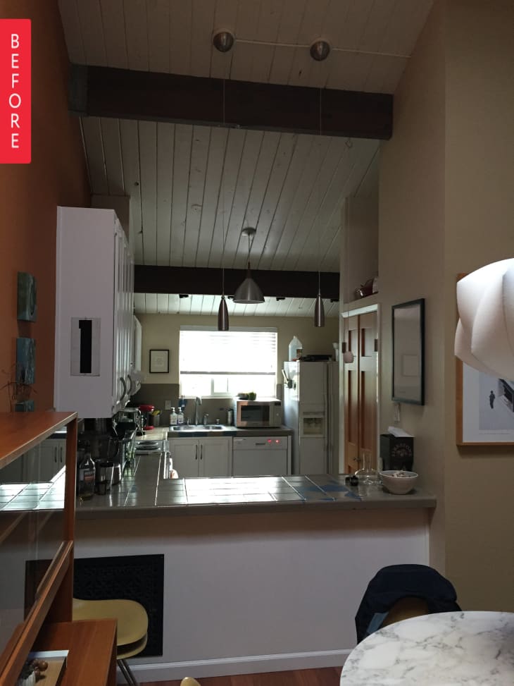
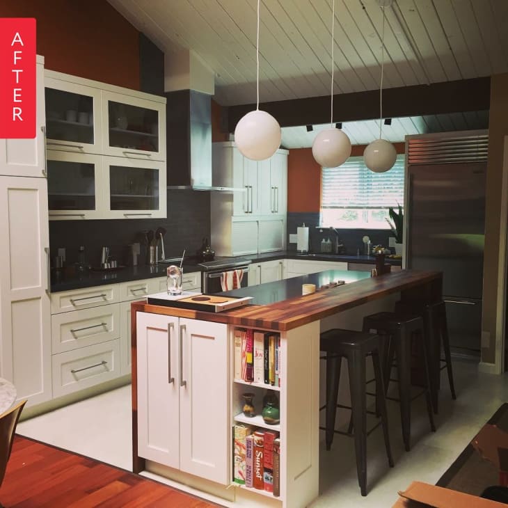
24. A Silicon Valley Kitchen Gets a Contemporary Makeover
Jennifer’s townhouse kitchen had an airy vaulted ceiling, but it felt cramped and out-of-date. Taking inspiration from the many Joseph Eichler homes in the area, they installed globe drop pendants, waterfall butcher block island, and handmade white tile on the floor. Red walls brighten the white cabinets, a mix of traditional and a break front ones that open vertically, like a mini garage.
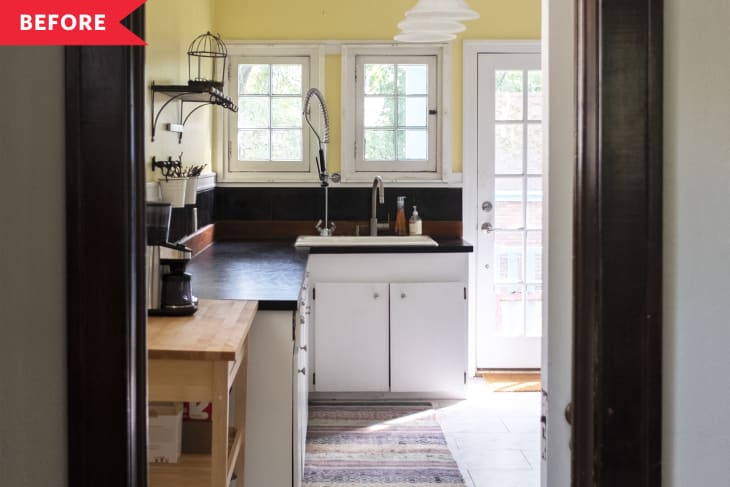
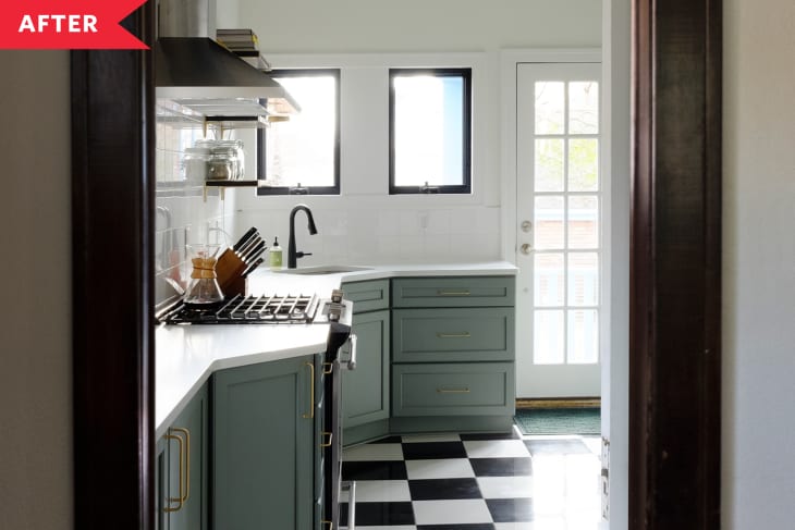
25. A Dated Kitchen’s Remodel Not Only Saves Its Charm, It Improves On It
The owners of this 1924 bungalow, Dan and Mike, wanted a kitchen remodel that would keep with the home’s old-school style. So they hired a contractor who created a kitchen with sage green cabinetry, brushed brass and black details, plus a black-and-white checkerboard floor that feels new and vintage at once.
26. The $500 Kitchen Refresh of Your Scandi-Modern Dreams
Sometimes less is more in a kitchen remodel. Mobile artist Gisele Blaker realized that her tiny kitchen would feel bigger if she removed the upper cabinets and got rid of the gray walls. After spending $500 on white paint and a couple long open oak shelves, she has a more airy and very cottage-cute kitchen.
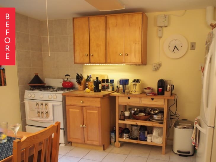
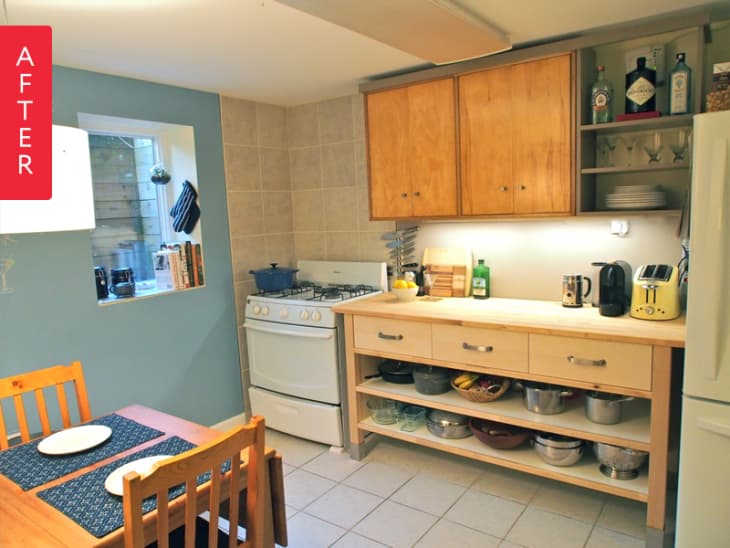
27. A Former Laundry Room Becomes a Functional Kitchen
Stephanie didn’t want a kitchen in the laundry room that had a fuse box on the wall, but that’s what she had to work with. Friends helped her level up the space with a open wall shelving to cover the fuse box and store spirits, and a new bank of cabinets below with open storage for bowls. These changes, and a feature wall painted cheery blue, give this little kitchen a whole new attitude.
28. How A Design Guru Created the Kitchen of Her Dreams
Sarah Robertson was so busy with her Studio Dearborn kitchen design business that she hadn’t gotten around to remodeling her 1980s Westchester County kitchen with blonde wood cabinets and inadequate storage. But after 10 years of planning, she finally created a modern farmhouse kitchen with white cabinets, open shelving, shiplap details, and tons of hidden storage.