
Before and After: My Dated Kitchen’s Gut Reno Unearthed a Beautiful Brick Wall
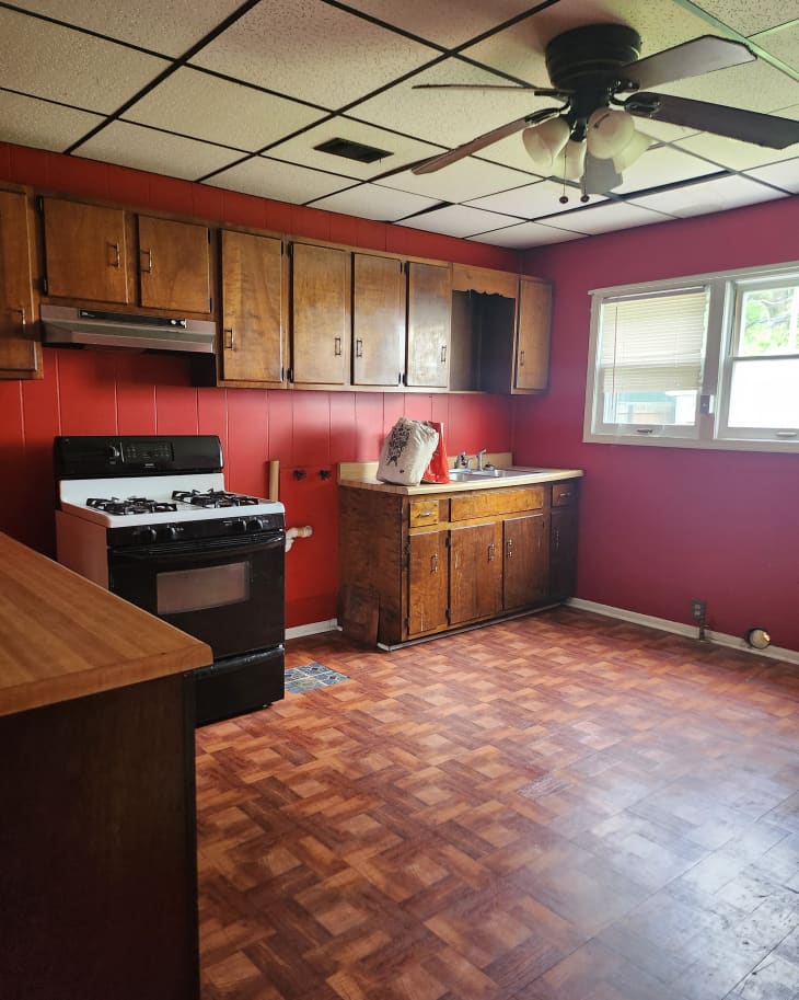
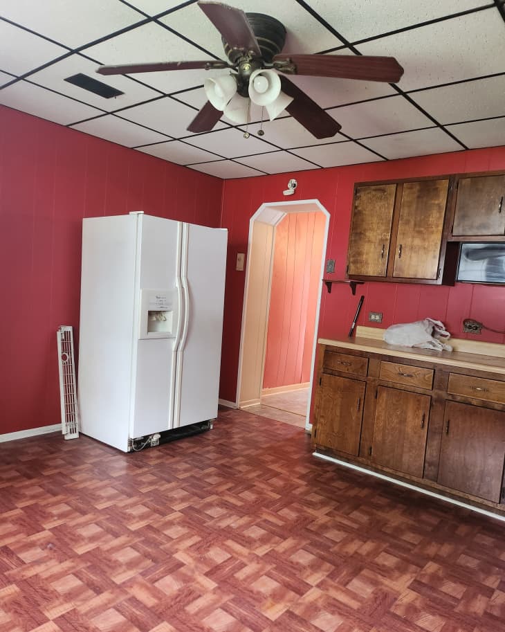
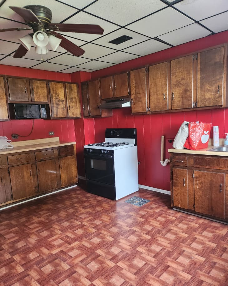
Sometimes, when you’re house hunting, you have to put on a very creative thinking cap when touring homes that are more run-down and dated. But if you’re willing to tough it out, it’s totally worth it. For example, in the little shotgun house my husband and I dubbed Cherry Pop after the cute color of its exterior (though coincidentally, its kitchen was also a deep red), there was a lot of room for improvement. In the kitchen in particular, the stick-on flooring, dark, dated cabinets, blood-red paneled walls, and drop ceiling weren’t promising at all. But we made the purchase despite the dark red cramped room at the back of the house.
A later addition to the 1883 home, the kitchen definitely felt like an appendage, but I’ve transformed enough kitchens by now to know that hiding behind the 1980s aesthetic could be a cozy, welcoming space. And after we tore it out down to the joists and original brick, sure enough, it had the bones to make an inviting heart of the home. Here’s how we did it.
A new layout makes better use of the limited space.
Before, the kitchen had an awkward layout with a washing machine hookup next to the stove and a big pantry in the corner. The fridge randomly stood alone, semi-blocking the path to walk in and out of the room. The dark wooden cabinets enclosed the room with uppers around two walls.
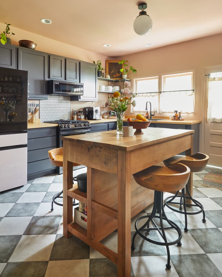
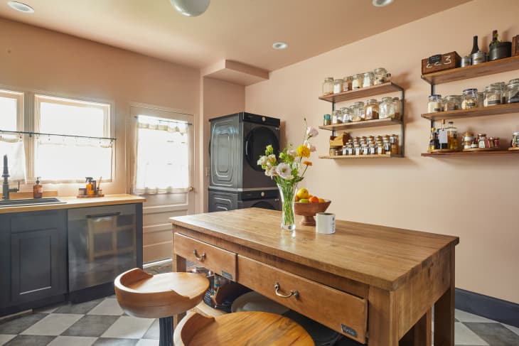
We tore it all out, tucking the laundry in the corner where the pantry had been, sliding the sink under the window overlooking the big backyard, and putting the fridge on the same wall as the range. In the middle of the room we put a timber frame island with four stools to serve every function we might need. (It’s where I’m sitting to write this story!) Without everything being so matchy-matchy, this kind of deconstructed vibe feels like kitchens I’ve seen across France and Italy, and to me, just has more personality.
I prioritized featuring the home’s historic details.
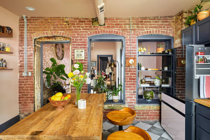
Rather than hiding the age of the house (140 years old!), I opted to play it up. When the paneling, drywall, and plaster came down, my husband and I found the original window openings that someone covered a century ago when they added on the kitchen. We kept those openings, along with the original exterior brick, as well as the authentically distressed original wooden doorframe. Casing the window openings and painting that wood the same Benjamin Moore Deep Indigo as the cabinets and trim (also used on the ceilings throughout the rest of the house) gave it a cohesive feel. Opening up those windows wasn’t part of the original plan, but it lets light pour in from the entryway and the rest of the house, making the kitchen feel a lot more spacious.
Storage (even in unexpected places) was a must.
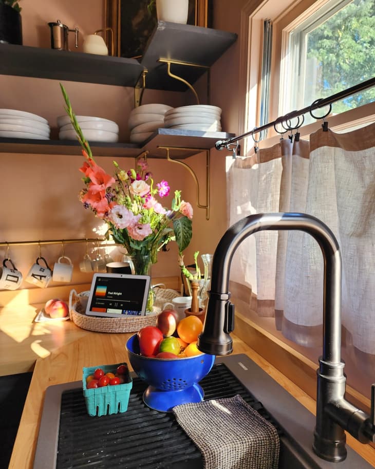
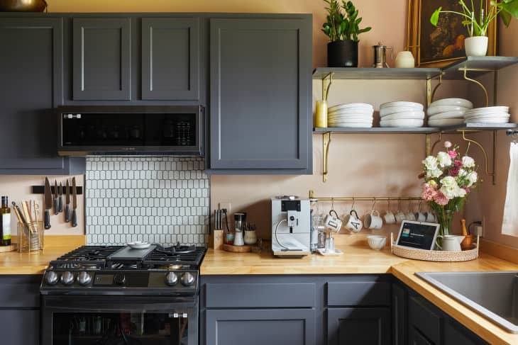
With limited room for upper cabinets, I turned to two sets of three-shelf units (sadly no longer available) for one wall, and had a carpenter build corner shelving between the sink and range on the opposite wall using just 2x12s and paint. The shelves look way more expensive than they were! I added a brass rail for hanging coffee mugs below them. We also added shelving to one of the old window openings, and I chose the island furniture for its additional storage. (Working with a pro organizer helped us make the most of every bit of that storage!) Somehow, nearly everything we kept from our old kitchen and pantry ended up fitting.
Natural colors and materials make the kitchen feel cozy.
Throughout the entire house, we went with a dusky rose pink paint (Benjamin Moore’s Boudoir), and in the kitchen I opted to do the walls and ceiling the same color. While the other rooms in the house have 12-foot ceilings, the much lower kitchen ceiling slopes down even more with the roofline. Using the same color all around gives it the coziest feel, and helps it not seem so cramped.
To save on the budget, I was leaning toward a cute new stick-on tile, but in the end opted for ceramic because I was worried about wear and tear from our two dogs. Thankfully, it was still pretty easy on the wallet (less than a dollar a square foot from Floor & Decor). Carrying the tile through to the entry helped the kitchen feel more like part of the house and less like an add-on. I used some leftover picket tile from another project for a backsplash that tied in perfectly with the floor. The stone-feel floor, the brick, the butcher block counters, the island built of reclaimed factory beams and floor planks, and nubby linen cafe curtains all combine to create something that feels real and rustic.
One of my kitchen reno rules? No boring appliances.
You can probably tell I don’t like a kitchen to look too sterile, so no stainless steel appliances here! While I chose a line of black appliances for most of the room for a touch of glam, I went for fun with the fridge. It’s the Samsung Bespoke refrigerator, and we popped the pink panels on the freezer and middle pull-out drawer. If we ever get tired of pink we can easily swap them out.
This kitchen project was just part of a two-month-long whole-house reno. It’s barely recognizable from the day we first saw it, and when we gather friends in here for intimate dinners, the best compliment they give is that it’s so me.
Inspired? Submit your own project here.
Correction: An earlier version of this post was edited to say the home was named for its red kitchen, but it is actually named for its cherry cola-inspired exterior. We’ve updated the post to be more accurate.